
For years, Microsoft’s mobile OS was plagued with a reputation of being, for want of a better word, stuffy. As competing smartphone platforms rocketed past it in both popularity and functionality, Windows Mobile 6 fell further and further into a realm of obscurity, damned by a shoddy interface, a painfully bad touchscreen keyboard, and a downright atrocious application store.
Microsoft’s next move was really their only option: scrap everything, and start anew. The result? Windows Phone 7. Built from the ground up, it’s about as similar to its predecessor as I am to a head of lettuce. Of course, different doesn’t necessarily mean better — so how does this new offering stack up? Join us after the jump for our full review.
If you’ve been hanging around these parts for a while, you might remember our “Pre-review” of an early build of Windows Phone 7 back in July. I had too much opining to do for it to be a simple “Preview”, but its early state would’ve made it unfair to do a “Review”; hence, the Pre-review. Either way, we promised our readers we’d do a proper review of the final launch build when the time came — and so here we are.
In A Nutshell:
When people click in to these reviews, a pretty big chunk of ’em just scroll right down to the bottom in search of the conclusion. For those looking for that one-paragraph wrap-up, I’ll save your mouse wheel the trouble:
Windows Phone 7 is elegantly executed, incredibly intuitive, and straight-up beautiful at times. What it’s not, relative to the competition, is complete. The things it does, it does well — but the things that it doesn’t (yet), tend to stick out. These things — third party app multitasking, copy and paste, or tethering — are things that people complained about other mobile operating systems lacking a year and a half ago.
The Interface — Blogger tested, Girlfriend approved:

Picture Windows Mobile 6.5’s interface in your mind. Got it? Okay, now, go ahead and mentally tear all of that up and forget it ever existed.
Windows Phone 7’s user interface takes as rapid a departure from its predecessors as is possible. Hell, it’s a pretty huge jump from any mobile OS before it. Building on some design theories they established with the Zune, Microsoft really took some chances with this design… and, well, they really worked out in their favor.
Why do I think this? Because of my girlfriend. Out of context, that’s a bit of a strange tangent, so let me explain: due to my job as an Internet-cell-phone-blogger-type-person, my house is essentially a venerable cell phone museum. Name a phone made in the past few years, and it’s probably laying around here somewhere. Whilst reviewing these phones, I tend to hand them over to friends and relatives to get their insights and opinions, in hopes of seeing things through the eyes of someone who doesn’t obsess over this stuff for a living. The one person who sees every one of them? The aforementioned girlfriend. The one person who seems to say “Meh, confusing.” to every single one of them? Again, the aforementioned girlfriend.
Her reaction to Windows Phone 7: “Whoa! This is pretty.” She then spent 45 minutes with it, stopping only after I realized she was trying to commandeer my review unit. The interface just seemed to make sense to her.
This is a person who does not like smartphones, even when regularly exposed to every platform, make, and model imaginable. Not wanting to base my opinion off one anecdotal piece of evidence, I shared the phone with a bunch of others. Relatives. The lady at the coffee shop. The dude who works security in our parking lot. All of’em had the exact same reaction: the interface just… made sense. It blew my mind.
For the most part, Microsoft really has done an incredible job with the visual interface here. From the lock screen on down, they manage to simplify things down in a way that seems almost artistic. Still, Microsoft has one helluva challenge in front of them: figure out how to build in the significant features that it’s so sorely currently missing (namely, proper notification management and multitasking) without messing up the foundation they’ve already laid.
Notifications — Better than iPhone, lesser than Android:

Notifications — that is, alerts that pop up to tell you whats going on in various places around the device, such as when you get a text or an IM — are something that everyone in the mobile world does differently. Android does it quite gloriously, with a pull down drawer that hangs out on top of the screen, storing all of your recent notifications for one-click access to their respective applications. The iPhone, on the other hand, alerts you much in the way a child would: it runs into the room, shouts what it has to say (by throwing an alert window at you, thereby interrupting whatever you’re doing), and then runs off to do something else and pretty much forgets it ever said anything.
Windows Phone 7’s notification system is somewhere between the two. Notifications pop up at the top of the screen, appearing where the status bar usually sits. Tap the notification, and you’ll jump to the app that pushed it. It won’t pause or otherwise interrupt what you’re doing — but it also doesn’t let you manage recent notifications that you didn’t address as they came in. It’s cleaner than the iPhone’s seemingly tacked-on system, but not nearly as handy as Android’s drawer.
(The iPhone’s notification system does have one advantage though: as far as I can tell, WP7’s notifications system can’t properly handle active alerts, such as a Voice-over-IP call coming in that needs answering. The app might be able to say “Hey! You! The phone is ringing! Quick, switch to the app!”, but as far as I can tell there’s no way for developers to fire off a proper call-to-action.)
Windows Phone 7 as a phone:
Whenever we review a new OS, someone always says “That’s all great, but how is it as a phone?”
This one’s always hard to answer, because much of what makes a phone a phone — its signal quality, its volume, its speaker phone clarity, etc — really depends on the hardware. Given that Windows Phone 7 is going to run on a bunch of different pieces of hardware (10+ have already been announced), those are things we can’t really wrap into a review of the OS.
On a solely software level, however, Windows Phone 7 is about as good of a phone as anything else, save for one pitfall. At this point, it’s the same experience across most of the platforms: the “phone” is an application, and that application has a dialer, a contacts screen, and a recent screen. Each may have its own little tricks, but none are really all that make or break — except for visual voicemail, that is. Unfortunately, that’s something that Windows Phone 7 seems to be lacking right now. Sad trombone.
Windows Phone 7 as a camera:
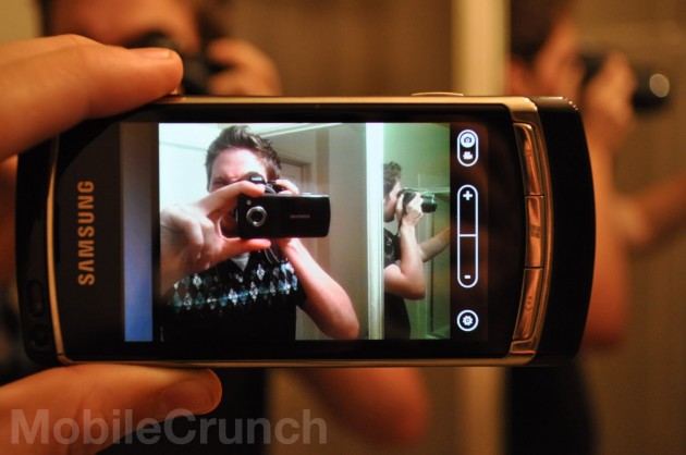
The picture-taking experience on Windows Phone 7 is perhaps the best of any platform out there right now. That’s not to say anything about the images it takes — again, that’s a hardware thing — but the actual act of taking a picture is pretty great.
First off, every Windows Phone 7 phone will have a camera button. It’s part of their design requirement. That camera button acts as a quick launch into the camera app, and serves as the shutter once you’re there.
So, why does that matter? Speed. Want to take a picture on your iPhone? Unlock, find the camera app, wait a few seconds for it to boot up, fire. Android? Unlock, hit the camera button if your handset has one, or dig for the app. Fire. On Windows Phone 7, you just hold the camera button; even if the handset is locked, it’ll jump right into the camera (Don’t worry, it’ll keep your photos private if the handset was locked. The camera button won’t become the “Show me the nudie pics!” button when your friends snag your handset). No more once-in-a-lifetime-shots sacrificed because you forgot which folder you put the camera app in.
Microsoft was also quite clever in designing the way you jump from the camera to shots you’ve already taken: just swipe from left to right. While the camera is active, your last photo is stored *just* out of view. Swipe over to it, and you’re viewing a film strip of your past shots. Swipe back to the camera, and you can snap some new ones.
Voice/Search:

WP7 has basic voice-activated functions, from calling contacts to launching applications. To bring up the voice prompt, you simply hold the Windows key, wait a second, and then speak. If it doesn’t recognize whatever you said as being a command, it triggers a Bing search.
Speaking of which, the built-in Bing search is pretty nifty. One search brings up three pan-able pages of results: news, web, and local. Searching for “Pizza”, for example, brings up nearby pizza places under the “local” view, general web results under “web”, and Pizza news (hey, I’m sure the pizza industry has news to write about.) under “news”. It’s simple, it’s quick, and I really dig it.
The Keyboard:

I’ve been raving about WP7’s touchscreen keyboard since day one. From the Pre-review Preview:
Who the hell did Microsoft hire to make this keyboard? Because whatever they’re being paid, they deserve a raise. I’ve got no idea what sort of sorcery Microsoft used to build this thing, but it rocks. I’ve typed the character-count equivalent of a novel or two on just about every smartphone platform’s software keyboard, and this … this just might be the best one.
I stand by that. This onscreen keyboard is really, really good. I’ve got big ol’ clumsy thumbs, and it always seems to know what I’m trying to say. The predictive text system seems fairly thorough, too — it even seems to know the names of some totally awesome gadget blogs. Go ahead, type “MobileCranch”. It’ll take care of it.
Microsoft has also since introduced a fairly clever text cursor system, allowing you to quickly and accurately put the cursor wherever you want. Rather than placing the cursor directly below your thumb, as is done on most platforms, Windows Phone 7 draws the cursor about 20 pixels above your thumb, and then moves it relative to where you drag. It’s not necessarily any better than the magnifying-glass-beneath-your-thumb routine popularized by iOS, but it’s a worthy alternative.
The Built-in Apps:

Like any good smartphone platforms, Windows Phone 7 comes with a good number of utilities out of the box, most of which don’t require a big ol’ section of their own to review. Here’s a sentence or two on each:
- Alarms: Takes all of 5 seconds to make a new alarm, and comes with 16 different alarm sounds out of the box, ranging from “Subtle Chimes” to “Something that I’m pretty sure is a dying animal”
- Calculator: It calculates! Like the iPhone’s calculator, it’s a standard elementary calculator in portrait mode, and a scientific calculator in landscape mode.
- Messaging: I really feel like this one deserves a bigger section, because I, like most smartphone users I’ve met, send texts far more than I call. Alas, there’s really not much to say: it handles threaded conversations, and picture messages can be attached with but a click or two.
The Hubs:

Hubs are a bit of a strange thing to explain. They’re sort of like apps, but they’re also sort of like folders. Take the “Games” hub, for example: you can check out your Xbox Live gamer score, tweak your avatar, and view game invites — but it’s also where all of your downloaded games are stored. So it’s less like an app or folder and more like a place you go to that has access to things associated with that hub.
Windows Phone 7 has 6 hubs: People, Pictures, Music + Videos, Marketplace, Office, and the aforementioned Games.
People is essentially your contacts list, with the little added bonus of limited Facebook support. Your Facebook news feed is pulled into a “What’s new” view, and tapping on any contact lets you write on their wall or view their individual feed (in addition to, you know, calling them). It’s a nice gesture for those who just want the basics of Facebook — but most Facebook junkies will probably want a dedicated application, which Microsoft assures us is coming.
Pictures is, as the name implies, where your pictures go. Your pictures are automatically pulled down from Facebook after you first sync and, like in the People hub, a “What’s new” view shows your friends latest photos.
The Office hub is where Microsoft flexes their business muscle, allowing for the creation/handling of Excel, Word, and Powerpoint documents. Are you likely to need (or want) to edit Excel documents from your phone very often? No — but the option is there. This is also where the platform’s note taking application, OneNote, resides. Notes can be synced back and forth to your Windows Live account — a nice touch for those of us that use their smartphones as a grocery shopping list.
One of my main irks when I first started exploring: certain things seemed to take too many clicks. For example: where’s the favorites screen in the phone app? What about games that I play often; why would I want them tucked in some other app? Fortunately, there’s a solution: from all of the hubs, most individual items — games from the Games Hub, contacts from the People hub — can be “pinned” to the start screen for one-click access, an approach that worked well on the Zune.
Marketplace:

Windows Phone 7’s marketplace is actually… pretty great. It has a ton of categories, simple filtering between free/paid applications, and top item tracking for each category. As with any mobile OS, much of WP7’s success will lie in whether or not developers embrace it — but so far, so good. Weeks before the handsets are even set to launch, the market already seems pretty well populated. Netflix, Shazam, OpenTable.. a bunch of the big names are already here. That’s not to say there aren’t gaps: I dug and dug, but just couldn’t seem to find an instant messaging app. I won’t harp on them for that, though; they’ve still got weeks before launch, even after which point they’ll have a good amount of time before anyone really expects every little need to be met.
Searching through the marketplace could use some work, for four reasons: Multiple apps can seemingly have the same name, and search results don’t show the price, who made it, or whether or not there’s a trial. Searching for “Flashlight” (of course) turns up a ton of Flashlight apps. How do you know which one’s free? How do you know which one is the one made by your favorite company? If the icon/name isn’t enough for you, you get to click through every item to find what you’re looking for. Also, Microsoft has decided to intertwine music results amongst app/game search results, which gets annoying quick.
While we’re on the topic, it’s worth noting: most of the third-party apps that we checked out were pretty great. Netflix, for example, worked swimmingly. Sure, there were plenty of duds (some of the indie games we checked out were reaaaaaally bad), but that’s simply unavoidable.
Perhaps the best feature of all: if an app developer wants to give their users a taste before they buy, the marketplace supports it. Next to “Buy” will be a “Try” button. Just tap that, and the demo will start installing. No digging in search of a “lite” version required. Alas, not all apps offer trials, and there’s currently no indication as to which do and which don’t until you click into the application’s description page.
Internet Explorer:

Just about everything we said in the Pre-Review still fits the bill here. To quote:
- For all the grief we’ve given IE Mobile in the past, IE Mobile 7 carries its own. It’s not the best mobile browser out there, but it’s certainly the best version of IE Mobile to date.
- Across about two dozen speed tests, both the iPhone’s Safari browser and the default Android browser beat IE Mobile 7 consistently. All handsets were on WiFi with cleared caches.
- Multi-touch pan and zoom behaves smoothly, and the kinetic scrolling (where pages scroll a bit based on how you flick’em) is spot-on
Remember that IE Mobile is distinct from IE on the desktop in both features and version numbering. Multi-touch panning and zooming has only gotten smoother since that early build, but we did notice a few more sites that didn’t want to render properly this time around. Microsoft assures us that they’re totally standards compliant and thus it’s not their fault, but what else would they say?
The Shortcomings:

After a few hundred mostly-positive words, you might think that Windows Phone 7 is edging on perfection. Not quite.
Don’t get me wrong: what it does, it does pretty dang well. The things that it doesn’t do, however, keep me from whole-heartedly recommending it. You see, here’s the problem: the things that Windows Phone 7 lacks are things that people were complaining about other platforms lacking years ago. Is it fair to compare a brand new product to things that have had years on the market to build up their feature sets? Absolutely. It’s not nice, sure — but the fact that it’s new really doesn’t matter to the person who’s dropping $200-300 on a handset they’re locked into for the next 2 years.
- Copy and Paste: Coming in early 2011
- Multi-tasking: The go-to ticket in any anti-iPhone argument up until iOS 4 (wherein Apple added backgrounding support to certain apps, like turn-by-turn navigators and music streamers), Windows Phone 7 seemingly doesn’t support background processing for any apps that they didn’t build.
- Turn-by-turn: Android has pretty much made including turn-by-turn navigation out of the box a must.
- Tethering: Again, an ever-controversial item for every platform until they get around to adding it. No tethering support out of Microsoft at launch.
- HTML5: The most surprising of the lot, WP7’s Internet Explorer browser doesn’t support HTML5. With more and more sites turning to HTML5 as a mobile friendly alternative to Flash, this could get sticky.
- Sockets: To get a bit technical for a second, WP7’s networking APIs currently lacks direct sockets support. If developers want to network their apps, they’ve gotta go through the HTTP protocol. What does that mean to you? That makes making a multiplayer game really tough, and things like Voice over IP nigh impossible.
- Swappable microSD support: WP7 supports microSD cards, but in a really strange way: It uses whatever space is on your microSD card as system storage, essentially acting as if the phone’s internal memory just got bigger. Swap cards (especially when the phone is in use) and things start breaking. If you want to throw stuff onto the phone, you’re going to need to use the Zune software, or the non-Zune syncing software that’s coming to OS X.
Will Windows Phone 7 get these things in the future? Certainly. Some of them (like copy and paste) are even confirmed for next year, but until the features are complete, tested, and being pushed out to handsets, we can’t pretend they’re not missing.
Conclusion:
Might I recommend buying a Windows Phone 7 handset? Yes — but not right now. Between iOS and the myriad Android phones available, there are simply way too many good options out there that have fewer or none of these shortcomings. If Microsoft can quickly crack away at these gaps whilst managing to not slip behind in other ways, I could quite easily see myself toting a Windows Phone in the future — but for now, at the end of the day, all WP7 really has to offer over the competition is a pretty face.
If you’re comfortable being that early adopter, or if you don’t care about the features it lacks, or just have to earn yourself some achievement points through the Xbox Live-brand games… dive on in. You’ll like what you see. Everyone else? Give it a few months.