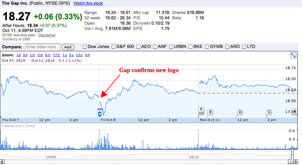
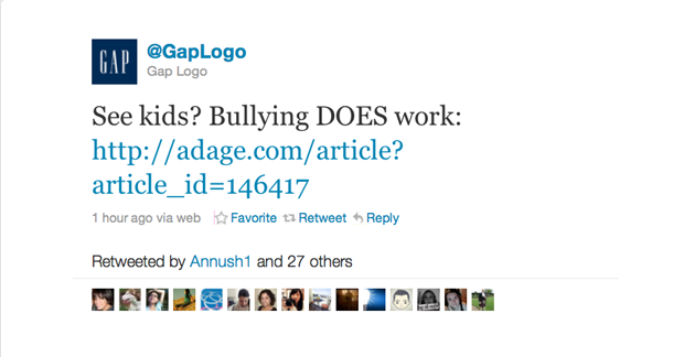
 … Only a mocking fake Twitter account, a fake Gap logo generator called Craplogo, a Twitter and Facebook avatar campaign, a failed logo crowd sourcing project, unflattering comparisons to MySpace which also launched a new logo, the unearthing of a Gap branding lawsuit, an Adweek article which posited that the company had designed an intentionally bad logo on purpose and $247 million dollars in stock loss (the logo design unfortunately coincided with a disappointing sales report, see below). Whew!
From their President of Brand, Marka Hansen.
“We’ve learned a lot in this process. And we are clear that we did not go about this in the right way. We recognize that we missed the opportunity to engage with the online community. This wasn’t the right project at the right time for crowd sourcing.”
While few people were actually fans of the new logo, it’s kind of heart breaking to see the company capitulate to users in this way. If I was The Gap I would have countered the backlash by changing my logo to this.
Or, at the very least, I WOULD HAVE NOT WRITTEN MY “WE’RE REVERTING BACK” PRESS RELEASE HEADLINE IN ALL CAPS.