The airline industry is pretty much the worst offender in terms of being amenable to change, hence the large user experience holes filled by market distruptors like Virgin America, JetBlue, and Southwest. Aside from cloning Richard Branson or crossing your fingers in hopes that skunkworks will change things internally, what’s an old school airline executive to do?
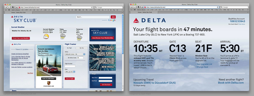
Part of the answer lies in paying attention to user suggestions, especially if they’re as elaborate as former Vimeo and College Humor founder and current Boxee CPO Zach Klein’s “one hour rethinking” of the Delta SkyClub complimentary wifi portal, a visualization he created and posted to Flickr while waiting for a flight out of Salt Lake City this morning (which probably should make the rest of us rethink how productively we use our commute times).
As any traveler has seen, the landing pages for these hotel and airline wifi portals are usually irrelevant filler, hence the beauty in Klein’s reimagining; Why not fill them with useful personal information like the weather at your destination, your flight boarding time, upcoming travel and even geek stuff like the history of the airplane you’ll be traveling on, creating “a fairly simple page that is dramatically more valuable”? In case anyone was confused on how to serve up this info, Klein goes even further: “My idea is to require your frequent flyer mile number in order to access free WIFI (almost everyone in a lounge has a number) and perhaps even use my Delta.com cookie to autofill it.”
We’ve seen unsolicited reimaginings of user interface design before, most notably UX Designer Dustin Curtis’ open letter to American Airlines about their homepage design, which received a “you are absolutely right” response from an anonymous American UX architect. While Delta hasn’t responded to Klein yet, I’m pretty sure another “you are absolutely right” is warranted here.
Photo: Zach Klein/Flickr