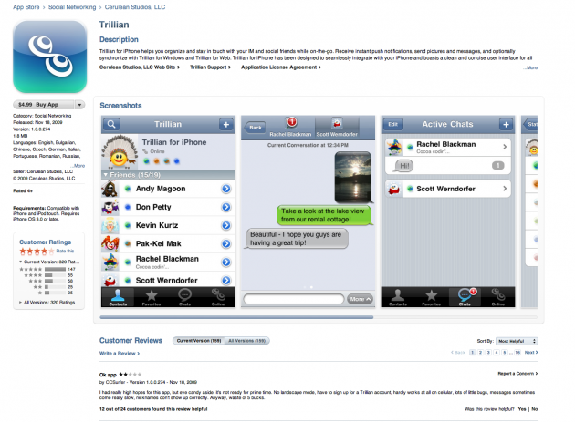
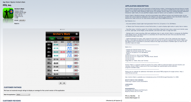
With the launch of iTunes 9, Apple revamped many of the areas of the iTunes online store so that they were rendered with WebKit, the open source web layout engine (which browsers like Safari and Chrome also use). Alongside this, the whole store was redesigned. But one area that remained untouched were the pages for individual apps in the App Store. Today, those are finally starting to be revamped as well.
While the new layout isn’t live for all apps yet, it is for plenty of them. As you can see below, the new pages look much nicer. Instead of being text-heavy by default, the new pages have much of the text area collapsed, and the emphasis is clearly on the images. Instead of just one app screenshot being shown, there are now 3. It’s just much, much nicer.
It will be interesting to see how this change affects the way app developers do their descriptions. Now that the emphasis is clearly on the first few sentences of the description, developers should be more concise in describing their apps, since that’s all that shown by default. If you click the “…More” link, the area will expand to show all the text, but again, that’s not the default look anymore.
[thanks Paolo]

