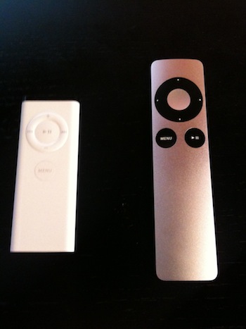
 I hold in my hand the new Apple Remote. In case you missed it, Apple quietly launched it alongside the new iMacs, Mac minis, Magic Mice, and MacBooks a couple weeks ago. Simply put: I don’t get it.
That’s not to say it’s not a nice looking product — it is, but there have been some changes that make me confused as to what Apple exactly is trying to do with this thing. From a design perspective, it makes sense. The new remote now has the brushed aluminum and black button exterior that graces both Apple’s MacBook Pro line and the iMac line these days. The original Apple Remote was all white plastic (aside from the top sensor), that matched the older iMacs that it originally launched with.
Back in those days, the remote made more sense. First of all, it came with most new Macs. This, alongside Apple’s Front Row software, made it seem obvious that Apple was going to start taking media (beyond just music) very seriously across the Mac line (for a while it even came with Mac laptops). But today, the remote doesn’t come standard with any Apple product aside from the Apple TV (for obvious reasons). Instead, it’s a $19.00 add-on, even for the new huge 27-inch screen top-of-the-line iMacs (which seem like a natural fit to watch media on).
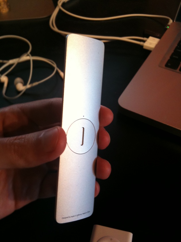
Also odd: while the original white remote had a magnetic back to allow it to easily stick to the side of the iMac, the new remote does not. That means this remote is yet another piece of clutter sitting on your desk if you opt to buy one. It would seem that Apple doesn’t really care about you using this remote anymore, even though without it, Front Row is basically useless. It doesn’t make a lot of sense to use it over simply using iTunes if you have to sit at your computer to do it anyway.
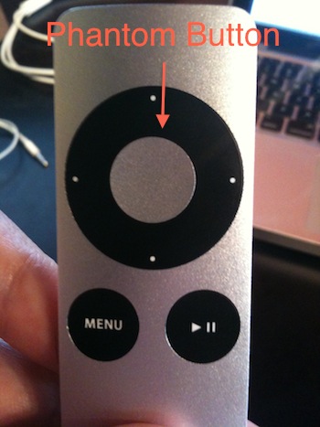
But the oddest thing about the new remote has to be that Apple has for some reason decided to move the Play/Pause button from the center of the navigational circle to the lower right side of the device, shifting the Menu button left to make room. That might make some sense as just a straight-up ergonomic design change, but the weirdest thing is that the center of the navigational circle is still a button, that does the same thing as the Play/Pause button.
 Yes, Apple has added a new useless button. Again, Apple. The company that hates buttons.
Apple’s documentation for the new remote provides little insight, but they do label this new center button as “Select” rather than Play/Pause. But again, it does the exact same thing. Could there be some new funtionality for Front Row in the future that takes advantage of the Select button? Maybe. But even launching something like the new iTunes Extras content now being packaged with movies doesn’t seem like it would need its own button.
Here’s something else: Apple doesn’t even bother mentioning it on the main Remote page on its site, but this new remote does work with the Apple TV. Again, from a design perspective, this makes sense as the new remote looks much more like the Apple TV than the white one that currently comes with it. But again, the remote’s phantom button does nothing different from the Play/Pause button aside from the fact that holding down Play/Pause brings up movie chapters, while holding the phantom button does not seem to. Odd.
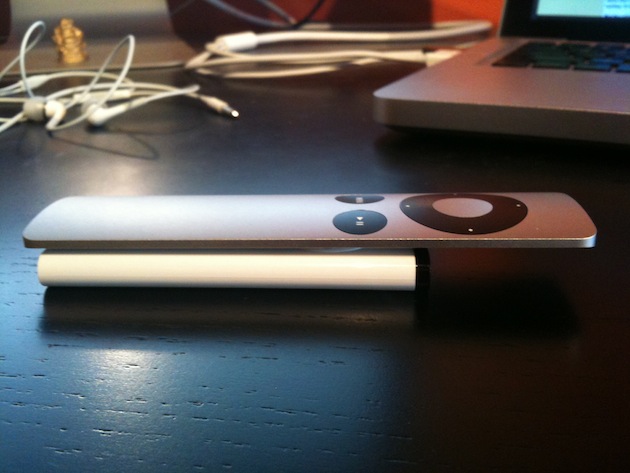
There is one definite advantage of the new remote: It’s much easier to change the battery. I have friends who have stacks of old dead white remotes simply because they didn’t even realize you could previously change the battery. So that’s nice, but does it really warrant the $19 price for a larger, heavier remote that no longer sticks to the iMac? Probably not.
If you want a good remote for iTunes and the Apple TV, just use your iPhone or iPod touch. Apple’s own Remote app makes it much, much more useful than either of the physical remotes. You can, for example, do a search by typing on the device’s keyboard rather than being forced to do a ridiculous amount of clicks to manually enter each letter on the Apple TV’s onscreen keyboard. It’s also much better for scrolling through a bunch of titles. Really, it’s better in every way imaginable. The only downside is that you have to own an iPhone or iPod touch. But if you own an Apple TV, chances are you probably own one of those as well.
I really don’t understand Apple’s thinking with these remotes. It would seem that they’re clearly inching towards products with less buttons and more touch elements, but this new remote is the opposite of that. There’s been a touch screen remote rumored for some time now, but this is what we got instead? What gives, Apple?
Update: A few things from some insightful commenters:
1) It’s also a bit odd that the new remote does not feature an Apple logo anywhere on it. The old one did on the back.
2) It’s true that aluminum is not a magnetic metal, but neither is plastic, which the old remote was.
3) I had forgotten about this, but the old Apple Remote is very similar to the original iPod Shuffle. It’s certainly possible that Apple was using the same manufacturing for both, and with that Shuffle long retired, it was easy to move to a new type of remote.
4) Apparently, the Play/Pause separate button also allows you to stop/start content when you’re not specifically in that section. That could very well be why Apple did this, but that is also not very intuitive since the buttons do the same things the rest of the time.

