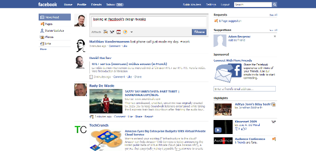
 Facebook has made a few subtle changes to its design, which a lot of users have been noticing for the past couple of hours (thanks for telling us, y’all) and tweeting about. The two most apparent tweaks: the blue header bar now covers the entire width of the screen and rounded corners have been dropped from the social network’s web pages.
In addition, feedback on display ads has been changed from “Thumbs up/Thumbs down” to “Like/X.”
Here’s how the decision to drop the rounded corners, which were apparently subject to debate at Facebook ever since they were introduced a few years ago, gets explained by the company’s design team:
Since we introduced rounded corners to Facebook, their consistent use has been spotty at best. The corner radii vary, and it sometimes feels arbitrary which corners are rounded and which are not. Additionally, they add an extra layer of complexity to the code (note: IE, please add support for border-radius).
As part of the effort to simplify our visual style, the design team recently decided to go back to our square corner roots. In doing so, we hope to champion cleanliness and the razor cut look that Facebook is known for.
Had you spotted the design tweaks or did it take us to tell you?