We only just opened the MobileCrunch Tips Line, and the stories are already pouring in. Keep’em coming, guys.
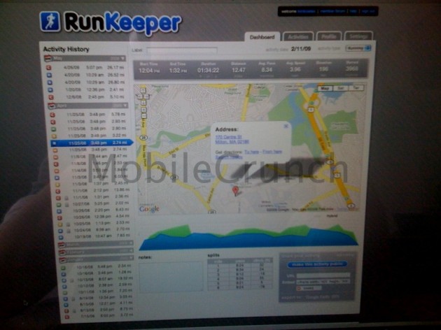
According to a source close to the matter, popular iPhone fitness app RunKeeper will soon be seeing a rebranding and website overhaul. We’ve obtained a screenshot showing most of the major changes, all of which seem to be visual at this point – but if nothing else, at least it’ll look pretty while you’re trying to de-fat yourself.
The new logo maintains the same color scheme as the original – but that’s about it. The sharp-edged, somewhat cheesy font of the original logo has been abandoned for a friendlier, rounded font. Additionally, they’ve opted to nix the strange RSS-icon-esque signal bars from the right side, filling the now free pixel real estate with the icon used within the app. It’s brighter and more inviting – overall, it’s a much better logo.
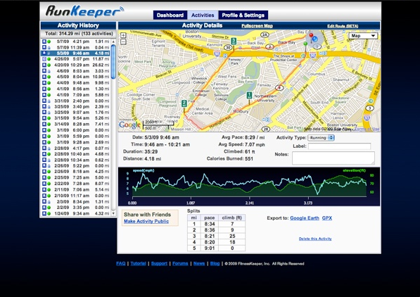
As with the new logo, much of new page design seems to be aimed at toning down the gloom factor. We’re fans of the RunKeeper application, but the dark blue background and accenting of the current design (see the screenshot at the base of this post for reference) depresses the hell out of us – not exactly a good thing, considering that the app is supposed to motivate you to go hoof off some poundage. The new design is much more inviting, with vibrant icons, rounded corners, and gradients aplenty. Its taken a while, but it looks like the design of the website will soon be on par with that of the iPhone app.
What do you think – better or worse?
New Design:

Old Design:
