![]()
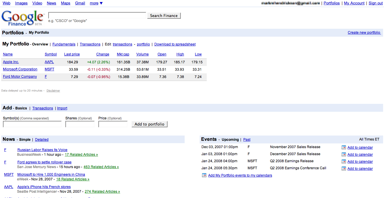
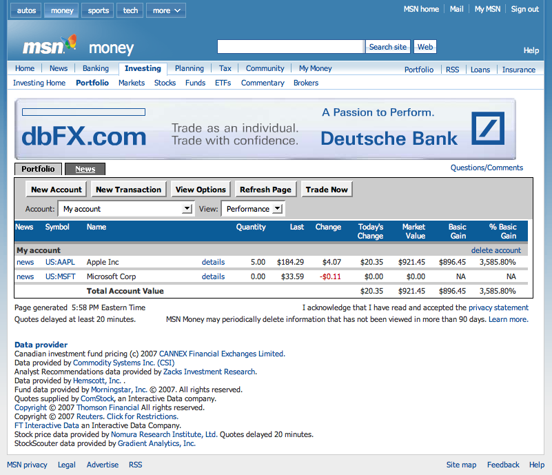
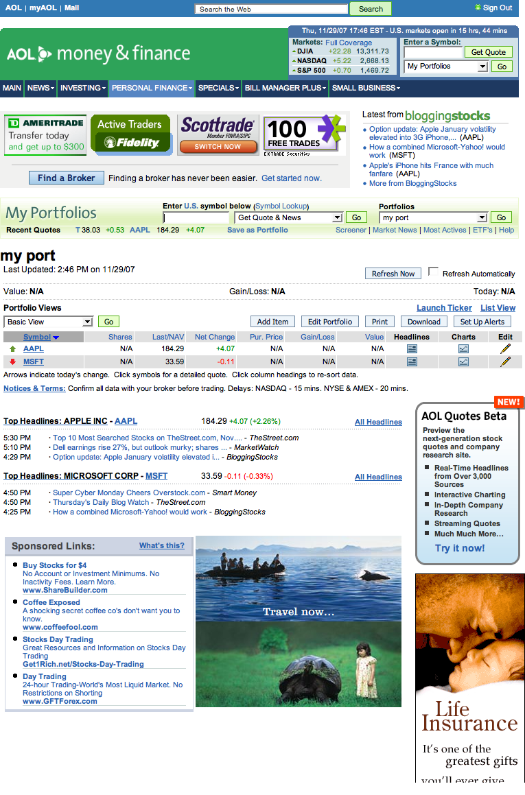
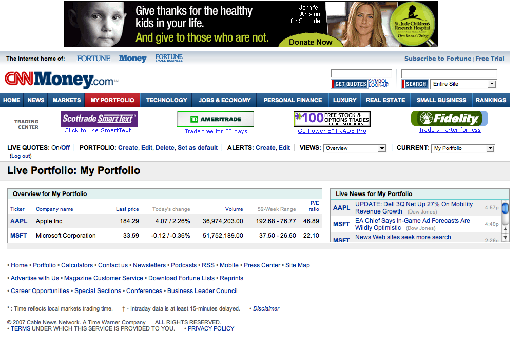
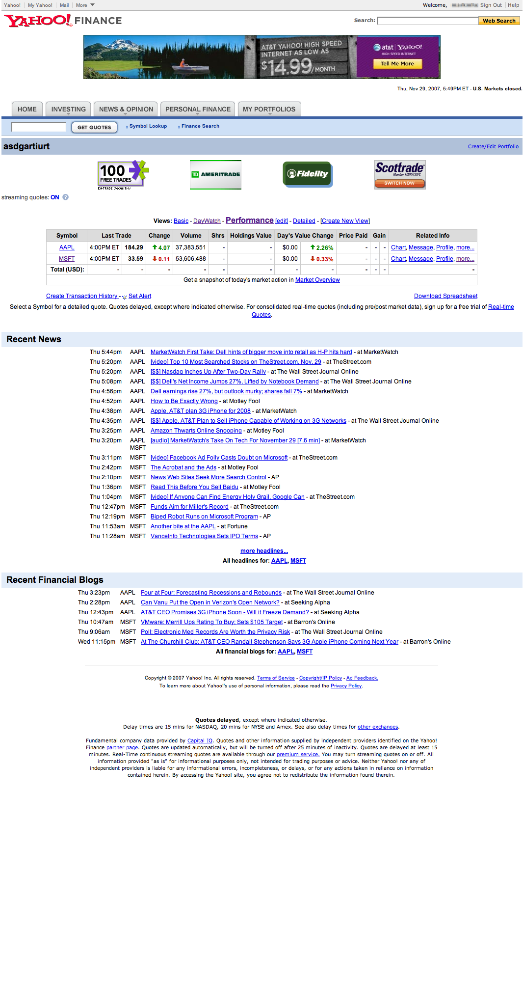
Dow Jones’ MarketWatch may not display stock information about particular companies as well as its competitors, such as Google Finance, newly redesigned AOL Money & Finance, or even Yahoo Finance, but it has taken the initiative to develop a new portfolio tool that tops them all.
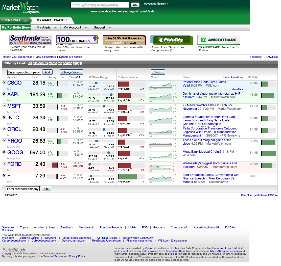
Whereas the others’ portfolio tools are still stuck with clunky interfaces that provide limited information, MarketWatch has developed an Ajax-based tool that enables you to thoroughly compare the performances of selected stocks side-by-side. During market hours, the tool will even update the stocks’ performances – and the investments you have made in them – automatically so you don’t need to refresh the page.
I checked out the portfolio tools of MarketWatch’s competitors (consisting primarily of free services such as those mentioned above) and was surprised to see how primitive they are, especially compared to some of their other financial features. Google Finance, for example, has a great Flash-based, interactive timeline for particular stocks but only a very stripped-down view of stock information when viewed in a portfolio.
MarketWatch’s new tool makes it easy to add stocks to a portfolio, organize them with tags, and view many performance metrics. In one well-laid-out chart, you can track your stocks’ most recent prices, price changes as percentages, price changes within ranges, trade volumes, price charts, and news. You can also see outstanding shares, 52-week highs and lows, market caps, P/E ratios, EPSs, yields, and dividends.
The value of this upgrade is best understood in relation to the other tools out there, so I’ve provided screenshots of the others below.
 |
 |
 |
 |
 |