
Valued at over $60 billion and used by millions each day for work and staying in touch with friends and family, the COVID-19 pandemic has helped make Zoom one of the most popular and relevant enterprise applications.
On one level, its surge to the top can be summed up in three words: “It just works.” However, that doesn’t mean Zoom’s user experience is perfect — in fact, far from it.
With the help of Built for Mars founder and UX expert Peter Ramsey, we dive deeper into the user experience of Zoom on Mac, highlighting five UX fails and how to fix them. More broadly, we discuss how to design for “empty states,” why asking “copy to clipboard” requests are problematic and other issues.
Always point to the next action
This is an incredibly simple rule, yet you’d be surprised how often software and websites leave users scratching their heads trying to figure what they’re expected to do next. Clear signposting and contextual user prompts are key.
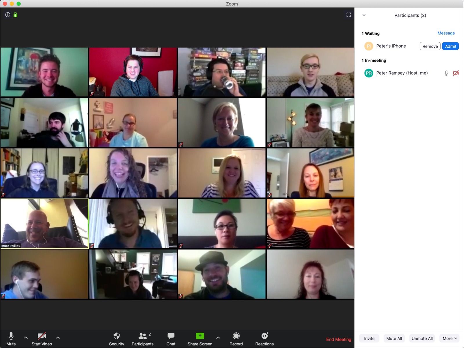
The fail: In Zoom, as soon as you create a meeting, you’re sat in an empty meeting room on your own. This sucks, because obviously you want to invite people in. Otherwise, why are you using Zoom? Another problem here is that the next action is hidden in a busy menu with other actions you probably never or rarely use.
The fix: Once you’ve created a meeting (not joined, but created), Zoom should prompt and signpost you how to add people. Sure, have a skip option. But it needs some way of saying “Okay, do this next.”
Steve O’Hear: Not pointing to the next action seems to be quite a common fail, why do you think this is? If I had to guess, product developers become too close to a product and develop a mindset that assumes too much prior knowledge and where the obvious blurs with the nonobvious?
Peter Ramsey: Yeah, quite possibly. There’s also an element of (people who build products) not understanding that not everybody uses the internet in the same way. Just because you’re comfortable with a very hands-off experience, it doesn’t mean everyone is.
So, in this Zoom example, it’s possible that for those building the product it just felt obvious that you’d click that button next. That, or they just didn’t think about it at all.
When developing a product — and presuming you don’t have the budget for a fully staffed user research and testing unit — are there any simple techniques or exercises that can help avoid falling into this trap?
I think it’s incredibly difficult to really sanity check your own product — I certainly could never do it very well. If you’re unfunded, I’d recommend calling in favors from people who you know, but won’t try and protect your ego. Other founders — who understand the process and the desire for honest feedback — are probably a good bet.
When I did my own startup — a social question and answer site — we spent quite a lot of time designing an onboarding experience that continuously pointed to the next action, but this only showed up for first-time users.
This feels like it might have been a mistake and so I’m wondering how you strike a balance between new and experienced users when pointing to the next action?
That’s incredibly common. The belief of “We’ll show them it once, they’ll learn it and then they’re self-sufficient.” This is almost never correct. The truth is, onboarding a large product is hard and probably too much to try and teach in one sitting. Features need to be explained at the right time and over a longer period of time.
I think what you’re also describing is the difference between onboarding and just general good practice. For example, it doesn’t matter how many times you’ve used Zoom, you still will want to invite someone when you start a new meeting. This isn’t about teaching the person that the feature is there, but more about helping them use it again and again.
Always have empty states
Whenever you build a dashboard, display, search results or just about anything that shows data, consider what happens when there is nothing to show. In these instances, build an empty state.
The fail: Zoom has a “contacts” tab, but when you have no contacts, it’s totally empty because no one designed an empty state for the contacts tab.
The fix: Add an empty state to the page, showing you how to add a contact.
In general, you should always have an empty state that covers the following:
- This is what is normally here.
- You currently don’t have any of that.
- But here is how you go about getting some of it.
Not designing for an empty state seems like a very basic error. Is it really that common and why do you think that is?
It’s so common, I see it all the time. I think it’s just a lapse in concentration, and things fall under the radar. For example, if you’re building a product with a dashboard, you may have tens of empty states — it’s easy to miss one.
Other than simply being left empty, you also sometimes see empty states that have a line of text acknowledging its emptiness — sometimes attempting humour — but no further explanation or call to action. This feels like a huge missed opportunity and generally just bad practice.
Yes, empty states should almost always have a CTA too, as this is something most people miss. I see lots of bad ones that are just “Nothing’s here” with an illustration. And it’s like, “Great, but how do I get something here?”
Show the URL during ‘copy to clipboard’ prompts
Any time you’re showing a copyable link, usually in a “copy to clipboard” feature, make sure you also show the URL that you’re copying.
Often you’ll see stuff that says “Click to copy to clipboard,” and the idea is that you click that, and then paste it elsewhere. It saves a click, great! But, whenever you do this you need to show the actual URL.
This is because the clipboard only works if:
- People understand what a clipboard is (not everyone does).
- People understand how to use a clipboard.
- People want to paste the link on the same device they’re on.
This can also be an issue because often people will retype the URL — perhaps on a different device — to send through a different platform, such as SMS. Getting the URL from your laptop to your phone can be difficult and people often end up just emailing links to themselves, and it’s super inefficient.
The fail: Zoom doesn’t make the “copy to clipboard” URL visible.
The fix: Show the link as a URL somewhere alongside the “copy to clipboard” function.
It’s amazing, but also entirely believable, that not everyone knows what a clipboard is even though they likely use copy and paste regularly. At the risk of repeating ourselves, I guess this is another example of how product designers shouldn’t presume too much or any prior knowledge?
Yeah, and also that not everybody cares about terminology enough to learn it. I think “copy/paste” is a more widely understood term, but even then I bet I can find someone that calls it “Apple Copy” or something.
You mention the use-case of wanting to use or send a meeting URL on a device other than the one you’re currently using. As you say, presuming the URL is displayed, simply typing it out on the other device is the simplest way, but for long or complex URLs that can be very prone to errors. Perhaps a share button hard-wired for sharing over email, messaging etc. would be the best solution of them all?
In my opinion, no. I’d rather opt for a URL shortener. Some companies will do this themselves, like zoom.com/bunny123123. The problem with a share link is that again, you have to get it across a device.
Be aware of hyperdistracted moments
You’ll all have experienced a “hyperdistracted” moment before — like logging into Twitter and seeing loads of notifications, private messages and interesting tweets. At that moment, grabbing your attention would be hard. When designing products, you need to be aware of these moments, and build around them.
If you’ve identified a “hyperdistracted” moment, you’ll either need to remove some of the distractions, or — if they’re unavoidable — ensure that you’re not asking the user to complete a particular action. For example: asking the user if they want to subscribe to your newsletter in those moments will almost always lead to a skip.
Hyperdistracted moment in Zoom.
The fail: If you’re a host on Zoom, and someone joins your room you need to accept them. There’s no notification or anything, it just appears as “accept.” This is fine, if you’re waiting for it. The problem is if you’re super distracted, then you will probably not notice this subtle CTA appear.
The fix: During this hyperdistracted phase, make a bigger deal when you need the users input (e.g., literally make the button bigger, and perhaps darken the rest of the screen.
More broadly, be aware of hyperdistracted moments inside your app. Other examples of this are:
- When you have animations/videos playing.
- A climax of a journey (e.g., the moment you first login to Netflix and see all the films you could watch).
- Making a really important decision (e.g., entering bank details).
In those examples, users probably wouldn’t notice if something changed in the header. Therefore, if something important happens, you need to actively notify people.
Okay, but — beyond the examples given — is there a good technique for identifying a potentially hyperdistracted moment in your app?
I’ve thought a lot about this, and I can’t think of a good rule. It’s just one of those things that you can tell in the moment. Like, when you look at a painting and visually it’s got too much going on — too many colours, or shapes, or it’s too small.
Presuming it isn’t possible or wholly desirable to remove a specific hyperdistracted moment, what are the best ways to actively notify the user and/or grab their attention?
So basically my answer would be to demand the users attention. Adverts do this well — they have a little cross you have to press, or skip. You can’t just “ignore” an advert and carry on. So things like taking over a whole screen with content, or visually making something stand out, then requiring some input to get it out of your way.
Don’t use icons to signal states
Icons have a use in design: They convey meaning without using words. Often they’re faster at digesting than words. But, you should almost never use icons to signal states.
The fail: Zoom has a security option of “Lock meeting.” This has two states:
- Lock meeting.
- Lock meeting (tick).
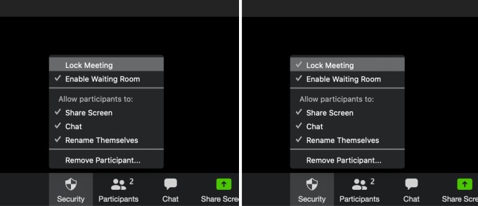
Don’t use icons to signal states.
The problem here is that it’s not clear if the tick means that it is locked, or that it’s not locked (i.e., the tick itself is clear, that means “positive,” but the context of “positive” doesn’t make sense when put next to these labels).
The fix: The right thing to do on these states is to change the actual content and show a state (i.e:, Lock meeting, Unlock meeting, along with some icons).
Back in the dot com days, I remember being taught to avoid “mystery meat” navigation in which icons were used ambiguously as links without any accompanying text. Would it be true to say this lesson has never really been learned, and in the context of conveying states, it is an even more common mistake?
“Mystery meat” is a term I’ve never heard, it’s brilliant. And yes, it’s still not been learnt, I see it every day.
Are there any exceptions to the rule?
I’m not sure there are any exceptions, unless it’s entirely obvious what they mean. And even then, I’d probably avoid using them in states.