LinkedIn, the professional social network that we love to hate, is hoping to entice you into using it more on your phone after it introduced revamped versions of its iOS and Android apps.
The new design — the preview of which we wrote about in October — is “more intuitive, smarter and dramatically simplifies your LinkedIn experience” so LinkedIn claims. I reluctantly use LinkedIn for online networking, but I haven’t had the company’s app on my phone for some time — which probably makes me a good test case for this new version.
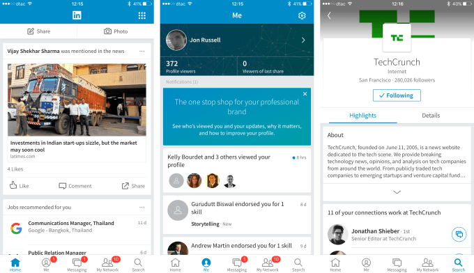
Certainly, the design is cleaner and less clustered than it had been. LinkedIn has, to me at least, traditionally meant a flood of information. The company claimed recently that it has cut down on the volume of emails that it sends out to users, and, in that spirit, it has revamped the main feed inside its mobile app. Not only is it more aesthetically pleasing, but you’re able to opt out of seeing certain kinds of content — because, let’s face it, who wants to see everything that the at-times tenuous contacts you have there post. That said though, the button could be more easily found.
The ‘Me’ tab is a “one stop ship for your professional brand” — which, in regular language, means that this is where you can edit your profile, see who has been checking you out, etc, etc. Again, the interface is far cleaner than before, making it easier to parse and use.
Messaging is a big focus of the new app. LinkedIn gave its messaging feature a long, long, long overdue revamp this summer, and that is carried into the flagship mobile app. The interface is more chat-like, there are stickers, you can attach documents and, in general, the previous stuffiness of LinkedIn messaging is gone.
That’s not a big surprise since LinkedIn CEO Jeff Weiner, talking at an event previewing the app, said that “the inbox is out and messaging is in.”
Neater though it is, the fundamental problem is that LinkedIn is the last place I go to for serious communication, as I said when LinkedIn messaging got upgraded. Maybe it’s just me, but email, messaging apps, calls, etc are all more favorable. LinkedIn is the directory where you know you can usually look a person up. Will that dynamic change now that there is a slicker interface? Time shall tell.
Elsewhere in the app, ‘My Network’ showcases updates from your contacts using a card-like layout. It’s neat but, once again, my ‘network’ is so noisy and it remains hard to separate the wheat from chaff and see the updates I want/need without needing to cycle through all of them. I’d love to see LinkedIn apply some big data magic to attempt to prioritize my contacts here, or at least let me train it about the kind of data that is valuable to me. That would definitely rope me into using its mobile app.
If you’re already sold, the cards feature is nifty in so much that it makes it easy to congratulate a contact on a new job by making it more visible. But again, relevancy! I do want to know when someone I know well takes a new job, or an existing contact moves to a company that interests me. I’m less keen on sending congrats to James A. Jones on his one year ‘anniversary’ at “self-employed.”
One useful element of the network tab, though, is a feature that allows you to sync your calendar and, ahead of a meeting, the app will provide a snapshot of the person that you are meeting, such as shared interests and contacts, to help you find some common ground.
Finally, LinkedIn said its search feature is faster — by an order of 300 percent apparently, though it seems hard to quantify it that way.
So, to conclude, the new app is cleaner, better looking and more easy to use. While that’s a step forward in terms of design, I can’t help but think that LinkedIn is missing a trick on the utility side. It could add more context or meaning and become a very useful app for the business community.
In some ways it is a victim of its own success here. LinkedIn is the de facto business networking website which means you don’t add people in the same way that you would on Facebook, Twitter, Snapchat or other services. LinkedIn is the place where you can add people you barely know, or in some cases don’t know but want to know. (Usually disappearing to other mediums to communicate with them.)
That means that curation is hugely important because of the sheer volume of noise. Yes, the new app is a step forward in terms of design, but it still isn’t useful enough for me to keep it on my phone. I don’t like I’m alone in thinking this way, but LinkedIn loyalists are likely to be happy with the changes, so there’s that.
Agree or disagree? Don’t take my word for it. The new apps are out and available for download here: iOS | Android