Google Play, the company’s storefront selling apps, games, movies, books, and more, is getting a big makeover. Screenshots showing a revamped mobile interface offering improved navigation, engaging animations, and simpler way to switch between apps and entertainment offerings, surfaced online this week via the online profile of a Google employee. It was initially unclear why a Googler would be sharing news of a revamp, since Google had not made a public announcement. But we understand now that’s because the updated interface is still a few weeks away from being available.
We suspect that Google will wait until a larger number of customers have the upgraded version of Google Play available, before it makes a statement about the changes.
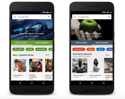
From the screenshots, you’ll notice that the Google logo in the search box has been updated to the new look, while the Google Play homepage now more smartly organizes content into two larger sections: “Apps & Games” and “Entertainment,” for everything else. That latter category includes things like Movies, TV shows, Books and Newsstand subscriptions.
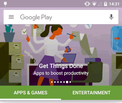
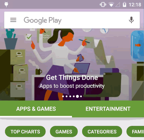
In addition, there’s also a new “highlights” row that features the best of what’s new in Apps & Entertainment, while buttons at the top allow you to quickly access key areas on Google Play, like the Top Charts, Categories, or the Family section, which features kid-friendly apps and games.
The updated storefront has also moved to a horizontal scrolling mechanism to browse through its various listings, which is designed to make it easier to explore and discover new content.
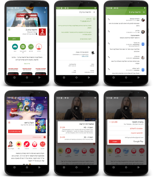
The Google staffer, Kirill Grouchnikov, who posted the images originally, also noted that the storefront will now support right-to-left languages as well.
And he showed off some of the animations, like the way the green bar expands into the status bar when it gets close to the top as you’re scrolling up, and then pops back down as you scroll down again.
Another image showed the transition between the two categories, “Apps & Games” and “Entertainment.”
The Apps side is now more easily identifiable because much of the navigational elements there are shaded Android green, while the Entertainment side is a bit more colorful, in blues, reds, oranges, and purples.
As this will be a slower rollout, it’s possible that some users will receive the updated look-and-feel before others.
Google, when asked, declined to provide an exact ETA for the release.
The Google Play storefront has evolved quite a bit over the years, but as it has expanded to include more content types following the merger of the Android Market, Google Music and the online bookstore, the store’s design became a bit more cluttered.
And as Google rollout out new features – like its family section, for example – getting to the right place took several more steps than should be necessary. The updated design seems to address these concerns, by allowing users to move into the right category, subcategory or section they need with just a couple of taps and swipes.
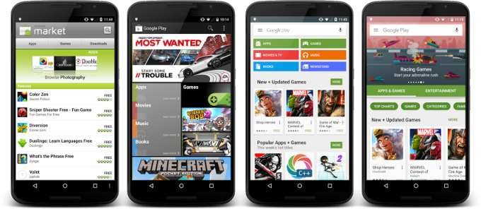
Above: From Android Market to Google Play