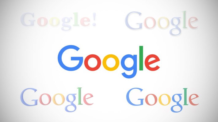
The more you see something, the more normal it becomes.Today, Google unveiled a new logo and branding. So far the public reaction is a mixed bag.
I’m sure that most of the people who spend time in Mountain View working for Google barely noticed its logo anymore. It was on T-shirts, buildings, computers, stickers and everything in between.
Of course, people don’t like change. But then the surprise wears off and what changed becomes the new normal. (This progression doesn’t include the whole Alphabet thing — that change hasn’t sunk in for me yet.)
Seeing Google’s new logo in the wild makes it seem a little more normal than when it’s in a blog post or a promotional video. A little more human if you will:
[gallery ids="1203404,1203405,1203406,1203407,1203408,1203409" orderby="rand"]
(photos via +theREALmarvin, +MikeBrzozowski and +AntoineNaaman)
Having been through a logo change at an iconic Internet company — Yahoo — I can say that swapping these things out is quite an undertaking. Think of every single property that a company of this size has stamped its logo on. Luckily, Google swapped in a flatter version of its logo in 2013, so it had recently gone through this exercise.
It’s not easy, though. Every building, every app, every page, every piece of schwag, every blog has to get changed (and 5,000 things that I can’t think of at this moment). It’s not like Google woke up and said “hey, let’s change our logos today.” I bet there was a good 3-6 months of planning for this at least.
I mean, making sure to swap out the favicon is a huge deal when doing something like this.
![]()
When’s the last time that a Googler actually thought about its favicon? Wild.
This isn’t the end. We’ll be talking about this very topic again one day. The next time Google changes its logo, to be precise. Don’t tell all of the people who were involved in changing out the logo this time, though…they need a mini-vacation after this.
