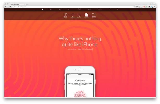
A redesign of Apple.com that went live today removed the standalone ‘Store’ tab, and the ‘store.apple.com’ domain entirely. This is an enormous change for one of the biggest online retail stores in the world.
The buying experience is now woven into the site as a whole, with purchasing buttons and options for products available on every product page. Instead of browsing for information about a product and then having to make the ‘jump’ over to the store side, customers will now take care of both actions at once.
I’ve personally had the experience of coming in to Apple.com to look at details of a Mac, and then having to jump over to build that Mac according to the research, so streamlining this makes a lot of sense. Each landing page for each product has a sub-browsing experience that lets you pick a particular model to explore.
There’s a new browsing experience for accessories as well, and many pages like this one now focus on a few hand-picked items to feature, with other category-based browsing options below that. A unified shopping bag (not the old cart) now follows you wherever you go and allows a drop down view of what you’re making off with.
The buying experience is now a single-page affair too. Clicking on a buy button brings you to all of your choices up to and including extended warranties and cases all in a row. 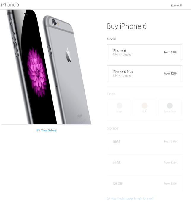
“We redesigned Apple.com knowing that our customers want to explore, research and shop in one place,” said an Apple spokesperson in a statement. “The new Apple.com takes the very best of our existing site and our online store to give customers one simple destination to learn and buy without navigating between two different sites. We’ve also improved several of the site’s features to make shopping easier than ever for our customers.”
More than 1 billion customers visit the online store every year in 40 countries. All of those countries are seeing the new Apple.com today. Apple.com is one of the biggest websites on the Internet, according to traffic rankings, and its design is picked over meticulously by the most design-savvy web and mobile developers. It should be interesting to see how they react.
There also remains the question of what happens when Apple releases new products. Typically, the whole store section is taken down (some say because the old store was still built on WebObjects, but I’m not sure if that’s urban legend by this point) and stays down until the product launches. Who knows what that will do to this new design, though it’s worth noting that the new site launched seamlessly around the world today without any downtime.
As to why? My guess would be more people buying on mobile — a lot more. Switching to a ‘store’ tab doesn’t feel so onerous on desktops, but it could make or break conversion rates on an iPhone. If you can transition more seamlessly between researching an Apple product and purchasing one, then you’re more likely to make that conversion, and that’s all the more case on a smaller screen that requires you to tap around and scroll around to just ‘find the place to buy this thing’. Now, that’s all one experience.
It’s getting far more common for people to purchase big-ticket items on their phones and tablets. Forrester research in estimated mobile commerce would hit $114 billion last year and mobile commerce is growing at around 48 percent y/y, hitting $8 billion in the second quarter of 2014. It would be silly not to service that kind of growth with a design more suited to mobile users.