Dropbox today released a redesign for its Android application designed to streamline the process of sharing files and uploading folders.
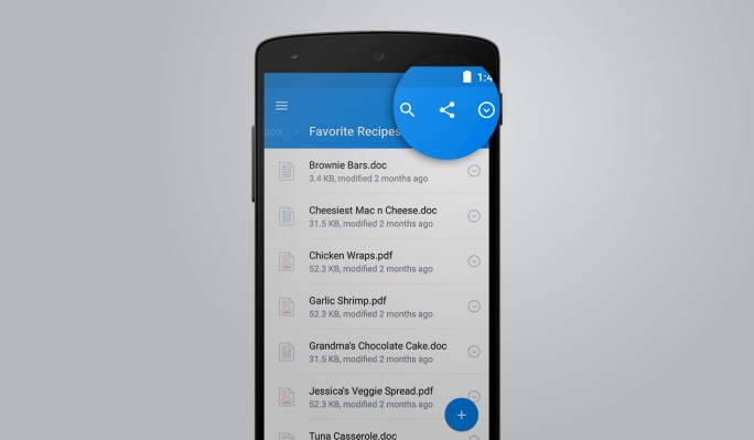
The new Android app, which will roll out in the next couple of days, is a redesign of the user interface that’s a little more seamless compared to its previous versions. The new app also includes a new spot for the company’s search function, now based directly on the top of the app’s interface. These kinds of features are important for power users that have to quickly sift through a number of large files.

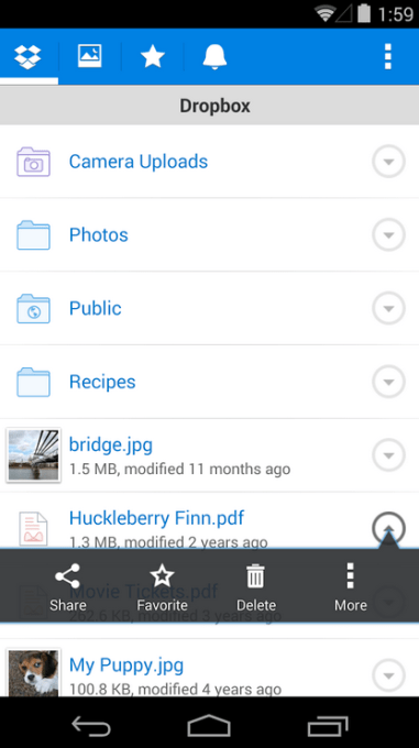
Here’s what the old Dropbox app looked like.
This update also comes at a time when Dropbox is still trying to figure out exactly what its mobile presence looks like after shifting from its original model of sharing files across multiple devices. User behavior on mobile devices generally differs from that of desktop devices, so the user experience has to fit to that kind of behavior.
Naturally, a lot of that centers around how users take and share photos — hence the changes to how Dropbox handles photos in the new app. Users can take photos directly from a folder that they’re currently browsing with a new button on the bottom of the screen. The new app has also moved sharing controls and processes like moving files and favoriting them to a single spot on the user interface.
The app has also been redesigned to be faster and look more in line with other new Android applications that Google has redesigned with its latest update to its Android operating system.
Meanwhile, Dropbox has been working to also expand its footprint among businesses, most recently launching a tool that enables users to request files from people who aren’t necessarily using Dropbox. That, too, has become a core part of Dropbox’s mission to figure out what next-generation file-sharing looks like in 2015 and beyond.
