Editor’s note: Eric Elia is managing director of Cainkade, a full-service product design and development studio.
YouTube Kids was low-hanging fruit for Google. Based on both the number of reviews and the high rating in the App Store thus far, the app will be a hit. It scratches the parental screen-time itch — how to put a device into your kids’ hands without risk of it being overused or exposing the kids to the seedy side of YouTube.
This joins well-done user interface facades like Amazon’s Kindle FreeTime and the character-centric Netflix kids menu on many devices. YouTube Kids’ visual and interaction design is solid. Borrowed ideas, like the access timer (thanks Amazon) are well-implemented. But there are limitations.
On iOS, there are only so many controls that a developer can put into its app. For example, there’s no way, in software, to prevent a child from pressing the home button and jumping into another app or game.
This got us thinking about what we’d like to see in an official Apple Kids implementation for iOS — something that would not impact developers at all but would empower parents with tools to better help them manage how long kids use devices and how they can use those devices. As parents, we believe in the value that supervised access to technology can provide. We just want a little help with metering that time. Sometimes daddy just needs to finish getting dinner on the table.
The Cainkade creative team did a great job of synthesizing the concept and fleshing out an experience that fits elegantly into the overall style of iOS 8. The key features we considered were:
- Limited access to certain apps that parents curate
- Time-limited access to that collection of apps
- No easy way to toggle out of the Kids mode
- A clear identified app icon on the home screen
- Multiple kid profiles / preferences
Our design goals were to:
- Respect the design language of iOS as much as possible with some variation when appropriate in kids mode.
- Minimize variation as much as possible from global conventions.
- Minimize clicks and interaction points that require parent intervention when in kids mode.
- Optimize for what we feel is the most common use case. A parent hands over a phone or tablet, and the child touches the icon that they know is theirs.
- We used iPhone as the concept device, but our approach would also support iPad.
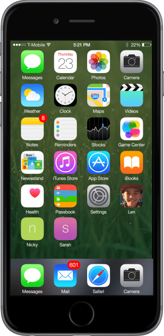
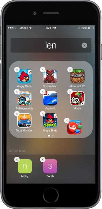
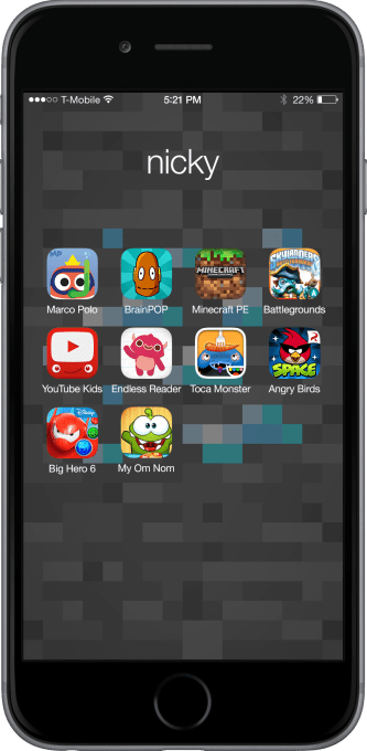
Home screen
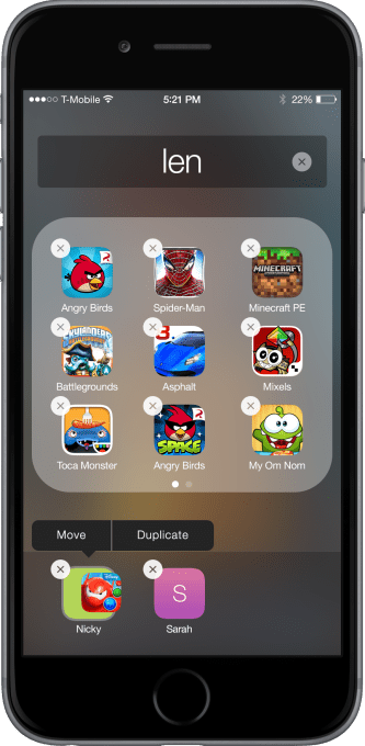
Icons on the home screen shown below represent three different kids’ profiles – Len, Nicky and Sarah. Icons can be customized with an image or color. Parents can add apps by dragging any icon on top of the kids’ icon, which is actually folder that contains other apps.
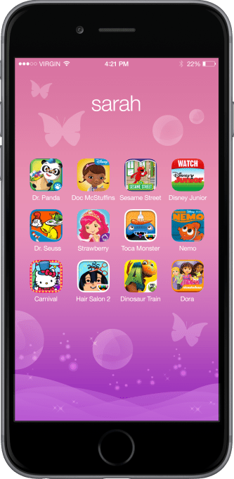
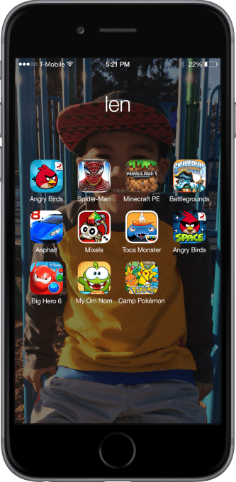
Kid home screen
Sarah’s apps are accessible using normal conventions. The wallpaper of her home screen can be customized in Settings.
App behavior
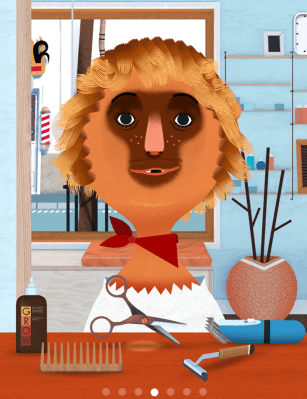
No changes within app usage, Toca Hair Salon 2 (below) is pristine. But after a preset time limit has elapsed….
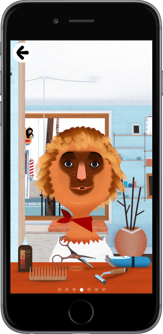
Source: Toca Hair Salon 2
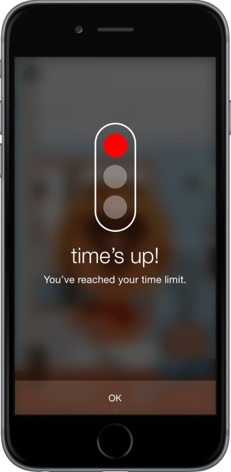
Time limits
A friendly traffic light tells the child that the time is up. The messaging uses graphics as a signal for pre-readers, as opposed to a standard text-heavy dialog box. Default time limits are set globally.
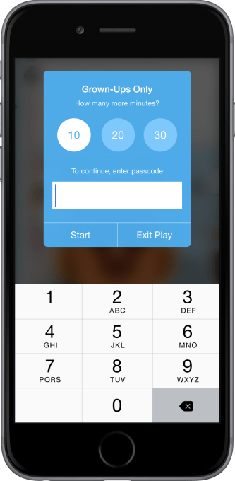
Extend the time limit?
Quick access to extend usage by convenient button press. We placed both the time selection and the default pass code on the same screen for convenience. It’s the parents’ responsibility to keep the code private if they choose.
Home screen No. 2
Wallpaper has been customized with this fella’s cute mug. Let’s say his sister likes one of these apps as well.
“Sharing” apps
iOS currently doesn’t allow for aliases or shortcuts for an app to live in two different places. But in a profile-limited kid mode, there needs to be a way for multiple users to access the same app.
This is a slightly hidden feature, but something that is kid-accessible. We went back and forth on whether this should be accessible in kids mode, or something that lived in Settings. We could be convinced otherwise, but felt it best to leverage standard drag-and-drop behavior and have all app management functions in the same place. By putting the sharing feature here it solved several problems at once.
A parent or kid can hold down an icon, and it starts to wiggle, as app icons do. An additional press makes the icon draggable down to the bottom row to other profiles.
Sharing options
When you drag the icon into the bottom row, there’s an option to move it entirely, or duplicate it.
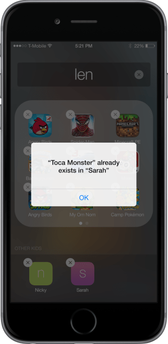
Duplicates
If you try to copy an app to a profile that already has the app, there’s a simple error message.
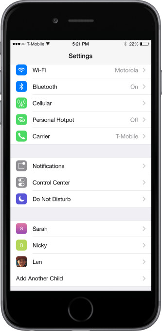
Settings
A goal here was to utilize global Settings as much as possible, in the same way that Privacy or Notification behaviors can be managed centrally, and leveraged individually by developers. Note the three kids’ profiles toward the bottom of this screen.
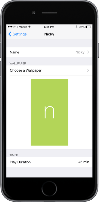
Customization
The main settings screen lets you edit the name, wallpaper and app icon, and default time limit for the child. If you choose a color or texture, the child’s first initial is used on the wallpaper and icon.
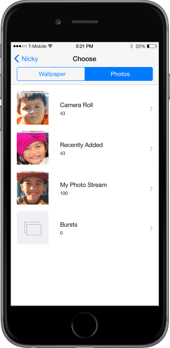
Wallpaper
Choose a picture for the child’s home screen wallpaper.
Or perhaps a color or texture.
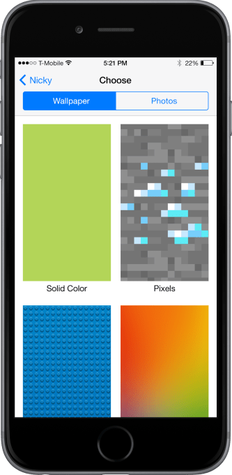
Colors can be customized for a texture using filter-style choices. We thought this was an area where we could have a little fun within the iOS 8 interface restrictions.
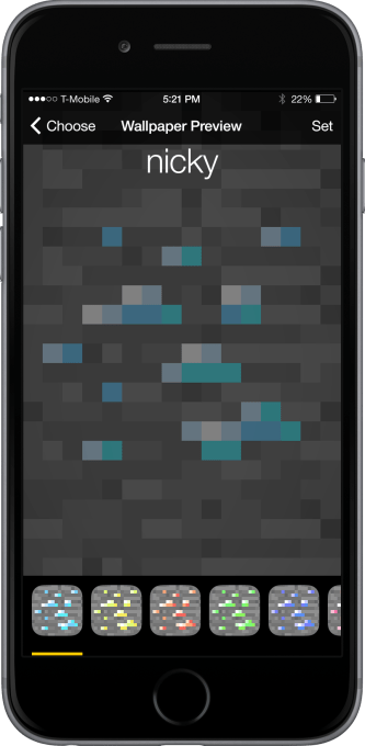
The finished effect.
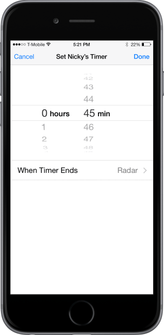
Time limits
Standard time selection and sound alerts are included.
This was a fun little palate cleanser of a little exercise for our team. We’d be delighted to see these ideas inspire our friends across the Bay in future versions of iOS. The designs are free to be used or leveraged in any way under a Creative Commons Attribution 4.0 International License. We are also comfortable with the Beerware license Cheers.