Editor’s Note: Brad Ewald is the Principal and Founder of Boulder Marketing Technology.
On April 21 Google will be making significant changes to its mobile search algorithm to promote sites that the search giant feels are mobile friendly (aka #Mobilegeddon).
Mobile friendly sites render different layouts depending on the size of the browser screen, and as mobile penetration rates prove, with more people accessing the web through mobile devices, the decision by Google to reward mobile friendly sites just makes sense.
In 2013 a study by Pure Oxygen Labs indicated that two-thirds of the Fortune 100 were not ready for the change in mobile search. So we were interested in is how big companies had progressed and how they could be affected by the change now that Mobilegeddon is nigh.
We crawled every Fortune 500 web site using the Google PageSpeed Insights API to identify those sites that are mobile friendly and the ones that are not and at risk of being penalized in search results starting when Google updates its search algorithm on April 21.
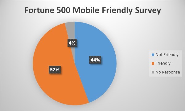
This survey reinforces just how pervasive this issue is – 44% of Fortune 500 web sites failed the test and another 4% of sites did not produce a response. A large subset of the companies in the 4% category actually discourage Web Bots from Google and Bing (more on that below).
What Is “Mobile Friendly” And How Does It Influence SEO
The use of mobile devices is quickly surpassing PC usage so companies that don’t have mobile friendly websites are clearly at a disadvantage. In addition Google has been publishing details about how changes to its search algorithm will favor mobile friendly sites over non-mobile friendly ones. More details on a recent Google Announcement on Mobile Search.
Mobile friendly sites render different layouts depending on the size of the browser screen. In some cases organizations build a separate mobile friendly view of a page, but it’s generally recommend that you use something called Responsive Design.
Responsive Design dynamically adapts your content depending on the size of the browser window. As the size of the screen changes the number of columns displayed, the menu layout, pictures, and other elements scale to the optimal size. Compared to a separate mobile site Responsive Design is considered to be more extensible to new devices, easier to maintain, and more effective from an SEO perspective
How You Can Test Your Site To See If It’s Mobile Friendly
Google provides a Mobile Friendly Test that is the sure fire way to determine if they view your site as mobile friendly. Another back of the envelope method is to shrink the browser window. If the site changes and adapts as you shrink the window then the site is responsive. Alternatively if the text and menus get cut off then the site is not responsive. You can also go to sites like mobiletest.me and simulate the use of different mobile devices.
The SEO Risk – Does It Exist For The Fortune500?
The Google SEO penalty for not being mobile friendly is widely documented (see Google Mobile Friendliness and Search Ranking) and there are lots of options for fixing the problem. One could argue that because companies in the Fortune 500 have a strong brand awareness they don’t really need a lift from search on their home pages. In addition there are some large companies like IBM who discourage Google Bots from searching their content so we were unable to determine if they were Mobile Friendly in the context of Google. In many cases these large companies have so many external links (both paid and organic) to their content that their SEO doesn’t appear to be effected significantly, but they still need to be mobile friendly because of the dramatic shift towards mobile devices (IBM passes the sniff test for responsive design).
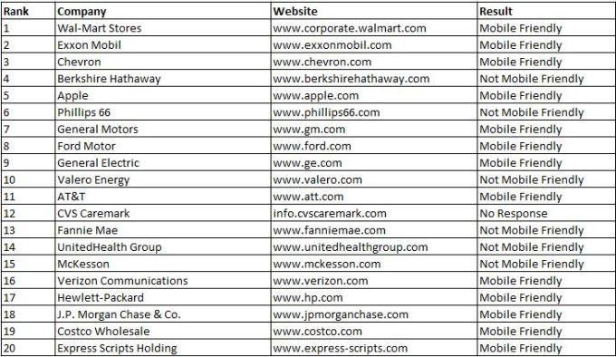
Here is the list of the top 20 companies in the survey and if they tested favorably: