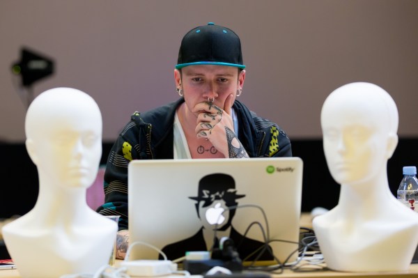
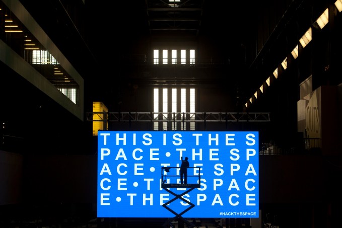
At The Space launch event last summer at the Tate Modern over 150 coders, hackers and digital artists were challenged to take any dataset and turn it into a work of art over the course of 24 hours.
With participants camped out overnight for the art hack, Tate’s cavernous Turbine Hall was transformed into a vast coder’s paradise, replete with the kind of creatively charged atmosphere that only a looming deadline can provide.
Backed by the likes of Sir Tim Berners Lee and the Oscar-winning visual effects teams behind both Gravity and Inception, the event also had the support of dissident Chinese artist Ai Weiwei, who donated data that he and thousands of bloggers had collected for those at #HackTheSpace to use.
This data consisted of the names of over 5,000 children killed in the 2008 Sichuan Earthquake – information initially obscured by the Chinese government following a scandal over the inadequate construction of school buildings in the area – something Ai Weiwei has been fighting to expose through his work.
What was produced at the end of the 24 hours was as diverse as it was fascinating. The winning piece was an online interface that tracked server security attacks in real time. Each attempted breach originating from China triggered an audio-visual representation of one of the names. The effect was both disconcerting and strangely moving.
Data as art is not new, but with the hack we wanted to show how it might become part of mainstream artistic discourse, as the boundaries between digital technology and ‘traditional’ creative practice dissolve, and artists of all kinds come to see its potential for affecting and reflecting our world.
No doubt this mirrors what is happening with the role ‘big data’ is playing across industries and disciplines of all kinds, as its significance, value and practical applicability grows. Some projections point to the existence of up to 40 trillion gigabytes of data globally by 2020.
One of the organizations putting the data revolution front and centre is the UK’s Open Data Institute. Set up by Berners Lee and Sir Nigel Shadbolt (who was also at the hack), its role is to examine the broader economic, environmental and social value of data, and help inform public policy. What’s interesting for those in the arts is that the ODI is also running a ‘Data as Culture’ program designed to interrogate data’s cultural currency, which is essential.
It’s only through parallel creative exploration that the broader ramifications of open data can be clarified and communicated, both in terms of the value of the art itself and also what it can reveal about our increasingly complex lives.
It was in this spirit that The Space commissioned the ODI’s Artist in Residence Julie Freeman to create a new work called We Need Us. Driven by user metadata from the citizen science website Zooniverse, the piece takes a more abstract approach to data visualisation and is composed of sound compositions and animated geometric shapes that recall mid-career Malevich.
It’s only through parallel creative exploration that the broader ramifications of open data can be clarified and communicated, both in terms of the value of the art itself and also what it can reveal about our increasingly complex lives.
Despite the explosive growth of this form of art, there’s still a sense that it exists in a kind of liminal space between data science, statistical analysis and what might be regarded as ‘art proper’. But this is changing… and changing fast. As multidisciplinary practice becomes the norm, we’re seeing ‘art’ bleed into other fields and vice versa like never before. As digital culture becomes ubiquitous, the gap is closing.
Taking inspiration from the work of pioneers such as Jer Thorp and Aaron Koblin, data is fast becoming the medium du jour for many; a pattern set to continue as the need to interpret and understand it becomes more urgent. The data juggernaut is now rolling into all areas of ‘traditional’ practice, from sculpture, to music, to textiles.
Witness, airFIELD, a colossal kinetic installation that uses real-time flight data to power a visual representation of the traffic moving in and out of Hartsfield-Jackson Atlanta International Airport. Then there’s the recent collaboration between IBM and the former LCD Soundsystem frontman James Murphy on a project that used stats from every match at the 2014 US Tennis Open to create a suite of over 400 hours of electronic music. Or take a look at Natalie Rachel’s Data Scarves, with patterns based on analysis of online craft retailer Etsy’s expanding user base…
It’s great to see examples of data art that derive value chiefly from their aesthetic qualities alone. We might call it “digital art for digital art’s sake” – which is another way of saying that data doesn’t have to be didactic or dull. It’s as valid a material as any other, and in the right hands can be just as captivating.
This applies to more politically engaged work as well. Another product of the ODI’s cultural program is James Bridle’s A Quiet Disposition – an automated tool that uses contextual analysis, machine learning and information from public APIs to construct a living database of people, companies and places connected with the proliferation of drone warfare around the globe.
Similar work is also being produced by the Forensic Architecture team at Goldsmiths University in London, who collate visual data from areas affected by drone attacks to construct 3D computer models which have been presented in a variety of locations, from traditional gallery spaces, to online platforms, to humanitarian judicial hearings.
In this brave new world, data science, investigative journalism, hacking, political activism and the arts collide with the intention of challenging established political and media narratives. Data as a raw material is being used to show us a world we might not otherwise see, a world others might not wish us to see.
That’s not to say ‘big data’ guarantees us access to some assured objective truth. We should be aware that its strengths as a material – its pervasiveness and malleability – are also its weaknesses. A growing critical consensus points to very real concerns regarding privacy, intrusion and security, to the flaws in the vision of social positivists who talk of data as some kind of panacea for the world’s ills.
If anything, it’s as much art’s job to act as a critique of digital culture as it is to explore its aesthetic potential. This will surely come as a natural consequence of the growth of data as a medium; for such is art’s tendency toward self-reflexivity it will no doubt serve both functions simultaneously.
In this brave new world, data science, investigative journalism, hacking, political activism and the arts collide with the intention of challenging established political and media narratives.
The work of the New York-based Office For Creative Research, for example, exemplifies the ways in which data visualisation can be used as much to interrogate the nature of digital networks – see their Specimen Box project, a prototype tool that tracks real-time botnet activity – as it can to reveal new insights into human ones.
The brainchild of Thorp, along with Ben Rubin and Mark Hansen, the OCR has been set up to “explore new modes of engagement with data through unique practices that borrow from both the arts and sciences”. Their projects cover a broad terrain, from complex visualisations of social sharing of New York Times content, revealing the architecture of discussion online, to the use of data in theatre productions and large-scale public installations.
One consistent factor in everything OCR produces, and much of the work we might term ‘data art’, is its strong visual appeal, which is something we’re keen to tap into at The Space. There is an almost innate desire on the part of practitioners to make their work beautiful, which is as much a source of its worth as its functional application or social value.
For among all the multidisciplinary buzzwords that abound in the data-sphere, ‘art’ is reassuringly the one I hear again and again. Many are thinking of data as something akin to paint or clay, a material that can be crafted and moulded into an infinite number of forms. We know intuitively that this is powerful stuff and must not simply be left to statisticians or corporate mandarins alone.
I believe strongly that we have to consider the human context in which data is viewed, and be alive to how revelatory it can be to witness human behavior and interactions through effective, well-designed visualizations. This form of art might help us develop an awareness of what it means to live in a data-driven world, to share and expose people to it, and give shape to the subjective experiences occurring within it.
Just as artists like Ai Weiwei have been doing for years, the best data artists are already offering us new ways of seeing the world. They must also retain a critical disposition and offer dissent where necessary, just as they must be sure to make things that make us stand up and take notice. In other words, they should continue to do the things artists have always done. It is our job at The Space and organizations like it to support them.
Editor’s Note: Ben Murray is the editor for The Space, a digital art non-profit organization in the UK and was a former BBC digital editor.