
Google’s new Nexus 6 is officially available, and along with that comes Android 5.0 Lollipop. The latest version of Google’s mobile OS has already been accessible to those who’ve had a chance to experience the Nexus 9 tablet by HTC, but the Motorola-made Nexus 6 is the first smartphone to ship with Google’s latest OS. While much of what using the tablet version of the software is like is the same as what we find on the Nexus 6, the experience of using both kinds of devices is very different, so this launch merits a second, closer look at Lollipop in detail.
Design
Lollipop is a visual treat, perhaps moreso on the smartphone as compared to the tablet. The animations, layering and simple but bold palette all shine here, and elements like the drop-down notification interface with transparency effects seem to have been designed with smaller screen in mind first, as good as they do manage to look on the larger Nexus 9. On both the smaller-screened 5, and the Nexus 6 (which is well into phablet territory), Android 5.0 represents a huge accomplishment for Google and for mobile design in general.
On the Nexus 6, some of the excellent design touches include the way the notification tray expands and recedes, and the way it can selectively show individual content like screenshots or minimize them to provide a better overview of all your notices at once. A long pull will reveal additional quick settings, replacing the tap away mechanism used in earlier versions of Android.
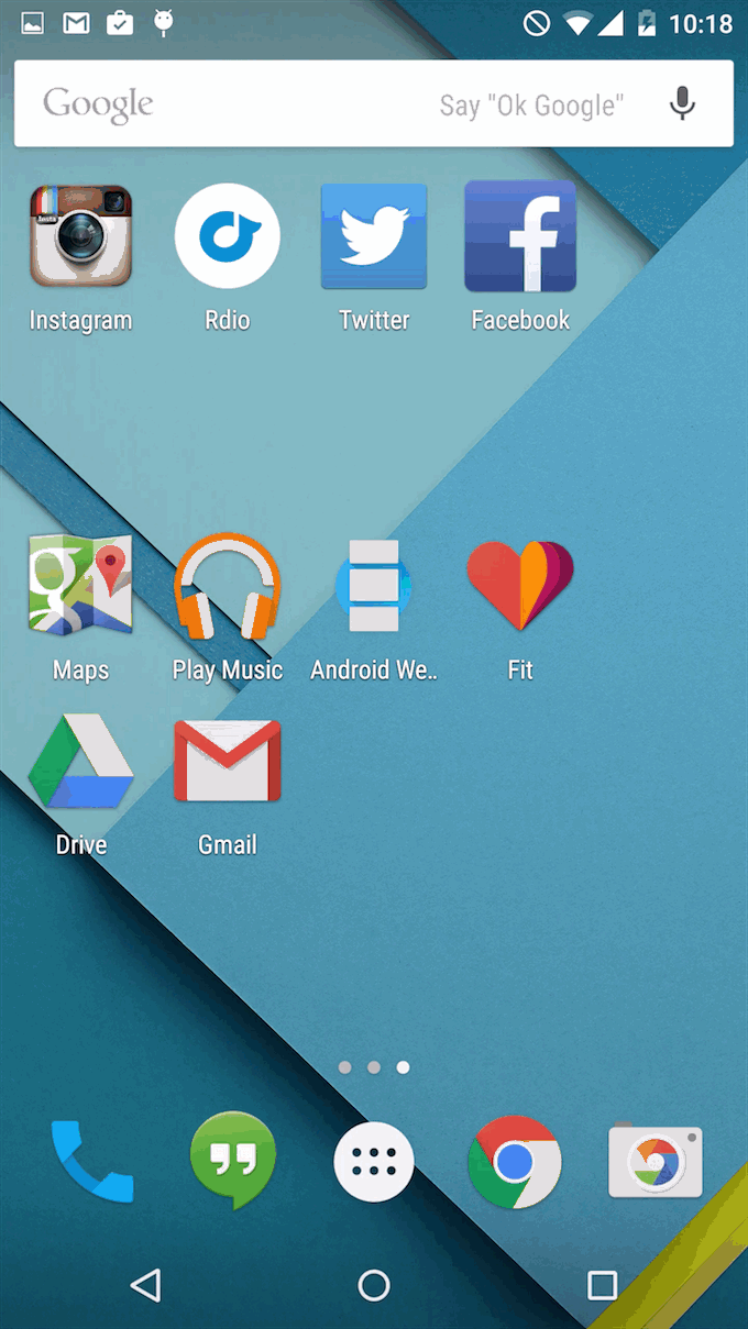
Another nice touch, in addition to system animations like the app drawer expanding from a bubble into view, which provides a sense of continuity between the home screen and Android’s traditional home for all installed software, are the animations that take effect when any app is opened. Apps now slide up from the bottom of the screen, with a very subtle layering effect that, once again, helps to create a sense of continuity between Android’s home screen and the software that runs on top of it.
Overall, Lollipop’s design, from the new, gapless keys on the software keyboard, to the blooming fields of shading that emanate from taps to show you an input was received, just screams continuity, and it replaces the often cobbled-together (albeit effective) aesthetic of past versions with something much more approaching a cohesive, unified experience. Android is often criticized for fragmentation, but with Lollipop, it feels very much like Google is doing its best to answer those criticisms in the very building blocks of the visual language that makes up its entire mobile OS.
Features
Some of the key features in Lollipop on the Nexus 6 reveal themselves before you even unlock the device. Motorola has some special features in store, like the ambient display that will show you notifications and time in a pale black, white and grey display that consumes very little battery energy. You can wake this to full power when you tap a notification or press the power button, and that’s when you get the new Android 5.0 lock screen, which features at-a-glance notifications.
Android’s native lock screen notifications have taken a long time to arrive, but they’re very well executed now that they are here. Each provides you with a time stamp, a brief description and the icon of the app in question, or else a preview of the content in the case of media files like screenshots. Notifications pop forward and expand in size when tapped once (another of Lollipop’s excellent visual flourishes) and a second tap will open that app or content directly (once you successfully unlock). Some categories of notifications, like those flagging messages, let you respond directly from the lock screen, which is very useful. Screen notifications can also be selectively dialled back for a less visually cluttered experience, or turned off entirely.

Another nice benefit of the new lock screen is that it shows you the time remaining before a full charge when you’re plugged in, without requiring that you add a widget or set up anything else. Lock screen widgets are in fact gone altogether, which might strike some users as a negative, but they simplify the experience overall, and lock screen widgets were never actually that useful in my opinion anyway. Google did the right thing by axing them, because the trade-off is an experience that once again offers more consistency, and in this case the cost in terms of customisability is definitely an easy one to justify.
On the Nexus 6, always-on voice prompts using the trigger phrase “Okay Google” work like a charm, even when the device is unplugged, locked and with the screen inactive. On the Nexus 5, you need to at least activate the display to trigger the “Okay Google” command, as well as enable the option to use it from the lock screen in settings, but it’s still a big help when trying to quickly access services.
Best Of The New
Among my favourite new features in Android L on the Nexus 9 was Smart Lock, and the ability to use paired devices to act as trusted security keys, bypassing the need to enter a pin to unlock your device when those trusted gadgets were within range and connected. On a smartphone, it’s even more of a convenience feature.
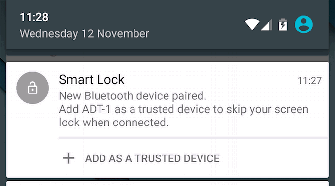
The reason Smart Lock shines so well here is that with a smartphone, you tend to be using it in different settings much more often – where a tablet is often a stationary use device, a smartphone goes with you everywhere, and isn’t just living inside a backpack much of that time. So, adding a pair of Bluetooth headphones will make it so that it’s easy unlocked while you’re checking your workout progress at the gym, while keeping it locked down on your commute where it might be a target for thieves.
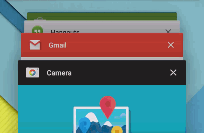
The recent apps multitasking switcher is another highlight. It’s a much more usable interface than what came before, with a scrollable rolodex that doesn’t leave you feel like you have to travel miles to find apps that you opened early on in the queue.
Finally, Lollipop brings back full access to SD card storage for apps, which was taken away in KitKat. This means you can shuttle apps between internal an expansion storage, should you have a phone that supports microSD, and you can also use them to store media data from apps, like songs stored for offline use. To make up for the security window that potentially opens, Google has compensated by beefing up production around microSD as a route for malicious software.
What’s Not So Great
Android Lollipop is mostly great, but there are some issues that mar the experience to a degree. Software bugs persist, including the occasional failure of a device to recognize a trusted Smart Lock paired gadget and thus bypass manual lock screen passcode entry. Also, the design of the new soft keys, while beautiful, reduces the amount of information they convey, which could make it hard for new users to find their footing.
I’m also not crazy about the way some features have been relocated, including the ability to change volume to vibration or silent. These aren’t housed under the menu’s quick settings panel, but instead are managed from a new interface with expanded options that pops up when you hit the volume key. It might be more intuitive if you’re coming to Android fresh, but it still seems out-of-place to me.
Bottom Line
Android is really taking a big leap forward with Lollipop – the 5.0 launch brings lots to love in terms of design and usability. On a smartphone, its advantages over previous releases are even more pronounced, which is great because this is where most users will encounter the new OS. Is Android 5.0 a release that’s strong enough to switch platforms for? That’ll depend on how much you wanted to do so to begin with, but it’s easily the best release of Android thus far. What will really make the difference will be seeing how developers use the new tools available in Android 5.0, as well as the new guiding design principles, to really elevate the state of Android software in general.