Google’s new mobile operating system is now available to consumers, as new Nexus hardware (starting with the Nexus 9) begins to make its way into the hands of pre-order customers. Version 5.0 of Android continues the candy naming tradition with “Lollipop,” and despite the fact that ‘L’ is just next in the alphabet, something about the name seems to resonate with the bold new design direction Google has introduced for this generation of its software. Lollipop’s playful, animation-rich aesthetic, which Google calls “material design,” feels fresh and alive, with an internal logic that should mean both longtime and new Android users can get accustomed to their new surroundings quickly – for the most part.
Design
It’s possible that design is the most significant part of Android 5.0. Lollipop marks Google’s full commitment to its material design principles of user interface creation, which take cues from real-world materials to present the user with UI elements that slide over one another, casting shadows and animating in and out of maximized and minimal states. The final effect is somewhat like paging through a unique small-run art book, a complex yet instantly understood artifact made up of bold-flat colors covered in simple, elegant typefaces that seem to leap from the page despite a print-like adherence to the same.
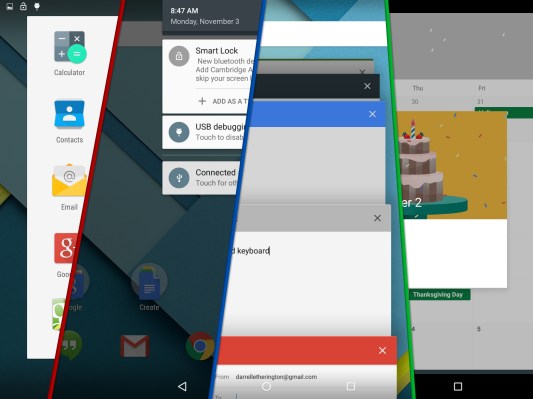
The visual design of Lollipop is indeed a treat, and it’s surprising how modern the UI feels once you go back to tablets running older versions of the software. Even Android 4.4.4 running on a Nexus 7 feels like it could be from a previous era of mobile computing. The effect is that pronounced. Google’s decision to make interfaces like the notification tray more lightweight with gaps between light-coloured panels, buttons and other elements succeeds in making Android 5.0 feel like a dramatic leap forward in the evolution of mobile software.
Small touches like the way the app drawer minimization animation returns to the new circular icon on the home screen also help to elevate the experience of using Android overall. Google has made interacting with hardware running Lollipop more of a delightful experience in general; interacting with older Android devices always reminded me more of days spent wrangling PCs with early pre-Windows versions of GUI menus glued on top of DOS environments. Using Android 5.0 finally manages to make you forget about the code running just under the hood.
In some ways, it’s like Android’s new clothes signals a coming of age, though hardcore fans might see it as an oversimplification aimed at too broad a market. Part of Android’s appeal to technically skilled users willing to get their hands dirty, after all, was the slight ugliness for which it seldom seemed all that apologetic.
Top to bottom, though, Android 5.0 represents a huge improvement that the vast majority of users will appreciate. It feels more fresh in general, with a Settings app that doesn’t seem like just a series of interminable menus, and the multi-tasking interface with its card-style scrolling is so well-done that you often just want to open the feature to page through it with no particular destination in mind.
Features
Of course, Android 5.0 isn’t just about surface changes. The new software also comes with new features, and many of these represent potentially big changes in how users will interact with their devices. One of these that occurs as soon as you set up your device is automatic encryption.
All your data on a brand-new Android 5.0 device is encrypted from the start by default, and that encryption is tied to both a secret generated by your user security code (should you set one up). This means that if you lose your device, the data will be better protected even if your lock screen code is bypassed and the data is accessed directly. It’s a nice feature, but it’s something that you won’t actually notice or benefit from unless you unfortunately lose your device or have it stolen.
Another new security feature in Android is actually much more useful on a daily basis, and that’s Smart Lock. You can assign trusted devices to allow your Nexus 9 or other Lollipop-sporting device to unlock automatically when actively paired with them, and it’s a huge boon to convenience while offering less of a potential security trade-off vs. just not using a lock screen passcode at all.
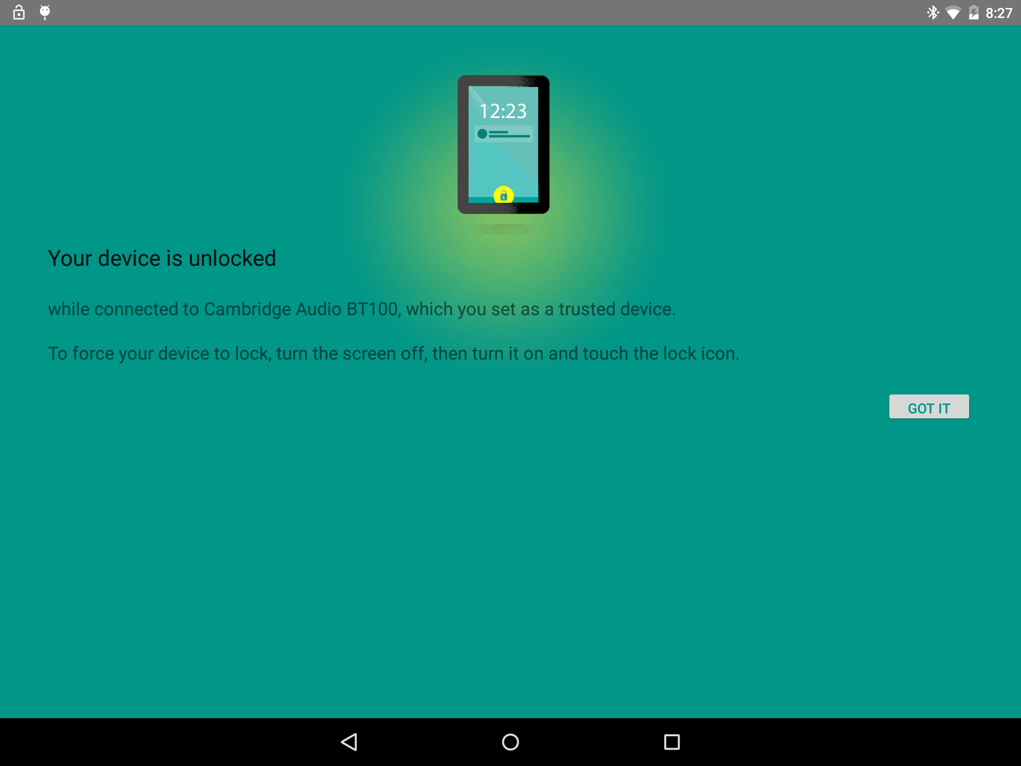
I set up my Nexus 9 to unlock without a passcode when connected to my Bluetooth Internet radio receiver at home, and when actively connected to my LG G Watch Android Wear device, meaning that as long as it’s either in close proximity to my body when I’m out, or basically anywhere in my home, it’ll unlock without prompting me for my PIN. Likewise, you can set up a face unlock mechanism that will recognize when you’re the one using the device and bypass the pin. In practice, however, that feature is a little more finicky, because Google has retooled its face-unlock tech. While that means it isn’t easily fooled, it also means it’s more susceptible to changes in lighting conditions and angles when recognizing your mug.
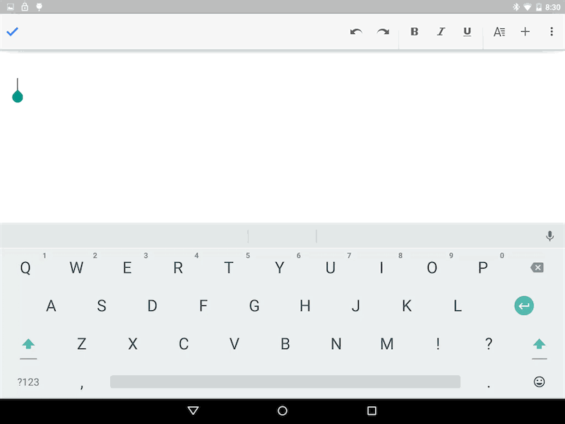
Android Lollipop’s new keyboard design is refreshed along with the app drawer and notification tray, adopting a dark text on white background look, without any visual market separating the space between keys. This has the effect of mimicking a printed page more effectively, which is one of the main themes of material design, and it also seems to make for better typing on a large screen. The keys seem to result in fewer missed hits, which is due perhaps to the fact that they don’t have gaps between them any longer, or to the increased clarity of the visually spare field of the overall composition.
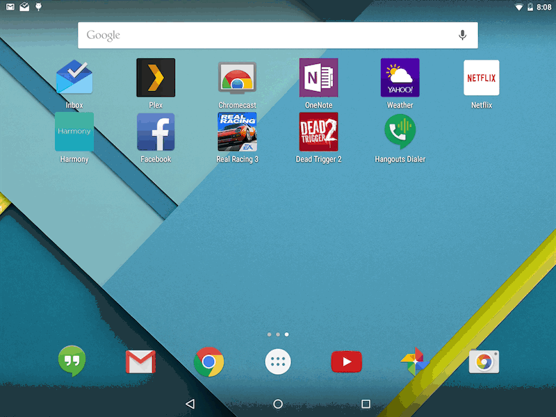
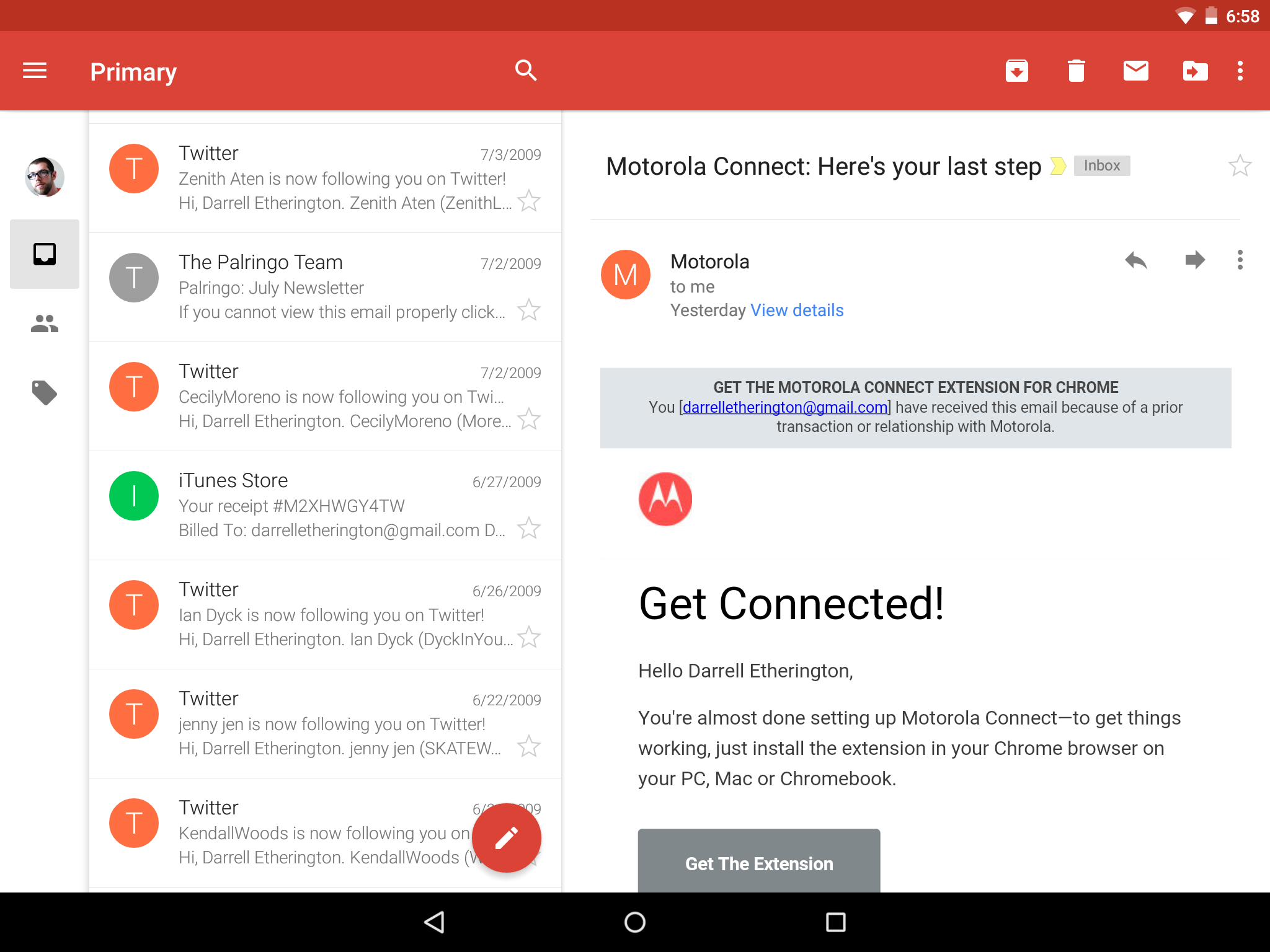
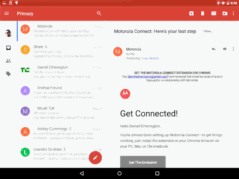
New Gmail and Calendar apps provide much better handling of both of those tasks. The new Gmail app looks a lot closer to Google’s new Inbox mail client than did the existing version, but there’s still a significant functional gap between the two products. Gmail still presents your email relatively untouched by automated filtration software, though it does highlight the recently introduced categories function for giving you a quick way of looking at all the various instances of one type of message on a case-by-case basis.
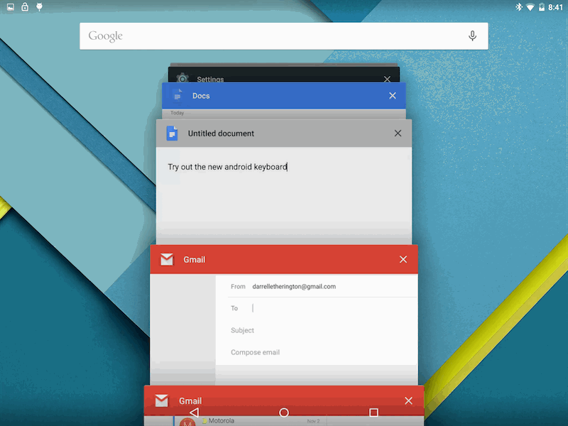
The landscape and portrait views on the Nexus 9 both offer ample opportunity to see lots of information at a glance, including a left-hand menu bar that can be minimized with simple but effective icons for navigation. Hitting “compose” will actually open up a new window, which is huge for productivity if you’re tired of having to go back to check your mail and then hunt around the drafts folder to find the message you were just working on.
Calendar now features inline photos and maps, adding a touch of visual flare to an app category where there has seldom been any before. It also offers autocompletion suggestions for titles, contacts and places to make text entry easier, and combs your Gmail for flight reservations and other pertinent schedule information to provide you with more dates automatically. The interface itself is more evocative of a stylish letterpress wall calendar than a boring agenda, and header images for different types of events when you zoom in to check appointment details, plus bold colors if there aren’t any pics to fit, really bring the whole thing together. Animations here are excellent as they are anywhere material design has been put to full effect, and again I’m struck by the level of delight Google can manage to inspire even with something as simple as a calendar application.
Best Of The New
Android’s new security features offer a lot of peace of mind, and the Smart Lock function that uses devices that have connected with the tablet through an active pairing protocol to bypass screen locking is an extremely useful feature when it comes to user convenience. This, combined with default decryption of all of your device’s data, should help users feel more secure even when they lose their tablets.
Lollipop is also a visual delight, through and through. The small touches like visual blooms of color and shading to indicate received touches or to subtly indicate that you’ve reached the end of a scrollable field, plus the way elements balloon to life or shrink back to their idle state are all things that, when first noticed, can sometimes evoke an actual grin, and that continue to amplify the overall experience even once you’re used to them.
With Google’s own native apps, the company has clearly dedicated a lot of time to building experiences that not only suit the tablet’s available real estate, but that also offer functionality more appropriate to people using tablets as laptop replacements. Gmail’s ability to splinter off new compose windows as separate tasks is a perfect example of this, and Sheets, Docs and Slides all offer the same kind of multi-tasking-friendly process separation.
What’s Not So Great
Some of the visual appeal of the new Android could conceivably place additional hurdles in the way of users coming to grips with the OS, whether for the first time or after becoming familiar with Android on previous devices. The new notification tray reveals no clear way to get to Settings, for instance, and it’s not at all natural to expect that clicking on the new User Account icon would eventually get you there. Nor is it natural to expect that double-tapping on the same icon will bring you to your actual user account options. Likewise, the new simple geometric buttons aren’t immediately illustrative of their functions, with the exception of the triangle, which does in fact resemble a back arrow.
While some of Google’s core apps, like Gmail and Calendar, have been overhauled to take full advantage of everything Android Lollipop has to offer on a tablet, there are others that have been sadly left out, including Hangouts. Hangouts is an especially glaring oversight because of how key messaging is to the overall communication experience on mobile devices, and because the app seems ripe for a design that takes advantage of more screen real estate.
Finally, bugs are still fairly plentiful in this release of Android, including some that would cause most apps to become unresponsive pending a hardware restart. Any major update of an OS is going to have some kinks, of course, and 5.0’s problems were hardly deal-breaking over the course of my testing experience.
Bottom Line
Android Lollipop represents a complete change in tone for Google’s mobile software: from heavy-handed, almost PC-like user interfaces to a light and airy feel that actually seems at time to be mood improving. It’s true that Google has been hinting at many of the things it’s doing in Android 5.0 for a while now with iterations on its individual apps, but seeing everything come together at the system level really produces a cumulative effect that feels dramatically different.
The playful papercraft look that pervades the OS manages whimsy without feeling immature or cartoonish. But the key to the long-term appeal of Android 5.0, especially in a tablet environment, will be whether Google can convince third-party developers to build a great software experience for Android slates that takes advantage of everything Lollipop has to offer.