 Opera is bringing its Coast browser to the iPhone today. While it uses Apple’s own WebKit rendering engine, the interface around it is decidedly different from any other browser you have likely tried before — and that’s a good thing. Just like with the iPad version Opera launched last year, the iPhone edition is highly optimized for touch and gestures and does away with almost all of the usual user interface elements most of us expect from a browser.
As Huib Kleinhout, the head of the Coast project at Opera, told me earlier this week, the philosophy behind Coast remains the same: the team wanted to create a browser that focuses on simplicity and a user experience that feels native to the mobile platform. To do this, Opera decided it had to do away with the usual hallmarks of a browser (forward/back button, URL bar etc.).
“All browsers are moving in this direction,” he told me. “But it’s all happening in baby steps. With Coast, we wanted to follow this direction and take ten steps at a time.”
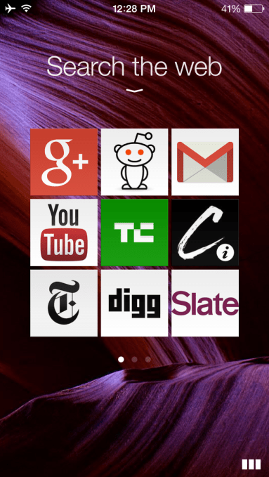
 For Coast on the iPhone, this means when you open up the app, you are presented with a 3×3 grid of your bookmarks. Only having nine bookmarks per page feels somewhat limited, but it turns out that’s how many you see without scrolling in Safari and Chrome on Android, too. Click on any of those and a nice little animation pops up and the page opens.
The browser interface itself then puts the full focus on the content, with just two buttons for opening up your tabs and returning to your bookmarks at the bottom. Most of the advanced features are hidden behind the tab menu, where you can click on the share button to bookmark sites or — well — share them on Twitter, Facebook and through iMessage.
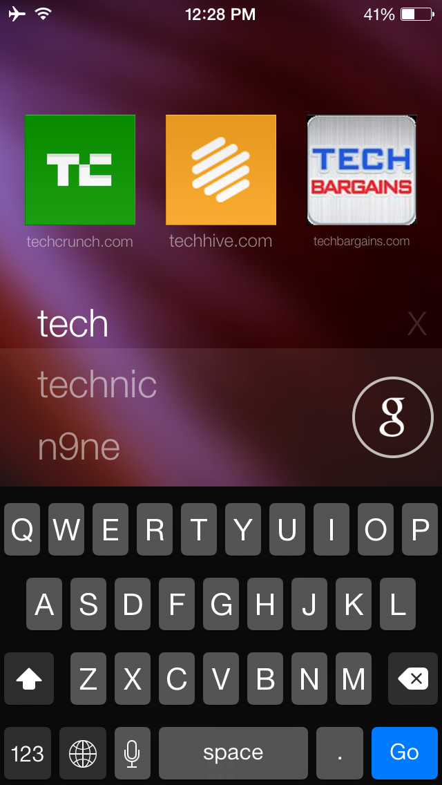
The other unique feature of the browser is that to search, you swipe down from the home menu with your bookmarks. Searching from there is pretty straightforward, but the Opera team also decided to use this space to present you with a list of sites that are popular around you and on the Internet as a whole.
 As Kleinhout told me, the idea here was to give people something new to discover. “We believe the Internet is a great collection of information, but in general, you don’t discover many sites simply because you don’t know about them,” he told me. “We want to bring back this ability to find cool sites.” He argues that today’s browsers mostly focus on search, but in his view, “that a very limited experience because you often don’t know what you are looking for.” He believes the typical use case for this are those times when you are stuck in the grocery line or on the bus and are looking for something fun to read.
Throughout the application, Opera has added small animations to emphasize a user’s actions. Click on a link, for example, and the link will blink while the next page loads in the background. Tiles flip open so you get the feeling the actual site sits behind your bookmark tile. As Kleinhout stressed, this isn’t just animation for the sake of animation. It’s meant to make the app more useful, too.
Given that Apple locks its operating system down quite a bit and doesn’t allow third-party browsers as the default browser, it’s always been puzzling to me why Opera decided to focus so heavily on iOS when Android would likely give it a bigger user base (few iOS users, after all, switch to a third-party browser). According to Kleinhout, the reason here is that with iOS, Opera gets a know platform to work with that has the high-end processors and GPU it needs to make everything feel smoothly. “We don’t want to compromise on the experience,” he told me. On Android, he argues, the large portion of devices isn’t powerful enough to give users the experience the team wants.
Still, because Coast is a very nice browser, I would hope the team rethinks this and does bring it to Android, where I — and many others — would be far more likely to use it regularly than on iOS.