Twitter has been testing designs furiously all winter, including a tile-like format for tweets and a Facebook-style profile page on the web.
But TNW has spotted an update in the Twitter app (which is being partially rolled out as a test, considering my version of the app doesn’t show the change) that brings the same profile look to mobile.
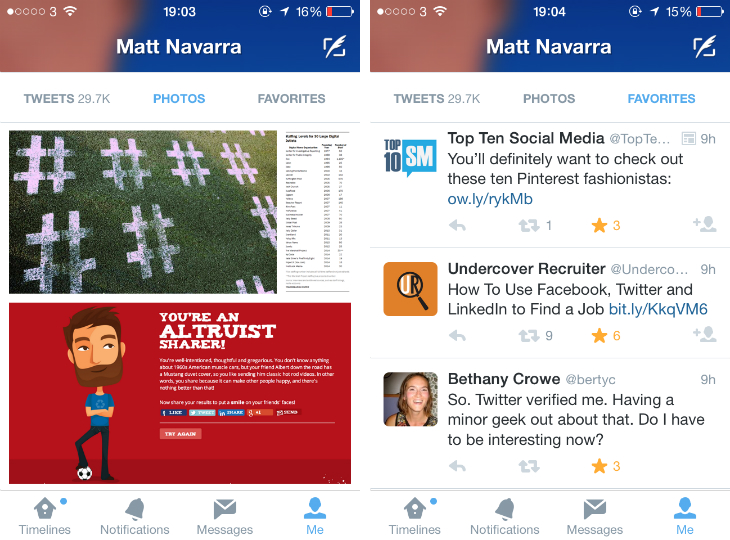
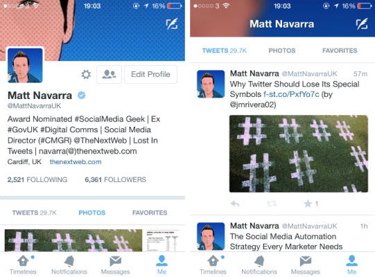
Instead of having a centered profile picture, with a user bio hidden behind a left swipe, the new design features the profile picture against a white background on the left-hand side of the screen, with a cover photo scrunched up top, and bio information just below the profile picture.
The redesign also incorporates two new feeds to the profile section of the app, one that shows embedded photo tweets only and another that shows all the user’s favorited tweets.
The idea here is to make Twitter a great place to consume, not just to share. It’s easy and simple enough to fire off a tweet, but when you’re trying to read through your feed or get to know someone a little better by viewing their profile, Twitter can become a bit tiresome. Not only are you traveling back in time, but it’s a text-heavy experience as opposed to Instagram.
By giving users a way to look at media only, chances are they’ll be happier stalking their friends and past lovers on Twitter instead of Facebook and Instagram. Plus, showing tweets that were favorited gives yet another window into what kind of Twitter user a particular person is, which is helpful in determining how to engage with them.
The switch is obvious. Instead of showing you a user’s name, number of tweets, and number of followers, Twitter is now focused on giving you real tangible evidence toward who a person is in the form of a front-and-center bio, photo feed, and favorites feed.
Twitter has been trying desperately to be a more user-friendly tool, rather than being the platform of choice for early adopters and tech-savvy youngsters. With user growth slowing, the future of the business depends on whether new users are comfortable using Twitter right from the start.
Though design has constantly iterated at Twitter to make things more user-friendly, like with the conversation view update, for instance, this would be the most drastic design refresh out of the company since launch.
And the fact that it looks a lot like Facebook profiles? Well, like I said, new users have to feel comfortable stepping up to the plate on Twitter. What better way to do that then bank off a design they automatically and intrinsically associate with sharing.
We’ve reached out to Twitter for comment but haven’t heard anything back yet. We’ll keep you updated if we do.