
Nate Silver, the famous New York Times statistics blogger who correctly forecasted 50 out of 50 states in the 2012 presidential election, has launched an entire news site dedicated to data journalism. Keeping the old blog name, 538, the relaunched site is dedicated to taking what Silver thinks is a more rigorous approach to writing about numbers. Flush with ESPN’s cash, Silver has hired writers who have skills in statistical analysis, data visualization, computer programming and data-literate reporting.
There have already been plenty of media outlets dedicating resources to data journalism, from the Wall Street Journal’s “Numbers” column to The Guardian’s data blog. So, what’s new about Silver’s 538?
Here are three stories that I think distinguish 538 from the rest of the media
1. New Statistical Analysis For Each Thesis
Typically, when journalists use charts and graphs, it’s entirely descriptive and plucked from existing datasets, like a graph of unemployment trends from the Department of Labor. From there, a writer will make their own argument about what the trends mean.
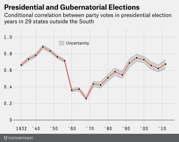
Silver’s writers are more like academics who use graphs to make the argument. So, for instance, 538 launched with a feature “All Politics Is Presidential,” which made the case that elections for governors are increasingly pegged to the popularity of presidential candidates. To illustrate the case, writer Dan Hopkins designed the graph below to illustrate how votes for political parties are becoming more correlated with votes for governors.
It’s not unlike what academics do when they start their own blogs. For instance, it’s how Rutgers Professor Bruce Baker began an influential education blog. But this academic approach to graphing arguments is pretty novel for a media outlet.
2. Writing About Numbers
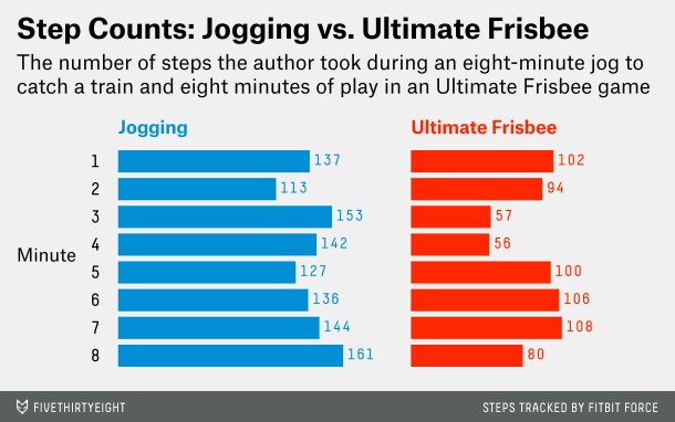
538 is taking a big bet that readers want a handful of skepticism when talking about research. For instance, 538, did its own gadget review, looking at how various health trackers, like the Fitbit and Jawbone UP, measure steps throughout the day. When I’ve seen this in the past, the writer looks at the differences in the number of steps each tracker says they took.
538’s approach was to meticulously break down how health trackers count steps during different activities, like this minute-by-minute breakdown of jogging vs. ultimate frisbee.
This kind of post is not for the Internet skimmer who blasts through articles. I certainly had to dig through the piece to glean the takeaway nuggets, but it’s also the most thorough first-person piece I’ve seen on the subject.
3. Equations. There Are Equations
I have rarely seen a mathematical equation in a news article, let alone one adapted from the famous Bayes’ Theorem. In an article exploring how media outlets write about health advice, writer Jeff Leek proposed this formula to help readers understand if they should believe the headline:
Final opinion on headline = (initial gut feeling) * (study support for headline)
In a mathy 1,600-word post, Leeks makes the claim that “In general, health headlines are advertising. The goal is to get you to read the article, not necessarily to represent the research accurately.”
So, after looking at all the possible elements of health evidence, from randomized control trials to whether the study was conducted on humans, Leeks explains how you can mathematically determine whether a piece of health advice is right for you.
The closest approach I’ve seen to this lately came from The Guardian in an op-ed last week about how it’s not practical to take person advice from large-scale health studies. The 538 approach is to just acknowledge that The Guardian article is a given and then outline a detailed, quantitative method for acting on this fact.
The Big Bet: We’re All Nerds
In a Venn diagram of conservative radio fanatics, TMZ fans, and Internet skimmers, 538’s audience is on other side of the Grand Canyon. Silver is going for an educated audience that relishes skepticism, nuance, and testable hypotheses. There are no pundits.
I won’t bother judging 538, because I’m (really) biased. I’ve experimented with being a one-man pollster, quantifying my caffeine intake, exploring the calorie-burn profile of my sex life, and citation-heavy statistics debunking. This morning I hooked myself up to a commercial-grade EEG device and measured the effect of green tea on my focus. Sometime’s these data-driven pieces have been popular — other times not.
Silver’s experiment isn’t a test of whether data journalism can work; it’s a test of how nerdy the Internet’s news audience is. 538 is all data all the time. If Silver succeeds, it will be because the news industry underestimated just how much data-driven analysis the public wants.