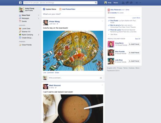
Facebook has gone through many iterations, and some growing pains, in its quest to find a happy balance between an interface that people love to use, and that will serve the best business purpose for ad-funded the social network. Starting today, Facebook will be embarking on another chapter in that story, with the rollout of a new look for its News Feed — announced last year but never launched.
In today’s update, the changes are all visual: a new font for the bulk of the text (Helvetica for Macs and Arial for PCs, the company tells me); a new “card” arrangement; bolder presentation for images; and a lighter and more simplified left-hand column — changes that will give the desktop experience more parity with Facebook’s mobile apps. The changes are getting turned on over the next few weeks worldwide.
To be clear, none of the changes affect advertising on the site, or how Facebook surfaces content to people: in other words, if you are a marketer on the social network, you don’t change anything. On that front, there will continue to be updates to the news feed algorithm over time, which will be posted about on in the News Feed FYI blog, notes Greg Marra, a product manager who I spoke to earlier.
Some context on the changes that are out today: Although there were News Feed changes announced last year, they were not rolled out worldwide.
Marra says that Facebook wanted to take some time to really think them through. “Over the last year we have been taking time and listening to what people think about the redesign,” he told me, with “lots of interviews with users to understand what parts were working and what parts were not. Some changes were getting in the way of using Facebook.”
 On the changes to Helvetica and Arial, Marra says this was because Facebook was looking for something that felt more “like a system font.” And in general, the aim is to try to simplify complexity: while there used to be different levels of indentation for different shared stories, now each has its unique part.
Similarly, attachments will get their own space, with links presented in Georgia titles (a serif font). And shared photos will be full width, with multiple photos coming up as a collage.
One noticeable change between the version of Facebook that I’ve been shown in the screenshots of the new look and how my feed looks today has to do with the left column. It’s far simpler than it was before.
Marra says that the navigation on the left side in a small screen was challenging for many people, especially with smaller screens as you get on laptops and other smaller desktop machines, to use. “You didn’t have the space and needed to scroll,” he said. Going forward, Marra says it doesn’t matter what size your screen is, “you get the same number of links, and we think it will be easier to find the things you care about.”
So what was behind the changes that Facebook made today? Marra says that the things the company is evaluating how people use the site and where are they going — to groups or apps or stories? “We wanted to pay attention to qualitative feedback this time. It’s hard to tell what’s working and what’s not so we talked to people as we did the update. We put usability studies first.”
It turns out that it’s more usable, for example, for the chat window to be in the bottom right-hand side instead of on the left side where it sits in the version I have now. (In the screenshots here, you cannot see the chat box, or the ads that Facebook confirms will continue to sit in the right-hand column.)