This ain’t your mama’s Facebook. Paper is almost too modern, or maybe it’s just years ahead of its time. The free new iOS app released yesterday in the U.S. lets you browse your News Feed plus curated sections of articles and memes through full-screen cards, new gestures, and delightful animations. Paper is equipped to be a full-fledged Facebook client, but the question is whether we’re progressive and curious enough to adapt to Paper.
From the second you open Paper, it strives to forge an identity distinct from Facebook. First it plays you a quick teaser video that looks like the intro to an indie film. A Siri-meets-Facebook robotic-yet-sensual female voice then begins walking you through Paper’s features.
To hear her, you’ll have to download Paper yourself. But for now, check out my video demo and review to see how Paper looks and feels:
Temptingly Tactile
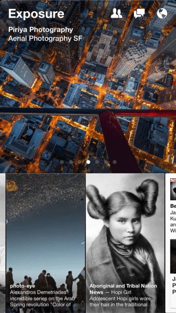
Beyond a reimagined version of the News Feed, you can select from sections like Headlines (world news), Tech, Exposure (photography), Ideas (long-form takes on a different topic each day), and meme channels like Cute and LOL. Each is filled with stories shared publicly to Facebook from big publishers, public figures, and emerging content creators.
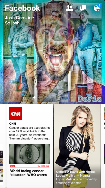 In the top half of the screen you’ll see a cover image for your currently viewed section, and while a horizontal row of stories fills the bottom. Swipe up on a story and you’ll see it magically grow into a full-screen summary card. Swipe up again and the story unfolds into a mobile web view of the story on its original website. The double up-swipe gesture is oddly satisfying, like picking up a newspaper, then bringing it closer to your face for reading. Swipe down to fold an article back up and return to your Paper feed.
It takes wagging your finger back and forth over Paper’s home screen to see just how responsive the app is. The Facebook Creative Labs squad that’s worked on Paper for over a year is basically an iOS dream team, including acquired Push Pop co-founder Mike Matas, who helped design the Nest thermostat and iPhone interfaces for Apple; Loren Brichter, who invented “pull-down-to-refresh” and other UI mainstays while building Tweetie and Letterpress; Michael Reckhow, who product-managed the Kindle app for Amazon; and Jason Prado, who Facebook poached from Google’s Hangouts team.
Paper’s take on the News Feed is refreshing, as it makes every post as readable as possible, expanding the text size of status updates while laying out photo albums into vertical columns so there’s no click required. Oh, and there are no ads. The Paper team tells me that, like a startup, its sole focus now is growth. If it becomes popular enough to cannibalize Facebook for iOS or becomes a big enough revenue opportunity, that’s “a good problem to have,” and it will figure out how to inject ads or otherwise monetize.
One-Size-Fits-Some Content
The vertical content “sections” are where Paper could use the most work. I’ll cut it some slack, though, as along with algorithmic aggregation, Paper uses a team of human editors to pick what people see — a first for Facebook. Some of the news content feels a bit fuddy-duddy and mundane. It certainly doesn’t help that by the evening, most of the posts in a section are from five to eight hours ago. Compared to Twitter’s real-time news, it feels painfully behind, and there’s no way to manually refresh.
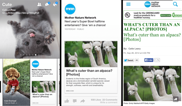
Meanwhile the Cute and LOL sections are cloying. They quickly delve into mediocre drivel out of fear of offending anyone with edgy humor. Hopefully the content immediacy improves, and the Paper team builds personalization into the Sections like it said it’s considering. Otherwise you’ll need pretty mainstream tastes for Paper’s sections to drag you away from Flipboard, Prismatic, Circa, Zite, Pulse, or another news reader.
One thing I did enjoy was how some big publishers’ Paper summary cards are customized and they retain their article formatting. For example, The New York Times headlines have their iconic font, and BuzzFeed floats buttons for Tweeting, sharing via email, and commenting at the bottom of its Paper stories just like on its mobile site.
What You See Is What You Share
A true “wow” feature, Paper lets you tilt or pan your phone side-to-side to view the edges of a panoramic photo. In most apps including old Facebook, panoramas are squished down to fit on the screen at once, obliterating their detail. Paper lets those wide angles shine. Similarly, videos auto-play, but in portrait mode by default.
 Matas, who is Facebook’s product designer, tells me “Not that many people shoot portrait videos. But I would argue the reason for that is because not many people display portrait videos in a good way…just by giving people a way to share portrait videos in a good way…there’s lots of really interesting stuff that could be videoed in portrait like a person’s face.” By providing a beautiful outlet for them, Paper could get more people shooting and sharing panoramas or portrait videos.
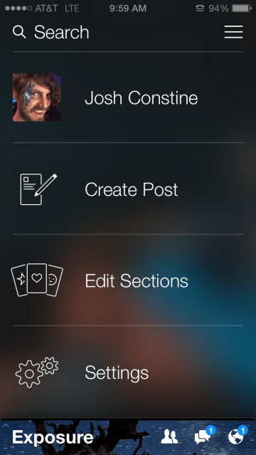
Paper buries its own sharing button in the pull-down menu so you’ll have to remember to share, unlike Facebook’s web and mobile app that keep status composers at the ready. But Paper’s composer gives you real previews of how your content will look to others so there’s no guessing about whether a blurb or your text will be truncated. That lets you share with confidence.
Is This The New Facebook?
Though Facebook set out to make Paper extremely focused on content, it actually built a working replacement for its multi-featured main app. You can search, and view a mobile-first full-screen card version of profiles and Pages. Friend requests notifications, and Chat Heads messages are all in there and can be opened in little pop-overs on top of your currently viewed content. You can even change your settings in Paper to open notifications from Facebook within Paper instead of Facebook for iOS. The only critical feature missing is your full Events calendar, which Mark Zuckerberg hinted could become one of Facebook’s next standalone apps.
This all means you can stay current and communicate with Paper, and shove your old Facebook app in a folder with minimal functionality loss.
 Facebook’s Creative Labs launched Paper to explore how content delivery could be reimagined if there weren’t a billion users to worry about shocking. It’s purposefully built for open-minded, style-conscious users willing to embrace change in exchange for a cutting-edge experience. You could almost say that makes Paper “Hipster Facebook.”
But Paper’s radically innovative design is its biggest liability as well as its greatest asset. Facebook learned from “Students Against Facebook News Feed” way back in 2006 that many people are resistant to change. That’s why it typically tweaks its website and main app conservatively, and when it does execute a major redesign or product launch, it often rolls it out slowly.
For the mainstream American, for Grandma, for people around the world still new to Facebook, Paper may be too different to fit into their daily lives right now. And there are a lot of those people. By launching Paper as a standalone app rather than a redesign of the News Feed, Facebook avoided giving a sizable percentage of the planet a heart attack.
There will surely be some people who use Facebook most of the time, and Paper when they’re in the mood to discover some new content. Others will try to remember to use Paper, but unless they replace Facebook with it on their homescreen, digital muscle memory will kick in and they’ll gravitate back to their old app. That’s why to gain traction, the Paper team needs an elegant way to convince people to make this switcheroo.
With time, though, I’d bet we find Paper to be pretty polarizing. For some, it will feel over-designed and overwhelming. Too unfamiliar. Too new. And they’ll keep using Facebook for iOS.
But for an influential minority of progressives and power-users, Paper could be the Facebook of the future. They’ll see it as setting a new bar for mobile user interfaces. They’ll be patient as its human-curated content gets up to speed. They’ll say seven years of vertically scrolling feeds of chrome and whitespace were enough. They’ll pick up Paper, and never put it down.