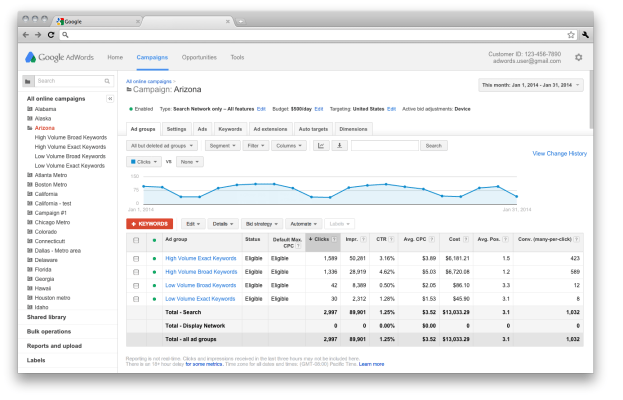
Google’s AdWords now sports a much-needed update that brings its design up to par with most of the company’s other web apps.
Most of Google’s services, including Gmail, Drive and Analytics, now sport the company’s new, flat look. Even after a few years of going through this process, however, some apps still look just like they did back in 2011. Both AdSense and AdWords, the publisher and advertiser back ends to the company’s most important revenue sources, were among the services that were left behind in the first waves of the redesign.
AdSense started testing a new homepage last November and it got a bit of a facelift back in 2012, too.
With today’s change, AdWords’ interface now looks more like Gmail and also sports the same gear icon you find in most of Google’s consumer apps to get to the settings menu. Of course, it will also feature the same colors and other design elements that are now part of Google’s design language for web apps.
If you’ve spent some time in Google Analytics, this new look will feel pretty familiar (though Analytics still uses Google’s old menu bar). Google says this change is also meant to provide more real estate to the most important tools in AdWords and for the charts and tables most users rely on to track their ad campaigns.
As part of this update, Google has also made it easier to see who else is currently signed into your account.