Roambi, the app that makes it easy for companies to turn their data into interactive graphics, has released a major update of its analytics platform. The most obvious difference in Roambi Analytics 7, as the latest version is called, is a complete visual makeover that brings the app’s look into line with iOS 7’s design. MeLLmo, the Sequioa-backed creator of Roambi, also launched Roambi Card View, a new mobile dashboard that gathers metrics from different data sources into a single custom display.
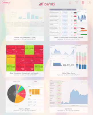
Roambi uses information from each customer’s own data information sources and customer-relationship management software to create cloud-hosted presentations. The app is intended to make it easy for employees throughout an organization to access just the data they need without being overwhelmed by other information. Examples include pharmaceutical reps that use Roambi to replace binders filled with information and spreadsheets about medications while visiting doctors or retail store managers who want to look at sales data relevant just to their area.
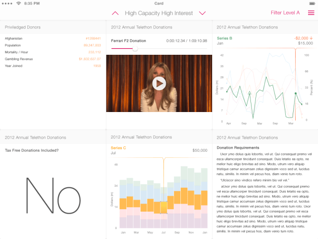
The new version of Roambi Analytics also includes updates to its functionality, such as features to allow its 11 data visualization options to flow more smoothly into one another, a redesigned dashboard that lets users navigate reports visually and a View Bar that puts all data management tools (sorting, filtering, hiding columns, etc.) into one location. The new Roambi Card View has an interactive dashboard, new ways to view data (such as waterfall charts, scatter plots, bubble charts, data tables and single metric values) and allows users to flip through different displays like a set of cards.
For an app that relies so much on its visuals, a complete makeover to coordinate with iOS 7, whose design was initially greeted with skepticism, is a potentially risky move. But Roambi’s development is closely tied with the evolution of iOS, says co-founder and lead designer Quinton Alsbury, so it makes sense that the app would refresh its look to match iOS 7.
The app’s founding team began working on the data visualization platform four months after the iPhone opened up for native development in 2008. The first version of Roambi adopted the black background and primary colors of the previous iOS design to set it apart from PC user interfaces.
Alsbury says the company waited until several weeks after iOS 7’s release to unveil Roambi Analytics 7 so people had a chance to get used to its flat graphics and softer color scheme. Alsbury says taking away graphic elements like skeuomorphs gives iOS 7 a cleaner and faster feel. When applied to Roambi, the new look lets its interactive data visualizations take center stage.
“We had iOS 7 on our devices and had been using it for a couple of weeks after the developer conference. When we went back into the older apps, it really felt old, stale and archaic,” says Alsbury. “We realized that if we don’t move in a new direction and take the design along with it, our app, which has always been the leading app in what we do, is going to fall behind and be perceived as old. We expect some users will take some time to adjust to it, but our overwhelming expectation is that in a short amount of time, it will feel as familiar, if not more so, as the old iOS and a lot of benefits will be understood.”