
Yahoo! earlier today revealed the fruits of its month-long logo labor: a new, still-purple Yahoo! with an animated exclamation mark (H/T Tumblr), no more serifs (H/T Optima), jaunty curves (H/T humans), and some nice Y-fronted 3-D relief worked in for good measure (H/T skeuomorphism). Big work, and they are all proud of it.
Problem is, those pesky consumers. They’re not happy.
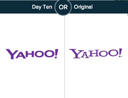
Up to announcement day, Polar, the image-polling app founded by Luke Wroblewski — formerly the chief design architect at Yahoo who worked on the last logo — had been running votes comparing Yahoo’s old logo with the new ones that Yahoo released daily throughout the month of August to get people excited for the big reveal. Today, Polar added a new poll, comparing the actual new logo with the old.

Guess which one is winning out.
As of right now, the old logo is beating the new one, 193 votes to 105.
It’s still early days, and you could say that this is because consumers are creatures of habit and resist change. But actually, in one of the previous polls, the old logo lost out to one of the other candidates in Yahoo’s month-long campaign. The squat, sans-serif Day 10 picked up 2,797 votes versus 1,248 for the old incumbent.
To be fair, many of the candidates offered up in Yahoo’s daily logo campaign — with their uneven baselines, crazy kerning, baby-shower-invite cursive and super-stylized serifs — were almost certainly there for fun, not serious consideration. But judging on votes alone, some had potential. In addition to day 10, other days that came close (but no dice) were day two (3,062 vs 3,759 to old logo):

And day five (2,594 vs 3,376):
Maybe it’s because people were feeling more free with their votes, knowing that this was just a game and not serious, that they let Day 10 win out like that. But when the chips were down, new stuff is just too new.
On the votes, Wroblewski had this to say (exclamation points his; purple blood runs deep):
“People hate change, it’s natural for them to vote for the old logo. So if any new logo comes even close to the original, that’s a really good outcome! Day two and day five logos came really close, day 10 beat the original logo! That’s phenomenal. So people do seem to accept change, two proposed ones came close, one beating the original.
“People would take to the new logo, but the new logo has to be modernized. People are looking for a modern look for Yahoo. They do not want retro, off the wall logos, and all those did really bad in the polls. People want an aesthetically sound and up to date take on Yahoo brand. Slick and put together.”
Aesthetically sound, slick and put together? You can vote on whether you think Yahoo’s achieved that effect here.
Image: thatsaspicymeatball