Amazon’s Silk web browser, which comes built into Kindle Fire devices, has received its first major upgrade since September 2012, the company announced today. Though there have been steady under-the-hood improvements over time, this is the first release since last fall to introduce consumer-facing changes to the way the browser looks and behaves, including a new tutorial, redesigned tabs, better browser controls, simpler navigation options, and easier access to Silk’s Reading View feature.
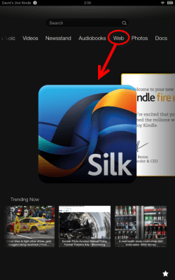
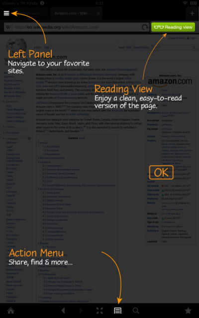
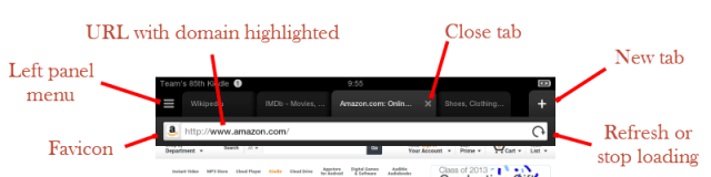
One of the new features rolling out today has to do with how Silk appears to first-time users. Like many apps do today, the browser now launches with a brief tutorial to explain its features. Instead of screens you have to swipe through, Silk adopts the “overlay” interface which darkens the background to point out various navigational buttons like the Action Menu, Reading View, and Left Panel slider, for example, which is where users can view their Most Visited pages, Bookmarks, and History.
But one of the bigger changes, especially for current users, is Silk’s new Start page – something Amazon revamped based on user studies and feedback. Previously, this page featured links to users’ bookmarks and browsing history as well as a “Starter” section, which showed the most visited pages, trending pages across all Kindle Fire devices, and a list of “selected sites.” Some users didn’t care for the way what other people were surfing and reading on their Kindle Fires took up so much of their own new tab interface, and Amazon didn’t let users customize this screen, which was an annoyance, too. Not surprisingly, Amazon found that the “Most Visited” links and direct URL entry were the two most commonly used navigational options, so it has now made them more prominent in the new tab view.
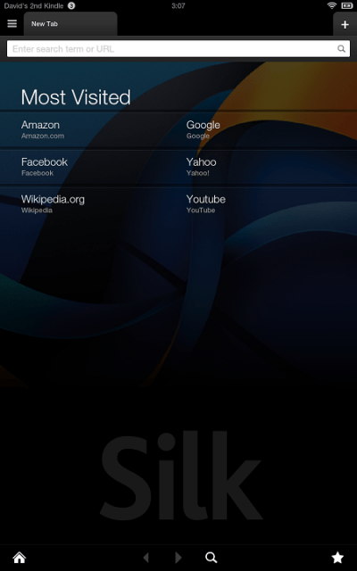
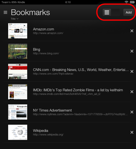
The other links, like Trending section, Bookmarks, and History section are now tucked away off to the left side of the screen, which is also where you can access Settings. These pages received updates, too, with Bookmarks now offering two view modes: a single column of entries with thumbnails, or a grid view with larger thumbnails.
Other more subtle tweaks include performance improvements, a rounding of the tabs on the tab bar to make it easier for users to see where tabs stop and start, and updated browser controls. This includes making the Reading View (the view that strips out the related links, and ads to leave only the text) easier to find than before, as well as an improved full screen view.
![]()
Combined, the refreshed feature set makes for a notable overhaul of Silk’s browser, which has never really been one of the stronger mobile browsers out there – at least in terms of its user interface – despite its long touted “cloud accelerated” underpinnings. That’s been frustrating since a good browser is a key component to any tablet experience, but even if you only use your Fire for reading, the browser is still needed in order to browse and checkout books from your local library’s website, in many cases.
The refreshed Silk browser is rolling out now, and Amazon has also published a Silk Developer Guide along with today’s release.