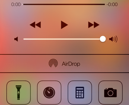
iOS 7 was announced today officially at WWDC 2013, and it brings a lot of visual changes to Apple’s mobile OS, plus a host of new features and functionality as well. The official release is still a few months off, but one enterprising developer, Brian Roizen, has posted a fairly extensive collection of screenshots from the new beta out today. The screens really just show a close-up view of what Apple demoed on stage, but they’re definitely worth a look if you want a better idea of the coming changes.
As you can see, simplified style and indeed, “flat” design are the hallmarks of the new OS, even if there are still some remnants of so-called skeumorphic design, like the paper texture in the notes app. The new multitasking tray looks to be a massive improvement over what we’ve seen in the past, and the Command Center is infinitely more useful looking than the limited access to some settings you get now with the bottom tray accessible via double-click.
Overall, the OS looks like a much more modern and clean experience that the current version of iOS based on these screens, especially when it comes to some of the core apps like Calendar, Email and Safari, which have all been reduced down to their basic essences and feature far fewer distracting design flourishes. I’m curious to see how some areas where they’ve added more information, like with the new Notification panel, with its “today,” “all,” and “missed” panes will change the experience for what’s essentially supposed to be at-a-glance triage material, however.
We’re still quite a ways off from the general consumer release of iOS 7 this fall, and a lot can change over a few months, but expect the overall look and feel of what arrives then to be very much the same as is depicted in these early shots. It’s a dramatic change, to be sure, but it’ll be interesting to see how general users react to the shift.


