Editor’s note: Kevin Marks is VP of Open Cloud Standards at Salesforce.com, and a host and co-founder of TummelVision.tv. Over the last 20 years he’s moved between giant companies and founding startups – BBC, The UK MultiMedia Corporation, Apple QuickTime, Technorati, Google, BT. He is one of the driving forces behind microformats.org, activitystrea.ms and portablecontacts.net. Follow him on Twitter @kevinmarks.
As someone who uses both Android and iOS regularly, I’m getting increasingly frustrated by fragmentation. However it’s not on my Android devices I see this, but rather on the iOS ones.
I install a popular, well-funded application like Instagram, Flickr or Circa on my iPad, but when I launch it, three-fourths of the screen is black bars, with a teensy little app in the middle. Or I can choose to scale it up without smoothing, so jagged pixels I haven’t seen since the 1990s reinforce the sense that I am doing something wrong by attempting to run the app. Every affordance is pushing back at me saying I’m doing it wrong.
By contrast, on Android, applications scale up to fill the space sensibly — buttons stay button-sized, text and image areas expand well. Developers can add alternative layouts to better handle varying sizes, but if they don’t, things remain legible and touchable.
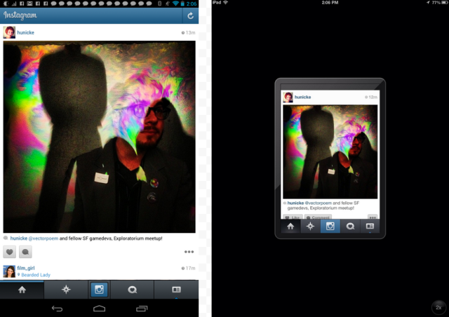
On the Android Nexus 7 (left), Instagram looks great. On iPad, Instagram looks like a Victorian death notice.
One Hand Or On Your Knees?
More pernicious is the artificial dichotomy into which the iOS world leads our design thinking. You’re either on the held-in-one-hand phone, briefly standing somewhere, or you’re sitting down in the evening using your iPad (so big and heavy that you have to rest it on your knees — Steve Jobs even brought out a sofa to sit on at the launch). This false “mobile versus desktop” dichotomy even misled Mark Zuckerberg when he said “iPad’s not mobile, it’s a computer.” and at the Facebook Home Launch, a tablet version was said to be “months away,” though a working version was hacked together by outside programmers within days.
Meanwhile, nobody told Barnes & Noble, whose 7-inch Nook did so well that Amazon launched a Kindle range the same size, leading to the lovely Nexus 7 from Google and finally to the iPad Mini from Apple. This is the form factor, tested for years by paperback books, that makes one-handed long form reading comfortable. If you spend any time on public transit, being able to read standing up or in narrow bus seats is an obvious benefit. But the hermetically sealed company-coach commuters at Apple missed this for years.
Steve Jobs even said you’d have to file down your fingers to use it. The thing is, on iOS it does feel like that. The iPad sized apps have too-small buttons, the iPhone ones are too big if zoomed. There is no way for an app to know how big your finger is compared to the screen, let alone a website.
The supposed advantage of iOS is fewer sizes to design for, but now you need 12 different layouts to cope with the horizontal and vertical orientations of each device, and the general layout tools don’t handle this as well as Android, requiring complex updates. Chiu-Ki Chan explains the pain, whereas Android Studio just made this even easier for developers.
No App Is An Island
The other fragmentation problem on iOS are the missing links. Not in the evolutionary sense, but the ability to readily connect between applications using URLs, as we’re used to doing on the web. Applications can’t claim parts of a URL, only a whole scheme. As Apple says:
If more than one third-party app registers to handle the same URL scheme, there is currently no process for determining which app will be given that scheme.
On Android, any app can claim any scheme, host and path, and the OS will resolve as appropriate, giving you a choice if more than one possibility is available.
On iOS, each app ends up embedding webviews inside it rather than linking to a browser, fragmenting your web history. I have to remember whether I got to the page via Twitter, or Facebook or email to go back to it later on, and I only get to share it to the iOS-approved places, Twitter, Facebook, email or iMessage. On Android, any installed app that can handle that type of media is an option to share to, or create a photo, make a phone call, any of hundreds of “intents” that act as bridges between apps and, through browsers, the web.
This means that Android apps don’t end up doing everything, but hand off to each other as needed, meaning that you can replace any function cleanly across apps. Better keyboards are the obvious example here, but camera apps, browsers, and SMS apps can drop themselves in, with the choice made by the user.
On iOS, you have to explicitly link to the scheme, which is per-app. Ironically, this means that Google (or Facebook) can release a set of iOS apps that connect to each other preferentially, leaving the Apple applications out of the loop. But it also makes it harder for developers to specialize in doing one thing well and linking to the rest.
What Of The Web?
The other pernicious influence of iOS fragmentation has been the rise of the mobile-only site: the “m.” layout that was tuned for iPhone use, then slightly adapted for other mobile users, often giving rise to farcical single-column layouts with huge whitespace on tablets. In the early iOS days this was a bonus, as it encouraged function-first design without the organisation-chart-inspired cruft around the edges that websites accumulate over time. As the effective resolution of mobile devices has increased, now often exceeding what is available on desktops, the assumptions that drove mobile-specific sites are breaking down.
Now that Android is the dominant operating system, Google is getting serious about it as a web platform, too, which is very welcome. The Android browser was installed as part of the OS and didn’t get upgraded over time. This has changed, with Chrome now the default Android browser, and it is on a regular update pipeline like Desktop Chrome and Firefox. iOS’s Safari updates are frequent too now, and Microsoft is now pleading with developers to give them modern web apps.
Truly responsive design has succeeded mobile-first as the best choice for websites, and we’re seeing this spread as browsers converge on HTML5 features. What this means is that the web platform is now evolving rapidly, without any one browser provider being a bottleneck. The installed base for SVG passed Flash a while back, and even Adobe is now backing the web fully, bringing its design know-how to HTML5 features such as regions and exclusions. Also in the pipeline for HTML5 is browser-to-browser audio, video and text chat via WebRTC.
Hoping Apple Continues The Revolution
This web platform revolution was catalysed by Apple with WebKit and Mozilla with Firefox, and picked up by Google, Microsoft, Adobe and others. We now have a Browser Battle to be more standards-compliant and consistent, rather than a Browser War to be different and proprietary. What I’ll be hoping for from Apple at this week’s WWDC is a clear recognition of these design lacunae and new and better ways for developers to succeed both with native apps and on the web.