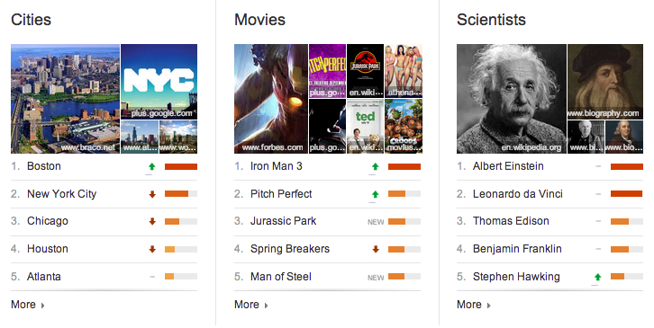
Every year Google creates a summary Zeitgeist feature to sum up the year in search data, showing what has been the most popular among its users. Now, it’s rolling out Top Charts, a new monthly series of lists similar to that year-end feature, available on Google Trends as of today. It’s built on Google’s Knowledge Graph, and provides a representation of the actual things people are interested in, rather than just keywords alone.
The charts are broken down in broad categories, and include lists of things like actors, animals, whiskeys, TV shows, space objects and medications just to name a few. The charts display a top five in the main page view, with a relative rating indicated by a colored bar, as well as arrows to indicate whether the items on that list have gone up or down since the last monthly period. You can drill down to see a full list of 10 items, as well as a brief description of each, its peak ranking and the total time it has appeared on the charts. They’re also embeddable, as you can see below.
There are more than 40 Top Charts in total, and that’s not all Google has shown off today. There’s also a very cool animated visualized of the top trending search terms, which indicates what’s being actively searched for at this very moment, with a colorful background and smooth animated transitions. This tool is customizable as well, so you can view up to 25 searches at a time and set it for different regions.
Finally the Trends home page displays elements of each of these, with a hot search term list, and ranking indicators that show popularity over time and by geography for different terms. The changes are not huge, but they do provide some useful data on a more frequent basis than we’ve seen before, which can help people identify what people are interested in, useful for media organizations targeting their content, for instance, or for anyone curious about the pulse of the world’s Googling population.