Google+, the social layer that Google introduced almost two years ago, has evolved quite a bit since its launch. Today, the company announced a complete redesign, taking cues from the mobile experience that has drawn positive feedback from those who don’t even use the service. In total, Google has launched 41 new features for Google+, including a completely revamped Photo product, Hangouts app and the stream that people interact with on a daily basis.
There are currently 390M monthly active users over the web and 190M directly on the stream.
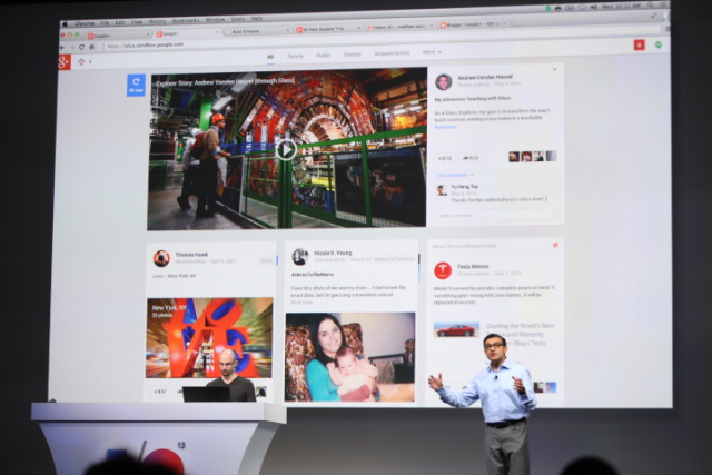
The stream changes will be familiar to Google+ users on iOS and Android, but have a few new wrinkles. The first noticeable item is the stream, which has been given the three-column treatment that the iPad version of the service presents so well. This is a huge departure from the Twitter and Facebook feed approach, which presents everything in one column. The multi-column design lets you scan items quicker, rather than scrolling endlessly for something to interact with.
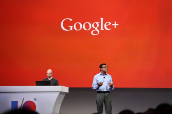
I sat down with Vic Gundotra, Senior Vice President of Engineering at Google, and he walked me through some of the new features. He was quick to point out that Google’s new approach to “feeds” will bring more attention to content:
We’re fixing a longstanding problem with these feeds, they’re flat. Other sites let you scroll through posts that have been shared with you. You can’t go through and read on more topics. You can’t go deeper on an interest on topic.
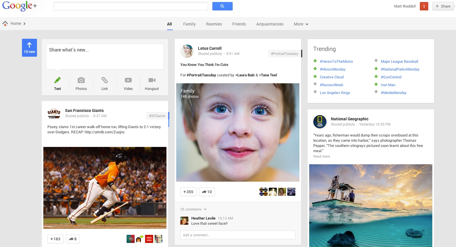
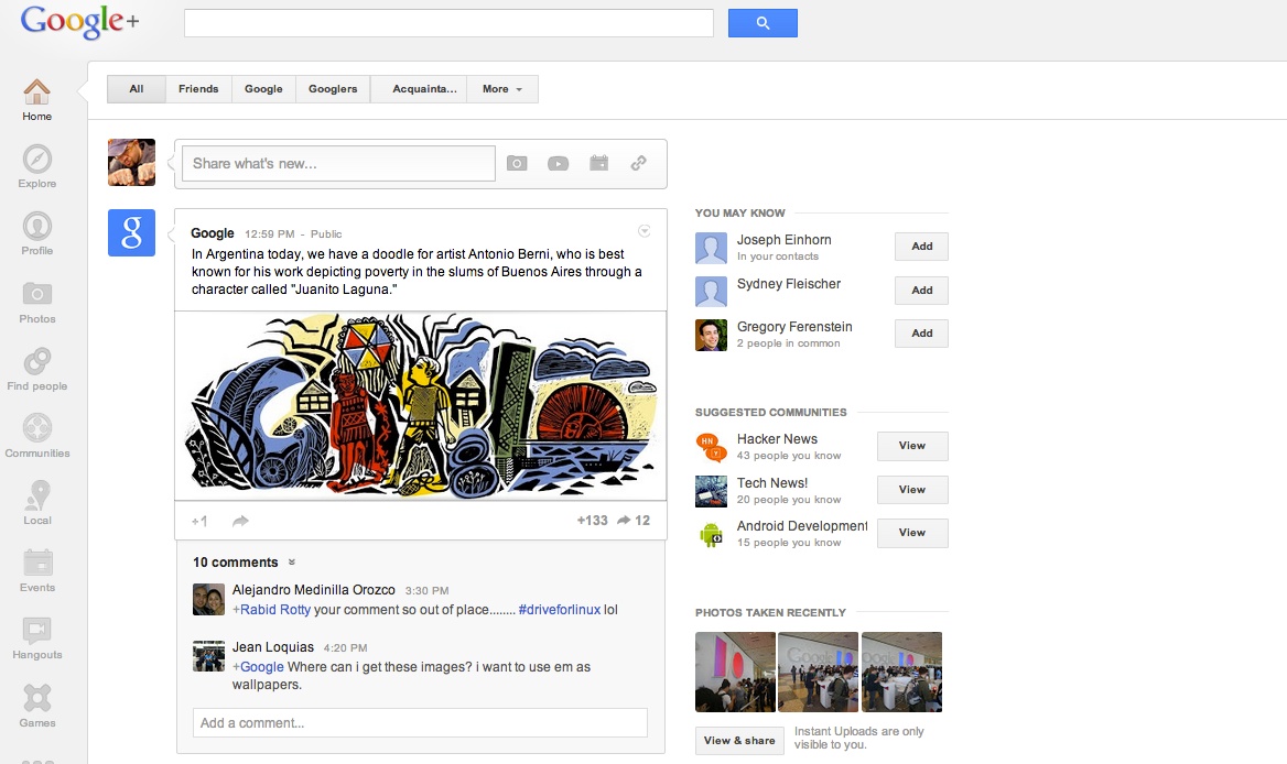
Just in case you haven’t used Google+ at all, or want to see the quick contrast between the two designs, here’s what the stream looked like before today, complete with that awkward white space on the right:
The toolbar has been simplified, looking like the toolbar you see on search and every other property. The days of static left-hand navigation is gone, and good riddance. It only comes up when you need it by hovering over the “Home” button.
You’ll also notice that pieces of content in the stream stand out much more, and that’s because they’re interactive “Cards” a la Google Now. One of the new features of Google+ is that whenever you post a new piece of content, it will automatically get a hashtag. You can remove it if you like, but Google’s massive processing power goes to work to try and categorize all of the content being shared:
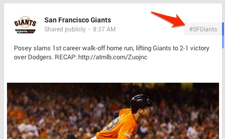
When you click the hashtag, the “card” will flip around to help you discover similar content. In the example of the Giants post, Gundotra showed me that Google automatically figured out that the post was about Buster Posey, since the company has deployed its photo-recognition technology on posted items. The image shared with the Giants post is of Buster Posey, naturally. By not taking you to a new stream of content when clicking around, Gundotra says that the context of what you’re interested in learning more about is preserved.
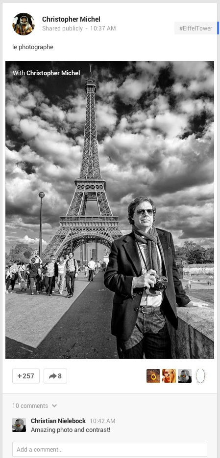
Another example of this automatic categorization is this picture of the Eiffel Tower. Gundotra explained that even though there was no text within the post that stated the origin of the photo, Google was able to figure out what it was, thus giving it the hashtag #EiffelTower. Greyed out hashtags are the ones automatically assigned by Google, and blue ones are the ones added by the sharer themselves:
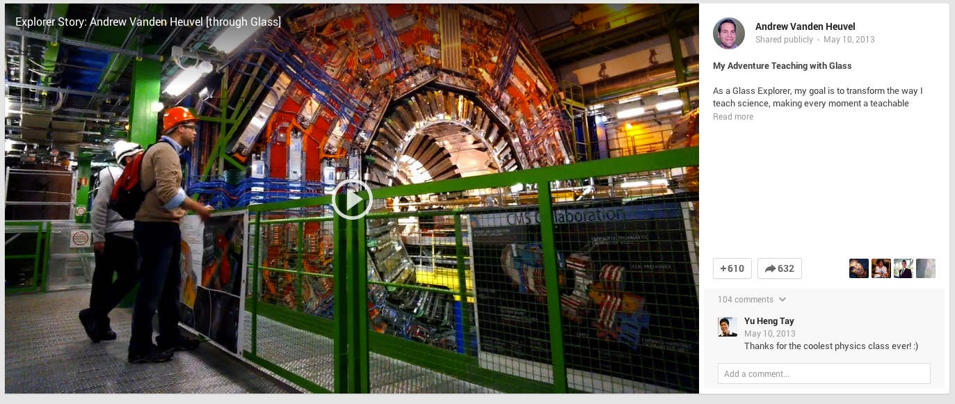
For content like photos and videos, they will get the same treatment that they do on mobile, which is spread across multiple columns:
There are other interactive animations, like a bounce when you share someone’s post. Again, these are things that the Google+ mobile apps do well, and it’s meant to get you more engaged within the stream. I’m not sure if an animation will do that for me, but it’s fun the first few times that you see it.
From what I can gather, Google wants you spend more time consuming information and less time navigating a site. This new look, including Google’s favorite new font, Robot, fits in with the design of most of Google’s other products. This familiarity will encourage people to pay more attention to the content, but not necessarily share more.
Some of what Gundotra said about this new approach to a stream makes sense. When you use Facebook’s newly redesigned News Feed, you’re still shown a single column of items, allowing you to switch between content types. While that might work on a smartphone, it might not be the best use of real estate for the desktop. At least, that’s what Google is betting on with this overhaul.