Scoop.it launched last November to give anyone and everyone the ability to create their own digital magazines — to aggregate and distribute content from across ye olde Internets according to their particular interests — not unlike Pressly or OnSwipe. In December, the startup released its first mobile app and has since been adding integrations with services like Hootsuite, SlideShare and Buffer to expand its reach into social media marketing.
As Steve wrote in September, through these integrations, Scoop.it now offers users the ability to optimize their presence on social media by allowing them to time-shift or schedule tweets, posts and updates while they curate their topic-based news items.
Aside from these integrations, Scoop.it has remained fairly quiet over the last year. But, today, the startup finally peeled back the curtain on what it’s been working on: An all-new, redesigned version of its news curation platform that aims to enhance its user experience through cleaner design, more customization and a greater focus on businesses and professional publishers looking to improve their visibility on the Web and on social media.
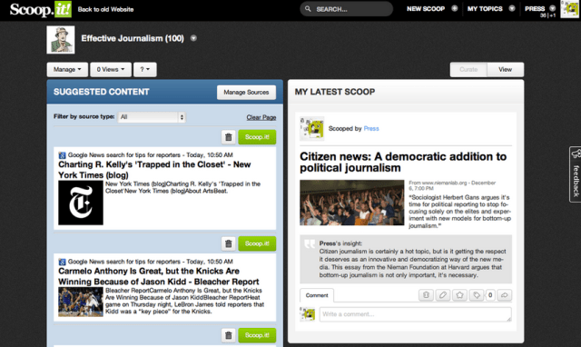
Beyond its new UI, the redesign’s biggest addition is a customization feature called “Insight,” which allows users to quickly personalize any article, image or video they post by adding their own commentary. The new tool was designed, the company says, to draw attention to the user’s unique voice and perspective.
This means that, rather than being able to simply comment on a piece of content, Scoop.it highlights users’ personal commentary, allowing them to customize the presentation through a WYSIYG-esque editor, add and edit images, edit its layout and give context to their commentary.
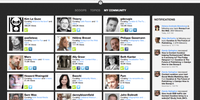
Scoop.it has also added more robust social integration, allowing users to sign in via LinkedIn and to view their social connections on Twitter, Facebook and LI to see which topics they’re currently creating. Users can also take advantage of its new notification functionality, which aims to encourage social-graph-based discovery while providing more accessible, realtime updates on users’ communities. These notifications are presented in a Facebook-like ticker stream and are now permanently hosted on users’ webpages.
With its new redesign, Scoop.it has gone to great lengths to create an environment that makes it easier for users to be discovered by relevant audiences — by those with similar interests — and boost their own brand by offering a much-improved social media publishing format. Its redesigned user interface significantly improves readability and adds critical support for larger, higher-res images.
Since its public launch in November 2011, Scoop.it has grown steadily and now sees over five million unique visitors each month and is averaging 1,500 new sign-ups each day. With its new rollout, the startup is looking to not only to accelerate this growth with better user experience but to monetize more aggressively through its paid services, which offer advanced analytics, customizable pages, post-scheduling and WordPress integration, among other things.
A better UI leads to more retention and loyalty for its public services, in turn providing it with more opportunities to up-sell customers on its premium offerings.
For more, find Scoop.it at home here.


