Google users in the U.S. may have other things on their mind today – like the need for a bit of last-minute candidate research, for example, or searches to find out where the heck their polling place is, perhaps – but that hasn’t stopped some users from noticing changes to Google’s navigation, too. Today, we’ve received tips, we’ve seen tweets, and we’ve even seen the changes ourselves: on Google’s search engine results pages, the navigation which used to be on the left side has now been moved to the top.
This includes Google’s various search verticals, like News, Images, Maps, Shopping and “More,” which is where News, Books, and other sections are hidden. And it also includes Google’s Search Tools, which let you filter searches by time frame or result type, or sort them differently, if you choose.
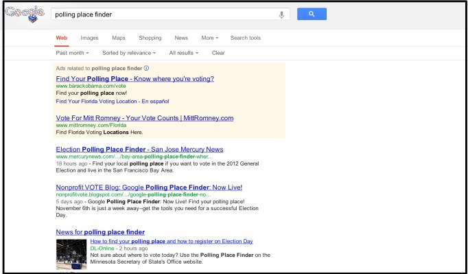
If you’re not seeing the change yourself, that’s not a surprise – this is likely just a bucket test taking place. We can say that with some certainty because in many cases, Google’s sidebar ads are gone, too. (If only!) Below are some screenshots of what the changes look like, in case you’re not in the test group and are curious what people are talking about today. You’ll notice that some users actually do see the ads, while others do not, which is further indication that this is only a test – as is the doubled navigation thanks to the ever-present black bar. (We’ve asked Google for more details, but the company has yet to respond).
Update: Well! So much for calling it a bucket test. It’s the new, new thing, says Google. The reason why only some users are seeing this is because the rollout is beginning in the U.S., and hasn’t yet reached all Google users worldwide. And those missing sidebar ads? Making way for more Knowledge Graph results, it seems.
This isn’t the first time Google has experimented with changes to its navigation, by any means. Like Facebook, Google often performs tests where a subsection of users will temporarily see some updated user interface which presents various Google elements in new ways. Google uses data from tests like this to determine if it should make any of the changes the new default for its users.
As for what people think, of the cleaner, more minimalistic Google? So far, reviews are mixed. (Is “looks so Bing” a compliment, I wonder?)
Thanks tipsters, Twitter