Veteran content discovery platform StumbleUpon has had a rough go of it over the last six months. In order to keep pace with sexy, young newcomers like Pinterest, StumbleUpon pushed a major redesign at the end of last year, introducing a new user experience and recommendation algorithms, as well as brand channels and a “Stumble” button, which took users to random (personalized) articles based on topic. Users didn’t love the new rendition, and last week, the 10-year-old company released another big redesign — this time bringing a bold new look to its iOS apps.
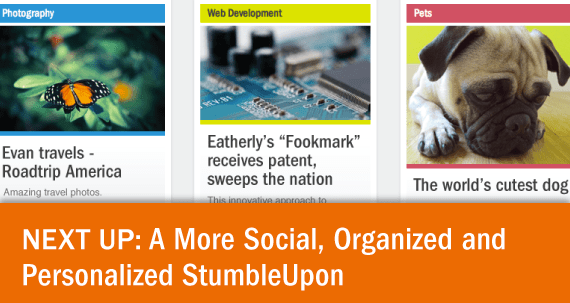
Today, StumbleUpon’s morph continues, as the company has unveiled “a re-imagined Stumbleupon.com in beta,” which brings the new design and user experience of its iOS apps to the web. According to StumbleUpon’s new VP of Product Cody Simms the redesign is indicative of a new focus for StumbleUpon (and a new strategy going forward), which is meant to give users a stronger personal identity on the site, along with better ways to discover (or “stumble” upon) interesting content and see what others are viewing and sharing.
Taking a cue from the impossible-to-ignore success of Facebook, Twitter, and Pinterest, the company declared in its announcement that “social discovery [now] is at the heart of StumbleUpon.” As such, the redesign intends to make it easier for users to see what people are stumbling, liking and sharing, with a new feature called “Activity.” It lets users Stumble the pages their friends have recently liked, commented on, or shared to Facebook and Twitter.
Therein users can see pages recommended by StumbleUpon “experts,” or those who have good track records for discovering and rating content within specific topics or categories. On top of this, StumbleUpon is getting a new “Trending” page, which is as you would expect — a place to find the content that’s blowing up across the site.

The other big part of StumbleUpon’s new direction is its incorporation of lists, through a feature that enables users to put their “Likes” into collections they can either share with friends or keep private. List creation is obviously not novel in the big picture by any means being a function that’s native to many of our favorite productivity tools. So, with StumbleUpon now offering users the ability to save pages for later (or “gifts you’d like to receive or photos of places you’d like to visit”) and follow other people’s lists, what familiar experience does this sound like?
Both in terms of user experience and design, StumbleUpon has come to resemble Pinterest in quite a few noticeable ways: Lists are going to become central to the user experience. Simms said that this feature will be rolled out across StumbleUpon’s platforms.
That being said, the company is smart in the way it’s going after something deeper than just being an aimless content recommendation engine or pin, ahem, stumble board. StumbleUpon wants to show us who we are based on the content we consume. It is doing so with its StumbleDNA, which puts every like and every share into an Interest category. You might be 23 percent tech, 13 percent sports and 47 percent outdoors, for example.
This will help StumbleUpon recommend content that’s more likely to get you excited, and it sets the table for a lot of big-picture demographic info that will certainly be of interest to advertisers, content producers, and more. Smart or creepy, depending on where you sit.
StumbleUpon’s new direction is obviously meant to bring new life back to the site, and the platform now contains a lot of elements that have been successful elsewhere. And there’s no reason they can’t be successful under the StumbleUpon banner, as well. It’s a baby step toward a new model of content exploration, one that will go beyond articles and be decidedly cross-platform, which is likely the reason why the company now seems to be letting its mobile experience set the tone for what users see online.
More in StumbleUpon’s blog post here. New site here.
