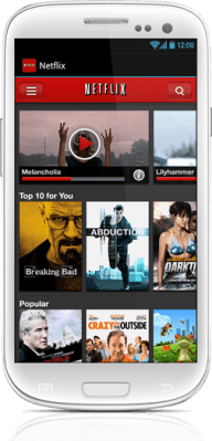
A week after Netflix debuted its new iPhone application, just in time for the iPhone 5 launch, the company is today announcing it has brought a similar updated experience to users of Android devices. The new application offers an interface that’s closer to what the Netflix app looks like on tablets, and, like the iPhone update, it also includes a new browse screen which lets you scroll through more titles than before, plus tweaks to the homescreen layout, and a search function accessible anywhere in the application.
At the top of the new interface, a row of larger windows appear, allowing you to continue watching whatever TV shows or movies you had been previously viewing, even if you started doing so on other devices. The Instant Queue is above your personal top 10 list and below that are more rows of personalized recommendations. There are more categories in the Browse menu now, and, for families with children, parents will have an easier way to quickly shut junior up find shows to occupy their kids with many titles organized by age.
The new interface is also more touch-friendly: to view information about a movie, you tap once and to start playing the title, you tap twice, again the same as on the new iPhone update. And finally, as noted above, the search box is now available throughout the application which will make it easier to find things to watch, even if you’ve navigated deeper into the content screens.
The update is available for Android 2.3 (Gingerbread) and higher, and is rolling out now in Google Play.