The Twitter-owned Tweetdeck application is being refreshed today, following a series of changes to the Twitter platform over the past couple of weeks, which have touched on everything from search and discovery, to a revamped mobile presence, and even included the introduction of a new icon. The Tweetdeck update, fortunately for Twitter’s power users, hasn’t been so much revamped as it has been tweaked, however. Twitter is promising a “swifter” experience with the new version, available today on Windows, Mac and Chrome.
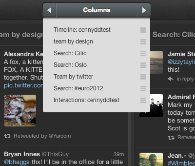
The features first debuted on the web version of Tweetdeck (web.tweetdeck.com), so they’re not entirely new. Columns have now been arranged in a continuous row, so you can scroll through them with the scrollbar, and you can scroll several columns over at a time by clicking arrows on the “Columns” button on the top of the toolbar. You can also click that button to reveal the full list of available columns and switch over immediately.
That last feature will be really handy for those of us list creators (raises hand) who have infrequently-accessed lists that disappeared off the far edges of the screen before; now you can just click to make them appear as need be. The same interface offers a drag-and-drop element for arranging columns, too.
Also new is a menu icon that lets you quickly get to other Tweet actions beyond the reply, favorite and retweet, and do other things like follow, DM, remove from lists, get the link to the tweet, email the tweet or delete.
Overall, not radical changes (whew), just little tweaks that make the Tweetdeck a more usable desktop or web app client for those who prefer a bit more complexity.


