Just yesterday, I finally moved the Google+ iPhone app atrocity to the back screen of my iPhone, and then the company goes out and does this. It makes the darned thing all pretty with a fresh update. And maybe even more usable? (I can’t confirm this as the update has somehow not hit my iPhone’s “Updates” section, but early reports are saying nice things).
If you’re at all familiar with Google’s previous iOS developments, you’ll remember how the Google+ iPhone app was a dog to use. I couldn’t even scroll through long comment threads with the screen locking up. Plus, it regularly crashed. And it kept pinging me with updates every time someone “Circled” me…although, apparently, that last one was by design.
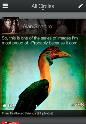
Today’s update, then, is at least promising. Everything has been overhauled, UI-wise, including fonts, photos, the homescreen, visual elements, gradients – you name it. Perusing the screenshots, I’m actually going to give this one a shot, if only to see how well the Google iOS devs and designers have been sharpening their skills.
Google even promises a more “fast and fluid” experience, with specific tweaks that see “conversations fall into view as you move forward and backward in time, optical cues (like parallax) help the mind linger on individual posts,” and “important actions like +1 now float atop the stream, making it easy to endorse all your favorites.” Um, neat – but you had me at “fast.” I mean, really, I’d like to see that.
More concerning is the Google blog post announcing the update. It seems they’ve begun spiking the G+ Kool-Aid over there something fierce. Because who can seriously write lines like this, if not just a wee bit drunk?
“Sharing is deeply sensory. From cooking a favorite meal to getting together with friends, it’s the smells and the stories and the smiles that make human connections so essential.”
Either I’m missing the part about the G+’s app’s new smell-o-vision feature, or Vic Gundotra is just getting a little crazy. (Or hired a sub-par ghost writer, I suppose?).
Another gem from the blog post?
“Full-bleed photos and videos are cool. But you know what’s really cool? Content so immersive it remakes your mobile device into a rich carousel of beloved memories and breaking news.”
You know what’s really cool? Not stealing famous lines from the Facebook movie to promote your wannabe social network. Especially when there’s another movie line that’s so much more applicable.
Something else that’s strange: Why wasn’t the Android app overhauled, too?