When last I met with Craig Muth it was in lovely Columbus, Ohio and he was a down-to-earth hacker working on memorize.com, a site dedicated to making the world a better place. Clearly a useful and noble pursuit. Craig moved to San Francisco a while back, and just sent me an email with details of his latest project: a space-saving font he’s calling dotsies.
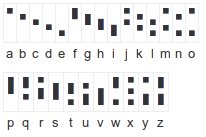
Dotsies characters are built from five dots which can be on or off. Capital letters are signified with a little dot above the glyph. This allows each character to consume only a single vertical row, making it essentially the perfect monospace font. At this time, dotsies is primarily for the 26 characters of the English alphabet. As Craig observes on the dotsies website, the dotsies font “is significantly more horizontally condensed than normal fonts, letting about twice as much fall within the area of your field of vision that perceives fine detail at any given time.”

The website goes on:
Since Latin letters (a, b, c, etc.) are optimized to be written by hand, they take up a lot of unnecessary space. Your eyes have to move at a frantic pace from left to right to read. Use screen space more efficiently! Have a more relaxed reading experience!
Craziness! I asked Craig how long this took him, and how many iterations he went through to develop dotsies. He claims he’s been nurturing this idea for the better part of a decade, though only just recently put much effort into it. Of the eight or so revisions he’s gone through only two or three are what Craig would call “major revisions”. He claims to be able to read dotsies-formatted text at about 150 words per minute, which is pretty darned respectable.
Craig admitted that this is primarily for writing online, though it can be manually reproduced with a slightly higher margin of error.
Not content with simply improving the information density of fonts, Craig’s also developed a chorded input method for dotsies. This allows the entire alphabet to be typed using only one hand. The dotsies typing instructions make it pretty clear how this saves time and effort: “each finger never moves off of a dedicated number key (your middle finger never moves off of the ‘3’ key, etc.).” Two-handed chorded input is also supported for even faster text entry.
Now don’t get me wrong: I’m all for innovation. And I’m all for people looking to advance the state of the art. I’m no greybeard staunchly holding on to my Dvorak keyboard layout as the one true input mechanism despite the advent of post-PC computing. But I wonder whether a new text encoding format like dotsies is really what we need?
Does it make sense to even continue to concatenate individual character symbols to compose complex concepts like “computer” or “fire-breathing dragon” or “baby in a stroller”? Should we perhaps skip characters and move straight (back) to hieroglyphics or Stephensonian mediaglyphs?
Keep up the crazy innovation, Craig! It’s guys like you who aren’t afraid to push the status quo that make the world better for the rest of us.