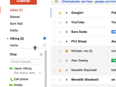
Google is rolling out a new design for Gmail over the next few days. It features more white space, less clutter, threaded conversations, new themes, and better search.
Messages aren’t as bunched up as before and easier to read. Adding a social element, Google is adding profile pictures beside each message, and the labels pop out more. The density of the text also adjusts depending on your screen size and resolution, making it easier on the eyes. The new design is in line with some of the changes Google just made to Google Reader in terms of spacing and overall feel.
Conversations are more threaded than before, not just lumped together, so you can actually follow the back and forth. Gmail is also prettying itself up with a host of new themes with background images from iStockPhoto. It is not clear what, if any, G+ integrations there will be.
But one of the biggest changes is the search UI. When you begin typing in the email search box a window pops up with advanced search options to help you refine your search by recipient, sender, subject line, date range, and so on. I think I still prefer the single box and let Google figure out what I mean, but I’ve noticed that it is getting more and more difficult to find emails. (Having more than 200,000 unread emails probably doesn’t help). Getting those advanced search options without having to click to another page might do the trick. I hope.
Google has shown previews of this before and the video below leaked out a couple weeks ago, but is no longer blocked.