Looks like Google this morning rolled out a brand new design for its Chrome Web Store, and it’s a major improvement.
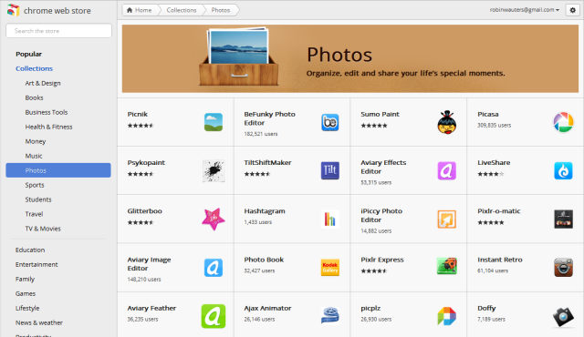
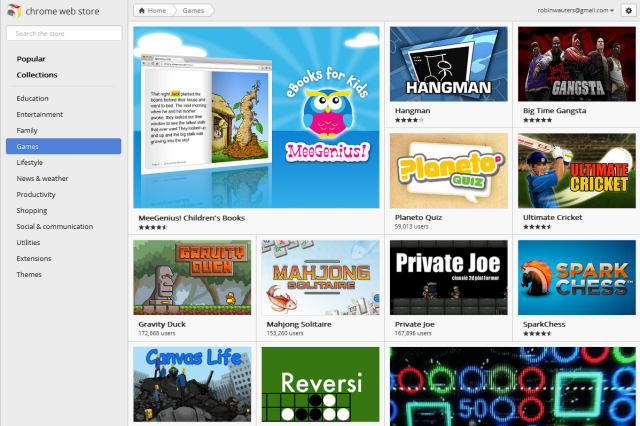
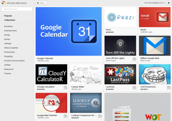
The updated Web app marketplace, first released in December 2010, is all about the software, now boasting large squares with attractive app visuals.
On mouse-over, users get a bit more information about the apps, and a one-click install option.
Also worth noting: the menu is now entirely on the left-hand side and is fixed even when scrolling, and Extensions and Themes are no longer highlighted as different sections but rather just navigational items at the end of the list. Also gone is any mention of ‘paid apps’.
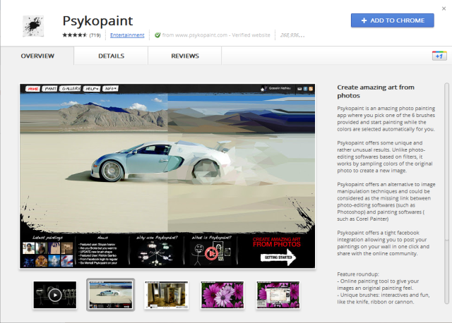
When you click a category or an ‘app collection’, you get a more visually pleasing overview of popular Web applications than was the case before, and the app detail pages have also been redesigned featuring a summary, screenshots and videos to promote the app, and tabs you can open to get more details or reviews about the software. There’s also the obligatory +1 button, of course.
Wikipedia has a screenshot that shows how it looked before, if you want to compare.
(Thanks to Saif AL Essai for the heads up)


http://twitter.com/#!/filipmares/status/128715333975539713
