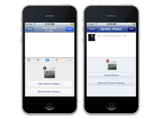
Because this reminds me of that time when Facebook unveiled that the Facebook Places logo was, no joke, a “4” in a square, I’m just going to copy the intro sentence to that post:
On the right is the status and photo update interface for Facebook’s iOS app, updated to a 3.5 version yesterday. On the left is the iOS interface for the current leader in the status update space Twitter. Notice anything interesting?
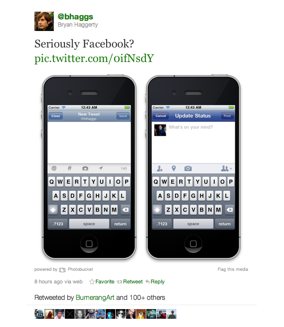
Sure you say, a standard mobile status update box isn’t exactly a UI opus. But it’s the little things, like how the people tagging icons are in exactly the same place on both apps, that matter. Also, this is what the Facebook iPhone status update interface looked like before the 3.5 version.
Heh.
Apparently I’m not the only one who sees the resemblance between the two, as Twitter mobile designer Bryan Haggerty has tweeted out comparative screencaps of both, with the comments, “Seriously Facebook?” and “Okay Facebook, enough with the flattery.”
Interestingly enough, Haggerty used to work on the mobile team at LinkedIn, which, coincidently, was at some point itself on the receiving end of claims that it had copied Facebook’s iPhone app interface.
What goes around comes around.


