 YouTube has just unveiled an experimental new redesign called Project Panda, and it’s looking good. You can activate the redesign right here (and if you don’t like it, you can disable it from YouTube’s Test Tube control panel).
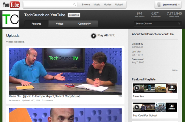
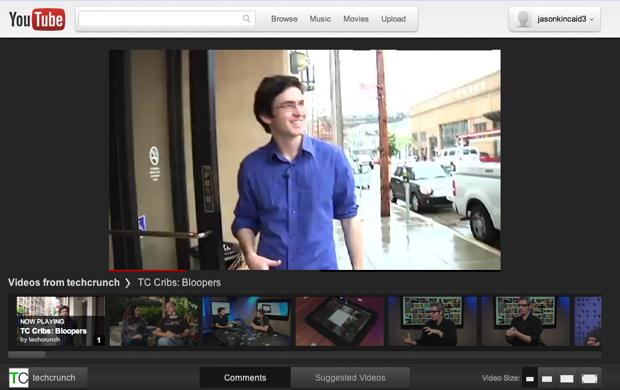
Some initial impressions: The new design makes significant changes to the way playlists are presented, moving them in some cases from a sidebar to a scrolling horizontal bar of thumbnails just beneath the video you’re watching (it reminds me a little of YouTube’s LeanBack). The video player now has a darker theme that looks more polished, and there’s a dark background behind the player that highlights the content you’re viewing. And channel pages look a lot nicer, with big, wide images for each video.
Here’s how YouTube is describing the project:
So what the heck is Cosmic Panda?
We’re always trying out new things here at the Tube and Cosmic Panda is our way of letting you in on some of the fun.
Here’s what to expect when you follow the cosmic panda over the double rainbow:
- A new experience for watching videos and playlists
- More page designs and better editing tools to customize your channel
- Keep watching when moving between videos, playlists, and channels (Chrome only)
- Stylish new look and feel
- You can always jump back to the YouTube experience you know and love by coming back to this page or visiting TestTube.
The redesign is especially noteworthy because for a long time, YouTube was remarkably ugly for being the world’s most popular video portal — it was noisy, navigation was’t great, and the UI just seemed a bit outdated. Things have gotten a lot better in the last 18 months, though — YouTube announced a revamped ‘Watch’ page in January 2010 that was much cleaner (no more stars!) and has made incremental improvements since then. If it rolls out broadly, Cosmic Panda would be the most significant change yet.