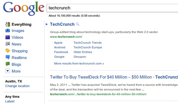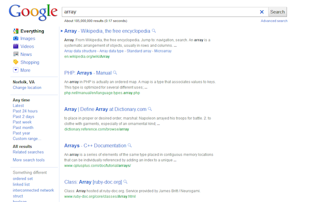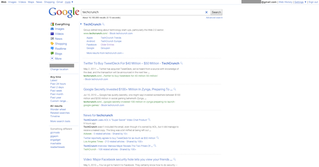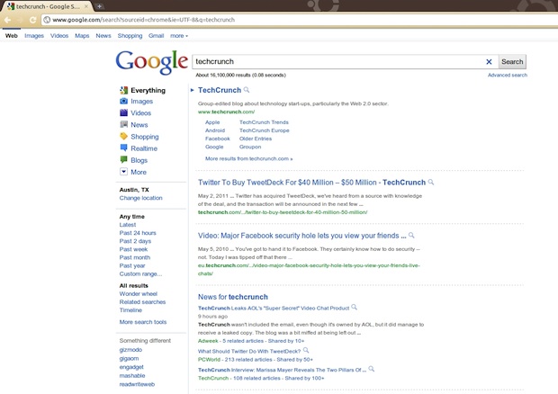
Whoa there tipsters, slow down. We’ve just been bombarded with tips coming our way that Google has rolled out a new-look search results page. Scanning Twitter, it looks like there are in fact a lot of people seeing this. And boy is it ugly.
I mean, it’s great that Google appears to be trying to clean up the look of the results page, which has gotten pretty cluttered over the years as they add more and more types of information and snippets. But the new design is too sparse. And the colors are too soft. It looks like Bing on a bad day.
The weirdest thing about the test is that it actually gives you much less information on the screen. This will require users to do more scrolling and paging through results to find what they’re looking for.
You’ll also notice that main result links are no longer underlined. And each result is separated by dotted lines (though there appears to be a version without the lines too).
Undoubtedly, this is just a bucket test (which Google likes to do quite often), as not all users are seeing this. But this is clearly a big test judging from the number of tips we’re getting and the tweets.
We knew Google was really interested in white space — just not this much.


