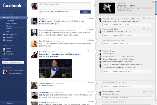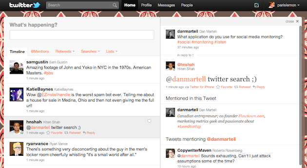
Back in April of this year, I put up a post with a simple question: Why Doesn’t Facebook Look Like This? The post contained screenshots of a Facebook redesign that Japanese design firm iA had done for the company back in late 2006/early 2007. Facebook didn’t end up using the ideas, but there’s no denying that they looked great. In fact, looking over them again, they now look familiar. They look like New Twitter!
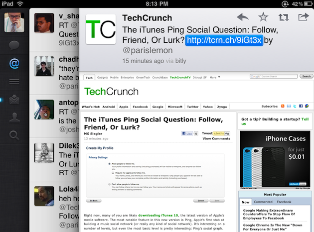
Well, technically, the overall concept is a bit more like Twitter for iPad (with the three-pane view). But that shares many of the same design concepts as New Twitter, so they all sort of look alike. And if you remove the first pane on the Facebook concept, you essentially have New Twitter: a two-pane experience in which the update stream folds out into the conversation stream. It’s uncanny.
Now, I’m not suggesting that Twitter borrowed anything improperly here — I’m sure this pane design concept is quite old — but it’s interesting that Twitter, a Facebook rival, now looks like this popular Facebook redesign concept that was seen the web over. Perhaps that’s why I liked both Twitter for iPad and New Twitter immediately when I saw them — as I wrote back in April, I loved this pane design concept, and wish Facebook would have gone in that direction.
Instead, Twitter did.


