![]()
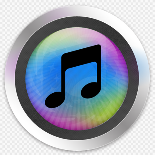
Brendan“I made an iTunes icon for you” Alan Clarke
![]()
Iain “I am better than Steve Jobs because my icons have even more photoshop effects” Henderson
![]()
Kanwa “iTunes10 icon from JAPAN” Nagafuji

Mike “Steve Jobs is colorblind” Potra

Daniel “Steve Jobs has more money than me, but only because I refuse to wear mock turtlenecks” Reneer

EyeTunes (get it?) logo by reader who wanted to remain anonymous.

Dario” iRaptor” Fisher

Claes “vinylTunes 2.0” Kallarsson
![]()
Alessio “I am better than Steve Jobs — Not really” Zito Rossi
Chris“The Replacement”Carlossi
Is it just me or has there been a lot of logo hate going around lately? Apparently hell hath no fury like an armchair graphic designer scorned, if you go by some of the comments on the “Hate The iTunes 10 Logo? Think You Can Do Better?” post. Along with haters doing what they do best (hint: it’s hating) we also got a ton of alternative submissions. Here are ten of the most noteworthy above. And in case you want to switch the current iTunes 10 logo out, here’s how to do it on a Mac and ona PC.
