If you’re a photographer and use a Mac, chances are you’re using Lightroom or Aperture. Probably Lightroom, since Aperture is less popular among pros — and the latest version seems to be an acknowledgment of that. The features added in version 3 are clearly intended to draw casual shooters using iPhoto to the paid image editing honey pot. Since so many of these amazing new features are direct side-loads from iPhoto, it smooths the process and makes the program as a whole more approachable, though whether existing Aperture users will find them helpful is questionable. Brushes, on the other hand, are a welcome addition to any photographer’s toolset, and depending on how dedicated you are, may be worth the price of admission.
Invasion of the iPhoto features
As long as I’ve been using Aperture, I’ve considered it a processing application. Its photo management was troublesome here and there, and iPhoto had the best ways of showing off your shots, but I dealt with it since maintaining two separate libraries of the same photos would be disk space suicide. I’ve only used Lightroom a little bit (and a version or two back) but all my friends say that it just has a better workflow for serious photo work — importing a couple hundred shots, scrubbing through them, doing the necessary adjustments, and outputting to the necessary format. Not that I have trouble doing that in Aperture, but apparently it’s faster and better in Lightroom.
Confronted with such a fearsome opponent, Apple decided that it would be better to flank than to risk a frontal assault. Hence the expansion of Aperture’s incorporation of iPhoto features Faces and Places. I question their relevance in a photo processing application, but given Apple’s tendency towards coalescing functionality, I’m guessing that iPhoto will eventually be Aperture: Gimped Edition, and the only real choice for organizing and messing with large numbers of photos will be Aperture.
There are some kinks to be worked out. Faces plainly doesn’t work. After it spent literally five hours going through my photos (about 1000 per hour), this is what it has come up with:
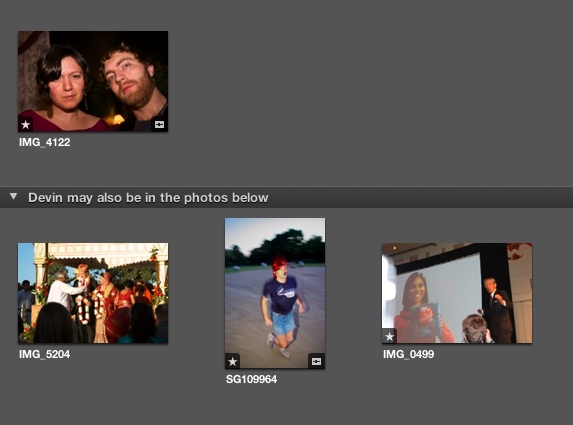
No, it didn’t have a lot to go on (I hadn’t “trained” it much yet) but really now. After giving it a few more pointers on what I looked like, it still mistook a three-year-old tow-headed girl, my friend Monica (who is Indian, and in a wedding dress), some E3 booth babes, and Casio president Kazuo Kashio for pale, bearded, Devin Coldewey. The cork board background is jarring (you can change it but the corny, inefficient “polaroid” interface and font remain) and the interface for going through your shots is terrible. I realize this is a technology still being perfected, and that is why I am wondering: what is it doing in my RAW editing program?
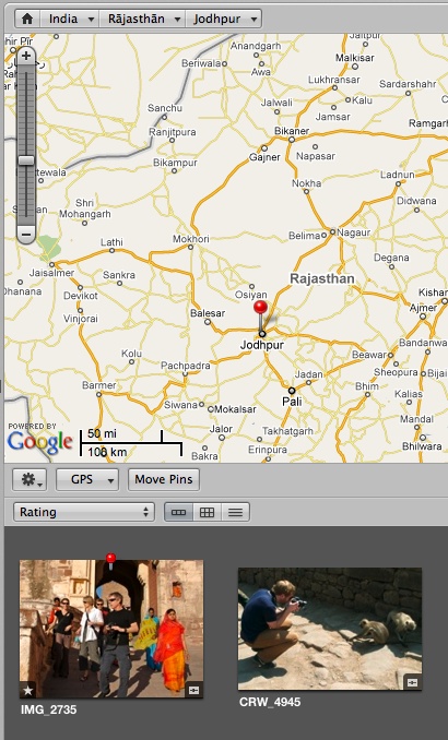 Places is useful if you have a geotagging camera (still rare) or want to spend a few hours dragging and dropping stuff onto the map. It can be fun, actually, if you take a lot of pictures of your friends, and want to drag and drop this or that night onto the location you went to; it’s like creating a different kind of album (“Linda’s Tavern”), and indeed you can make a browsable smart album from locations. If you’re like me, you won’t feel complete until the photos are more or less where they were within the city, and not all grouped in a single pin, smack in the middle of the city. This could have some promise, but with a backlog of several thousand shots, getting a library up to date in Places is a task I wouldn’t wish on my worst enemy.
It’s a mistake to judge Faces and Places by simply saying “well we were fine before them,” because it may just be that we found ways of working in the old system of organization (Project>Folder>Album) that approximated what these new features do. But I don’t think it’s wrong to say they just don’t really do much, and feel out of place to boot. You have to work at them, or shoot for them, in order for them to really be worthwhile. Still I have to give credit where credit’s due: if you just consider Faces and Places new columns to organize by (like rating or date) then they’re worth their salt. As flagship features, though, they’re duds.
Lastly, the slide show thing. It’s like finding a trout in the milk. Not that it doesn’t work — it works as well as iPhoto’s thing, and I suppose it’s better to have than not. It’s just a little weird to have a sort of… aftermarket feature popped in there next to the serious editing tools. Its little presets are, like in most Apple programs, 25% solid, 75% fluff. Who in the name of all that is holy is going to pick “Shatter” as their slide show transition? It’s ghastly.
The new features are very well explained in little videos accessible through the “Welcome” screen, which will be handy for new users — if they can find the screen after they close it (it’s in Help>Welcome to Aperture).
The good stuff
So if the iPhoto features are icing, the actual cake is the RAW editing, adjustment tools, and user interface. Let’s start with what I would say is the best new feature: Brushes.
You can see a pretty thorough overview of the feature at Apple’s site, but the gist is that it allows you to apply certain effects in limited areas using a brush of adjustable size and intensity. That’s great! I can’t count the number of times I’ve vacillated between two versions of a photo where an adjustment necessary for one part ended up blowing out another, or I just wanted to bring out the color in the eyes but not in the background. A lot of fiddling could usually approximate the effect I wanted, but it would be so much easier to just use a brush. I’ll be using the hell out of this feature, and it’s perhaps the only real step Apple took against Adobe in this update.
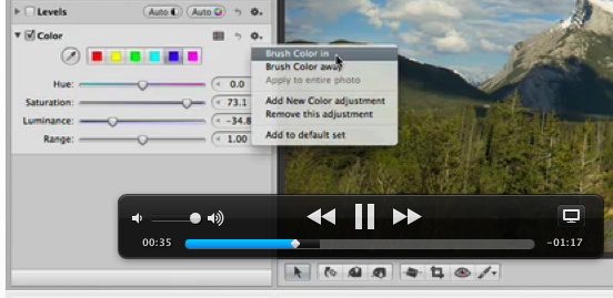
(combination Brushes and Help Video screenshot)
The brushes are non-destructive, like any of the dials and curves you can play with in the adjustments panel, so you can feel free to experiment, layer, and try out different effects. One thing I often have to do when shooting review shots is emphasize the color of LEDs, but if the subject is well-lit, the LEDs are going to be barely visible. No problem; make a little brush, add in a little contrast right there, bump the saturation just in the one area, and boom, it sticks out like a sore thumb. Brushes are useful for lots of little things like that.
The new full-screen browser is handy but not really a revolution. They’ve added the ability to get around your library a little more, which is nice, but it’s not as streamlined as the regular browser, which is always accessible by a single keystroke. The fullscreen presentation has definitely been improved, however, and when showing off photos to friends or clients, it’s a better option than either the plain editing window or a slide show.
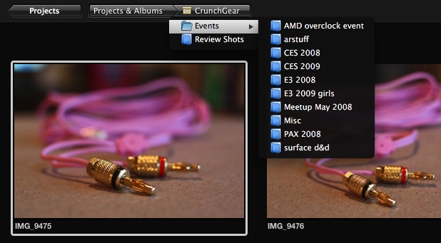
The preset adjustments, I think we can agree, are being blown way out of proportion; Apple’s breathless description sets them up to be quite the killer feature. Unfortunately, these are the same kind of “professional adjustments” that you have been able to apply on cheap point-and-shoots since the beginning of time. There are a few quick adjust things like high-contrast black-and-white or exposure +1 that are nice to have previews for (the live preview window is handy), but let’s be honest, these are just filters. I’d like to be able to say that they’re carefully adjusted so you won’t see weird color effects, blackouts, or blowouts, but the fact is every one I tried looked cheap and overdone. The others, like white balance and so on, seem pretty redundant considering the actual controls for adjusting those aspects are mere pixels away in the same window.
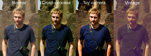
Click to see it larger. You can’t really tell here, since this photo isn’t very high contrast, but in several of the other shots I tried this on, the vintage look was really purple, cross-processing was really green, and toy camera pushed the contrast way too far. Subtle adjustments these are not.
The good news is that people new to the program might try a couple, see that they were created by dragging curves and color bars around, and then make their own. I’ve had my own “base” adjustment for years now, which was just as easily accessible and just as customizable, though limited to a single adjustment category. Putting together a “look” for a shoot using this feature might be easier now than before, but it’s still just a toy at this point.
The ability to have multiple libraries is nice; splitting work and personal stuff would be my move, so that if a meteor crashed into TC HQ (or, more likely, I’m fired for insubordination), I could free up a couple gigs in one clean sweep. It’s also convenient for backing up and sharing; “here’s my whole ‘wedding’ library, feel free to do what you like with it” rather than “here’s a folder full of RAW files.” (Update: my mistake, multiple libraries were already available.)
A quick note

Just a PSA: installation of Aperture 3 took ages. Plan on losing at least a working day to 100% processor usage as it converts your library, searches for Faces, and reprocesses your RAW files with the new profile. I’m not holding this against Apple (it’s a LOT of data to sift through) but it’s just something to be aware of.
Conclusion
Aperture is still a great program, in my opinion, and the budding photographer would be a lot better off with this than with iPhoto if they’re planning on doing anything more than collecting snapshots. I’ve gotten used to Aperture’s workflow and they haven’t changed it much in 3, in fact they’ve provided a couple serious improvements with Brushes and potentially Places and Faces — you know, if you’re into that kind of thing.
The trouble I see is that Aperture, once a rather single-minded program, is being diluted with features that have nothing to do with its core functionality. Why not have a new program, called “Collection” or something, that hooks into all your libraries, allows for creating robust slide shows, exporting directly to Facebook, and all that sort of thing? Putting all this junk into Aperture is doing to it what Apple has done to iTunes: once a sleek and straightforward program, it has now grown bloated beyond comprehension; it’s a bit like seeing a once-great fighter gone to seed. I have more of an attachment to Aperture than to iTunes, but if Aperture 4 continues along the vector indicated by Aperture 3, you can consider me a Lightroom conversion.
Give Aperture 3 a 30-day trial for free here. $199 to buy, $99 to upgrade.
Update: I completely neglected to mention that Aperture 3 also now has full 64-bit support. This means newer macs sporting Snow Leopard and adequate hardware should get a sweet performance boost.
Also: wow, guys. Take it easy. I didn’t insult your children. I’m not sure where I suggested that Aperture is the worst app ever made, or attempted to do anything other than hit the major new features and give what can really only be my first impressions, having used Aperture for a couple years but A3 only having been out for a month. What can I say? The core functionality is unchanged, and I feel half the new features are specious, suggesting the feature creep that has characterized Apple applications in the last few years.

