
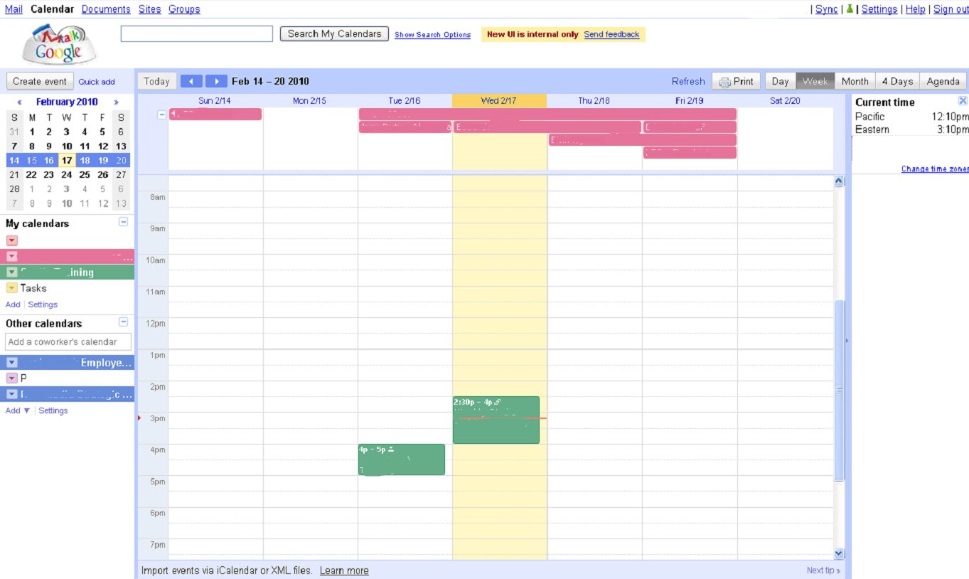
 Google Calendar may not be the sexiest product Google offers, but, as with Gmail, there are plenty of people who use it to manage their business and personal lives (and wind up staring at it for hours each week as a result). Today, we’ve gotten our hands on a screenshot showing what appears to be an internal build of Google Calendar, giving us an idea of what a forthcoming UI refresh might look like. We’ve included photos of both the internal version and the current version below for comparison’s sake (be sure to click on the photo for a larger version).
As far as we can tell, the changes are all aesthetic and fairly minor but they add up to make a difference — the new version looks more modern, and it also looks more like Google’s other Apps. The new version replaces many of the text-based navigation links with the sleeker silver buttons, which are also found throughout Gmail and Google Docs. The calendar has been spruced up a bit, and the entire interface is now surrounded by a colored border (in the current version, some text and links and hover above the calendar, which looks a little less polished).
You’ll also notice a worldwide clock in the screenshots of the new UI. These aren’t part of the default Google Calendar site now, but you can activate it through Google Calendar Labs, which launched last summer.
New
Old
