 Facebook has just started rolling out a new homepage design to a small number of users, and will be deploying it on a wide scale in the near future. The design takes the navigational elements that have previously been tucked under the “Applications” menu and returns them to the left sidebar of the page (which is actually where they were a long time ago).
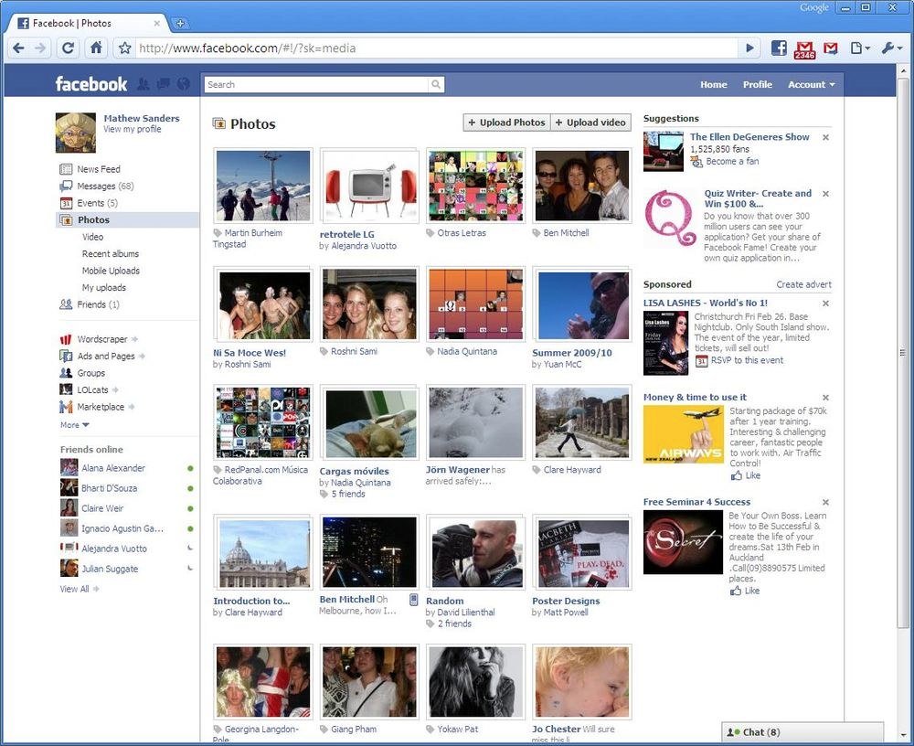
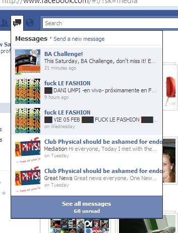
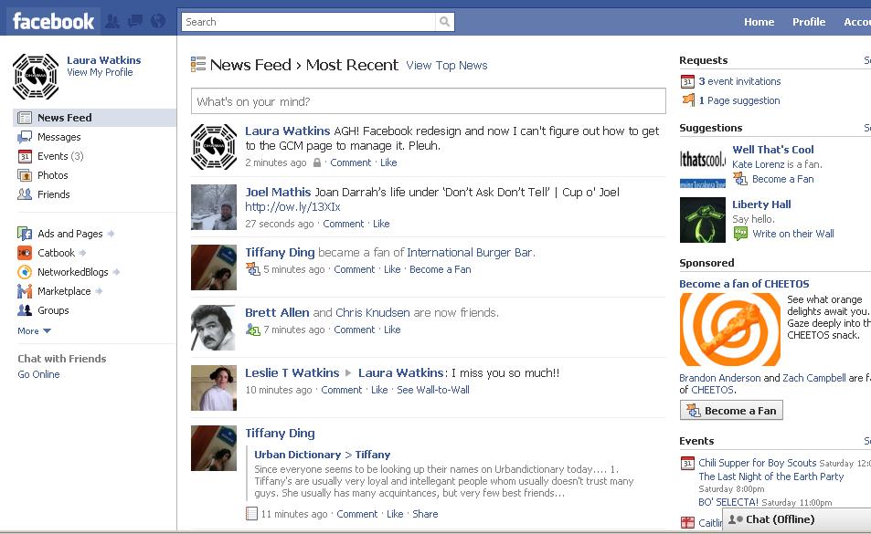
The design also includes some UI enhancements, like the ability to send messages direct from your homepage using a pop-over window, rather than having to visit a separate page. There’s also a new emphasis on search — note how much larger the search box is, and its more centered placement on the page.
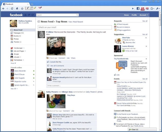
It also looks like the News Feed filters and friends lists have been removed (or at least no longer take up the entire left side bar). And the naming of the two different homepage streams — Live Feed and News Feed — have changed: they’re both part of the News Feed now, with the live updates under a “Most Recent” tab and the highlights under “Top News”.
The new design isn’t a huge surprise — Facebook has been testing out variations of the design for some time. And they announced back in October that they would be moving many of the navigation elements over to the left side of the screen.
I haven’t gotten to try out the design for myself yet, but I’m liking it a lot. It looks cleaner and easier to use than the old design (I’ve never been a fan of the ‘Applications’ menu concept). Also note the way it handles submenus, keeping navigation elements consistently in the left panel as opposed to arbitrarily scattered in each app. One slightly odd change though: it looks like videos are now actually part of the Photo application.
Twitter user Lwatkins84 tweeted this photo:
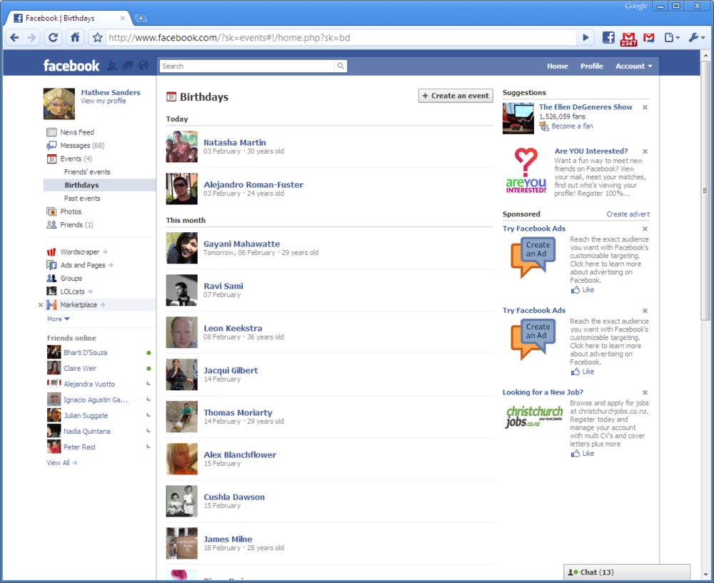
And Mathew Sanders has put together a gallery showing off some of the screenshots — note the changes to the Photos application: