The New York Times Company is considering the launch of a brand new online news reader that would let people experience the consumption of NYTimes.com content in an entirely new and fairly innovative way. The publisher has reached out to members of its Insight Lab to get some rudimentary feedback on the new reader prototype and to help settle the naming issue.
Insight Labs members can test out the new prototype on a live website, which means you can, too. All you need to do is head over to this web page and you’ll be able to play around with the ‘newview’ as well.
One of the names the NYT is considering for the new online reader is Article Skimmer, which is the same name that was given to a prototype product the publisher threw out there some time ago. But the new reader linked above boasts more features than the Article Skimmer that’s currently featured on First Look, which is basically a showcase for new NYTimes.com features and services.
This could be a sign that the company considers graduating the Article Skimmer experiment to a full-fledged mass product and giving it a new name for the occasion. Some other names it is suggesting in the survey: Grid View, Times View, Easy View, Broadsheet and Easy Reader.
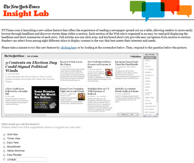
(click for larger size)
Here’s how the NYT describes the new reader prototype:
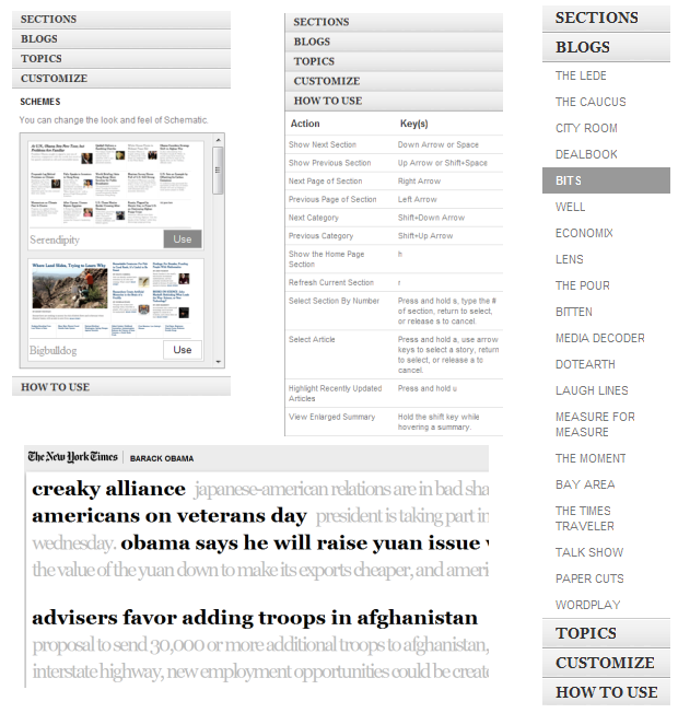
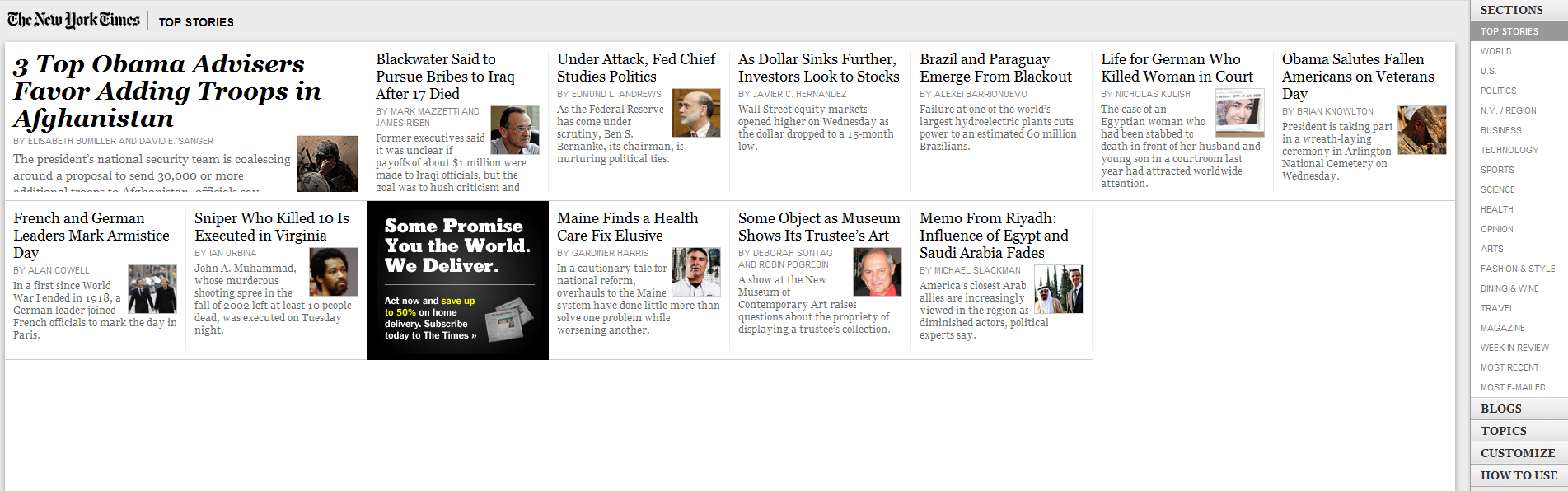
NYTimes.com is launching a new online feature that offers the experience of reading a newspaper spread out on a table, allowing readers to more easily browse through headlines and discover stories deep within a section. Each section of the Web site is organized in an easy-to-read grid displaying the headlines and short summaries of each story. Full articles are one click away and keyboard short cuts provide easy navigation from section to section. Readers can select from among eight different skins to display content in the way that best meets their interests and needs.
Some of the themes (or skins) are fascinating. One called ‘Flows’ displays headlines, a short summary and the author of the article in a single, continuous stream of text, while another (‘Blackout’) reminds me a lot of the TweetDeck design (see screenshot on top).
Evidently, there’s some place reserved for advertising units inside news content.
The keyboard shortcuts – which are mostly meant for navigation – are fairly useful, although not all of them worked flawlessly in my limited testing in both Firefox and Chrome. What’s more interesting is the fact that you can customize the content in your reader much more easily than on the regular NYtimes.com website, giving you the opportunity to filter what you see based on section, blogs, and topic. Surprisingly, there’s no option to display only articles from a specific writer.
Your thoughts on the new reader prototype?